Flipboard’s rebrand serves as a reminder of its mission
In a fast-paced and unpredictable digital age littered with fake news and information overload, it has never been more important for media companies to communicate a clear purpose to their users. By redesigning its visual brand and introducing a new campaign, Flipboard, a California-based news and social network aggregation company, has created a unique identity better fit for the envisioned role and purpose of the brand.
Eight months ago, Flipboard partnered with Moniker, a San-Francisco-based design studio, to design a visual identity that tells the company’s story. Established in 2010, Flipboard serves as a platform that curates personalised content sourced from news outlets, social networks and other websites for its users. By filtering unnecessary content, Flipboard allows users to ‘flip’ through information relevant to their interests.
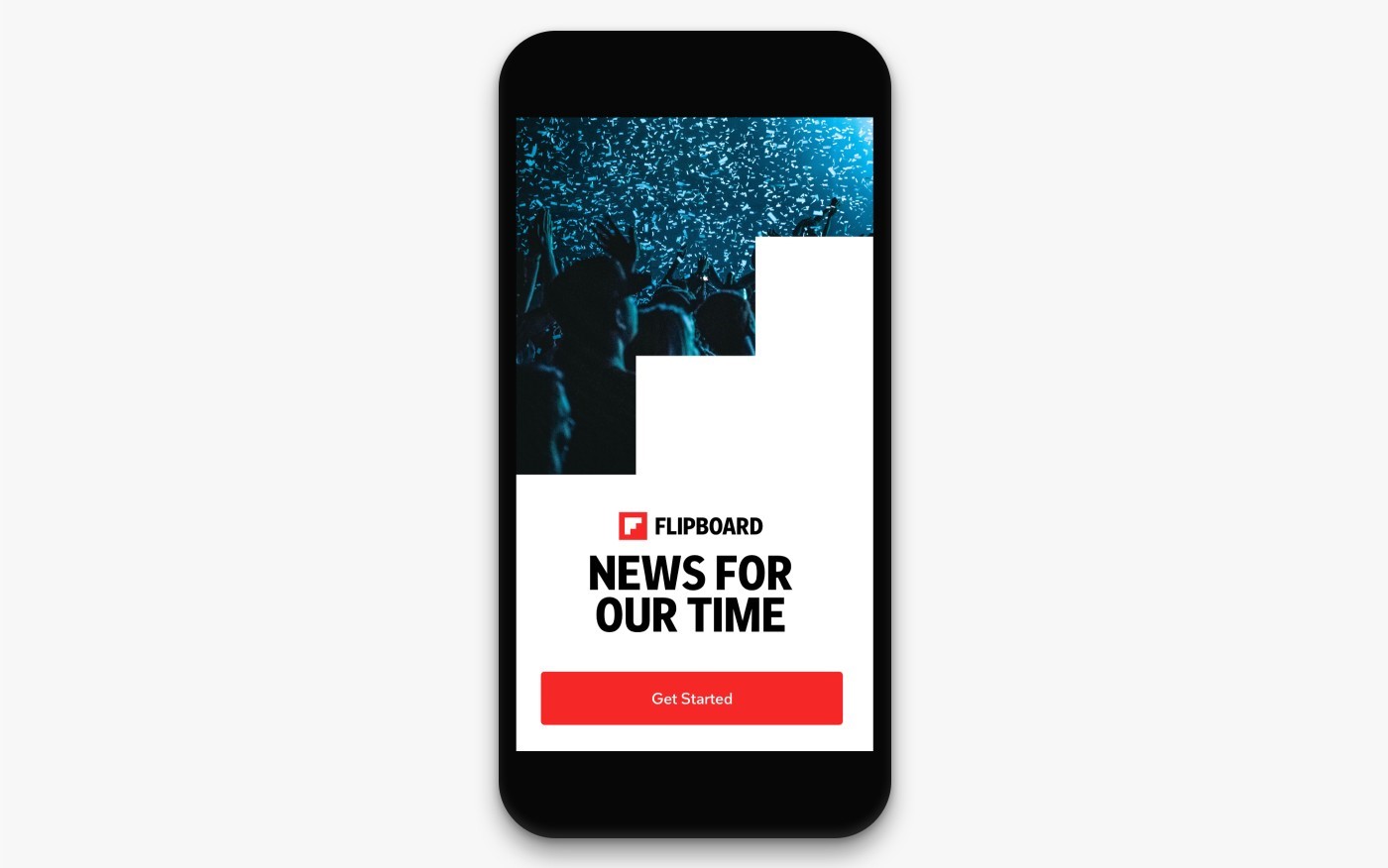
Inspired by its original mission, the company created an identity that brought out its unique characteristics and communicated to its users in a multidimensional manner. Reflecting on its original logo and manifesto, ‘great stories move the world forward,’ the company has always centred its brand around a ‘window’ that leads to great stories.
The 2010 logo, a red square with transparent window panes at its centre, was refreshed as an F-shaped fully open window. While the former logo aligned with the brand’s message, its transparency was impractical and inconsistent across different mediums. In addition to the window, Flipboard’s signature typeface Helvetica Neue was replaced by custom font Fakt Flipboard condensed, and the red colour used in the square was updated to a brighter tone.
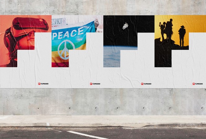
As a storytelling platform, Flipboard aimed to visually tell stories by playing with perspective and following the F-shaped pattern of its logo to display different imagery. By juxtaposing contrasting images, the brand advances its mission to convey different points of view.
Establishing a new slogan, ‘It’s Your Time,’ Flipboard collaborated with Red Square, another design agency, to introduce its first campaign. After working with Red Square on how to best convey this message, the brand decided on the format of a short paragraph with all the words struck through, save ‘It’s Your Time.’
As a bold and provocative design, the campaign simultaneously confronts current issues and conveys the brand’s new slogan. Founder of Red Square, Richard Sullivan says, “It’s been my experience that the best sign you’re working with a good idea is that it makes people a little nervous. The ads don’t look like conventional ads. They don’t sound like a typical manifesto either. No product shot. No visuals. Just thirty bold words, all struck through but three.”
As a platform that keeps its users informed and aims to enable them to be better world citizens, Flipboard has maintained its original mission in a time of constant change and uncertainty. By updating its visual identity and launching a provocative brand campaign, Flipboard has reminded its users of the current role it strives to play in today’s day and age.