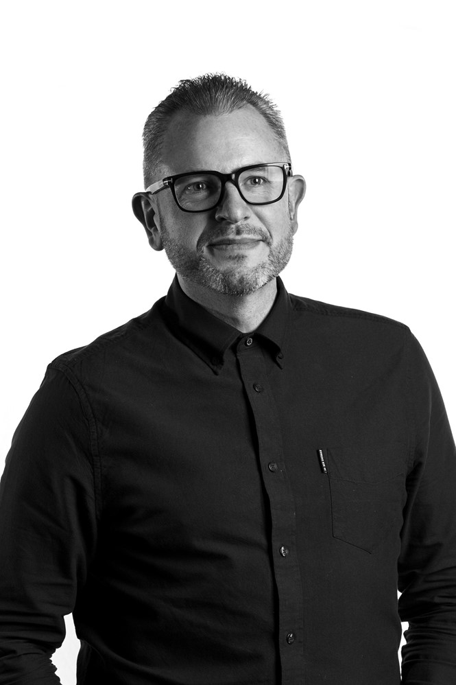
Five minutes with Mark Davis

The co-founder and creative director of integrated branding agency me&dave, Mark Davis, discusses the use of brand language and its work with Anco&co
What brief did Anco&co approach you with?
Build-to-rent (BTR) is a relatively new and misunderstood concept. DTZ Investors asked us to come on board to create a brand that would clear up any ambiguity and resonate strongly with the target audience: savvy 25 to 35 year-old renters looking for accommodation that’s a cut above the rest. There was no blueprint for this campaign; DTZ Investors was looking for a partner that would deliver something unexpected. And that’s the kind of project we love.
We were tasked with getting across that this is a ‘hotel-style’ concept. In addition to the self-contained apartments, there are communal bars, cafés, co-work spaces, a common room, cinema, rooftop terrace and a concierge service. We were asked to articulate just how big a gap there is between Anco&co and the regular private rental sector. Anco&co is all about building a sense of community; it’s a bit like belonging to a club.
Why did you decide to go with a language-led approach?
Typically, pictures are king. So, how do we differentiate ourselves? Language helped us do this, and we were able to be more tongue-in-cheek. As a rule, you wouldn’t start talking about a development as early on in the process as we did with Anco&co, but we wanted to make a bit of noise and pique people’s interest ahead of time. Without giving everything away at once, we created a fly poster campaign based on the language of protest. Some of it was explicit, some implicit, and it got people talking. It was designed to look like the gig posters you see pasted up all over the area, so it blended into the urban landscape.
We wanted to move away from the predictable photoshopped images of ‘what’s to come’ that you usually see on hoardings, and to speak the same language as the target market. Our campaign celebrates Anco&co’s disruptive approach to renting and the advantages it offers.
How did you ensure that, despite the brand being bold and colourful and addressing a younger audience, it is still considered serious and professional?
Professionalism isn’t about being corporate and dull or black and gold or navy! We always steer clear of the peculiar jargon of the property world – it’s so stuffed with hyperbole and euphemism that it has been rendered almost meaningless. Our to-the-point approach works on a professional level – it focuses sharply on the benefits of BTR and is honest and straight-talking. It uses humour too. Real estate can take itself way too seriously.
What core message does the new brand aim to convey to its audience?
Renting just got good. Everyone has a horror story – the uncontactable landlord, the damp box room, the broken shower. Anco&co is the antithesis of that. This product is designed for renting. A lot isn’t, which causes all sorts of problems. Our campaign frames Anco&co as a revolutionary proposition. Protest-style fly posters work well because it’s about taking a stand against what renting has meant for so many people until now. No more substandard amenities; no more dragging your life from one flat to the next.
How does the new brand you designed for Anco&co differentiate it from its competitors?
At me&dave we’re always trying to disrupt accepted approaches to property branding. In this instance, we came up with the name Anco&co to reference the scheme’s location – Ancoats in Manchester – and to inspire a sense of community. But, if DTZ Investors chooses to expand into new regions, the brand can easily move with them.
BTR is misunderstood, but this bold campaign sets it up as being more like belonging to a members’ club. The language-led strategy marks Anco&co out as different and better than the rest.
For more from Transform magazine, follow us on Twitter @Transformsays


