Finding the way
Managing the masses requires expert wayfinding design and an approach to typography that can embrace different alphabets at the same time. Amy Sandys discusses the relationship between type and signage design
Wayfinding is to human cognitive maps what echolocation is to the bat’s ability to navigate. Providing visual cues that prompt the brain into recognising, remembering or orientating itself to a familiar spot, wayfinding is integral to public places and buildings. If designed and implemented correctly, wayfinding becomes a network of signifiers through which everyday life is navigated. Take it away, and legions of people are rendered temporarily blind, lost among the unsigned roads and buildings from which the contemporary built environment is constructed.
The importance of wayfinding to human habitats is undisputed. Yet, for brands, wider complexity occurs about finding the most suitable wayfinding design for a global audience. Road signs require a different approach to a museum floor plan. A different approach again is required for an underground train system or signage across rural parkland, or even a consumer product. Further issues still arise when deciding the most suitable wayfinding style; from symbols to pictograms to type, its design can make or break a person’s experience of their surrounding environment. For Tom Foley, creative director at type foundry Dalton Maag, typography is a core pillars of good wayfinding. Yet, says Foley, successful wayfinding is also the product of a deep recognition of a brand’s aim – it identifies the core expectation of a brand’s audience.
“Most wayfinding has a component of pictograms, directional arrows and then typography saying what it is,” says Foley. “Wayfinding is a very pure way of directing people to where something is, or where they should go. If you choose the wrong typeface or choose something really expressive and difficult to read at a glance, you’ve lost those considerations of functionality.” And functionality extends not only to legibility, but also to how the brand expresses itself. If a type is difficult to read, audience attention is compromised; it should match the environment for which it has been designed. “Legibility comes as a priority and the brand consideration and recognisability and the typeface is quite high up there,” says Foley, “But then it does depend on who the wayfinding has been designed for.”
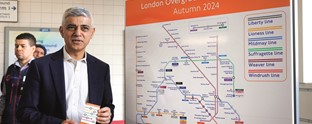
And identifying the audience is especially difficult if the audience numbers in the millions. For Jon Hunter, head of design at Transport for London (TfL), the corporation charged with maintaining London’s complex transport system, complementing place sign typography with easily identifiable pictograms is vital in maintaining TfL’s reputation as a reliable service. “The vast number of customers that we need to move through the network safely and efficiently every day means that we have to ensure our signage system is as intuitive as possible, resulting in the smoothest, and quickest navigation through the system,” says Hunter. “If customers were unsure at decision point in a major interchange station, the delays could slow the movement of customers through the station, resulting in potential delays and a poor customer experience.”
It is therefore at the point of finalising a design, argues Foley, that the typographer’s role is crucial. When researching and surveying a potential site, the designer identifies potential obstacles and decides on a typeface based on what is most effective in a given environment. “The designer making these typographic decisions has to see all the potential uses and potential issues, like if there are accessibility requirements with people of all ages and all demographics, or people of all abilities,” says Foley. And, while encompassing all manner of requirements such as disability, visual impairment or demographic, accessibility also extends recognising the nuances that come with branding for Latin and non-Latin alphabets.
For Mike Curtis, group CEO at brand and digital design consultancy Start Design, catering to an increasingly global brand audience imperative in creating and establishing brand connections. In the Middle East region, historic ties with British business and its emerging tourist market cements the need for wayfinding that encompasses universal visual characteristics. Given the increasing propensity for patrons to use wayfinding tools on smart phones and digital devices, then, synchronicity between ‘traditional’ and digital media, and divergent audiences, is key.
Start Design’s work in Dubai uses custom fonts and differentiation to ensure both customer-facing brands and corporate brands are accessible to all audiences. And successful branding in a place like Dubai, which is frequented by both Western and non-Western visitors, relies on the designer to go beyond typeface and create a truly universal place identity. “Where possible, we seek to apply reductive design and incorporate Arabic and Latin together into a singular element,” says Curtis. “This was successful with Arabic audiences for Yas, the Island of Entertainment in Abu Dhabi. Reading right to left and left to right simultaneously registers the name as just one brand identity device for visitors to recall.”
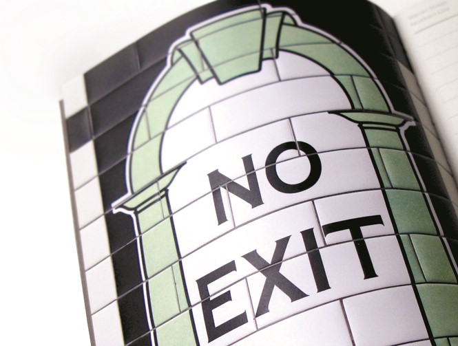
The benefits of combining typography with a visually stimulating approach is echoed by Martyn Garrod, creative director at print and digital design agency Carter Wong. “In the early 1900s, many of the Tube’s passengers were illiterate and the unique tiling helped them navigate the growing underground network with ease,” says Garrod. So iconic is the London Underground’s early wayfinding that it forms the basis of a recent notebook project by Carter Wong named ‘To the trains,’ that explores the tiled illustrations adorning much of the TfL Underground network. “This process of using graphics and colour as a wayfinding tool is still just as useful today, as people explore new countries where signage might not be in their own language,” says Garrod.
The benefits in keeping the continual flow of people moving with the aid of legible typeface font is not confined only to transport systems, however. For Carter Wong, the wayfinding experience at the National Media Museum in Bradford was approached with a similar attitude to TfL’s historic image-led aesthetic. With literal representations of the typeface, in the form of icons and pictograms, adorning the museum, Carter Wong ensures the National Media Museum became appreciated for a level of functionality usually confined to transport systems. “Typography has to be simple and clear for ease of legibility, but where possible iconography really helps,” says Garrod. “Your brain will register an icon for the toilet or shop a lot quicker than reading a piece of text and this also helps overcome any language barriers.”
Using iconography along with type also lent a flexibility to the museum’s target demographic, ensuring the audience was not restricted by a system driven solely by the English language. “We [employed] a series of icons that are immediately identifiable across multiple languages, such as knives and forks for the restaurant, and positioned them on large-scale chevron motifs as flexible navigational graphics,” says Garrod. The brand experience thus extends across all platforms, from printed marketing materials to social media to websites and graphics; designers must consider their audience and how the typography will be seen. Type is often underestimated, he explains, in consideration of the impact it has in creating a connection between the customer and the brand. “Typography plays a foundational role within a brand,” he says. “If the brand product is about delivering content to the customer, or communicating to customers across many platforms, type creates recognition and familiarity.”
A consistent wayfinding system and considered typography is key for brands achieve cut-through across audiences and access external markets. The branded built environment is not the only consideration when implementing wayfinding. Given the extent to which brand experience is dominated by accessibility, ease of navigation through a maelstrom of type and icons becomes synonymous with the brand message – and how the brand itself is perceived.
Type design across different languages
Jason Smith, founder and creative director, Fontsmith
There’s a practical and logistical reason for making brand typefaces consistent across different regions. Things like colour, photographic style and typography in advertising change from region to region – what you’d do in China, you wouldn’t do in the US for instance; it’s a different culture, demographic and market. As well as having a consistent logo and logotype, it makes a lot of sense to make the typeface visually consistent, and it makes managing those assets for a global brand much easier when there’s only one brand font family.
Fontsmith worked with Colgate, and with a product like that, you wake up in the morning and Colgate toothpaste is the first brand you experience of the day, and the last one you experience at night. It makes a lot of sense that the typeface and colours plug in to that and represent the brand, so we had to create a typeface that works in Latin, Thai, Cyrillic, Devanagari and all the other important regions.
But not every scenario needs a visual consistency. For instance, when you go to the airport, signage in different languages needs to be seen to be different, so the typography and graphic design should be sympathetic to that. I was in Madrid airport recently, and the signage was brown with white type. In Spanish, you’d have a regular weight Roman, something like Frutiger; then the English below it was a lighter weight Italic. There’s that contrast, but it’s still consistent in application and identifiable to different readers. That’s really important, but it’s also a designer’s job. Not everything can be solved by type, it’s about how you use type and ensure you are being logical about the whole brand or wayfinding system.
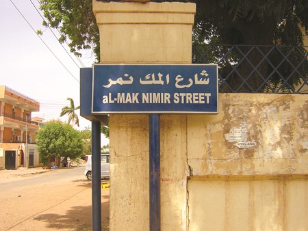
As for how brands differ visually for different regions, type-wise by the fact of changing from Latin to Arabic words, you’re changing the tone and flow of the type anyway. Arabic is a much more calligraphic and handwritten system, it often has a lot more thick and thin in the lettershapes. To make Arabic into a monospaced font to match a Latin monospaced font would stick out like sore thumb. You have to bear in mind what’s fit for purpose and functional for the region, sometimes localising a brand is far better than mindlessly globalising it.