Clear communications on flavoured water brand packaging
The focus on flavoured and sparkling waters is not disappearing anytime soon. With LaCroix taking off in the US and flavoured waters on the rise in many countries, drinks producers are finding it an opportune time to introduce new product ranges.
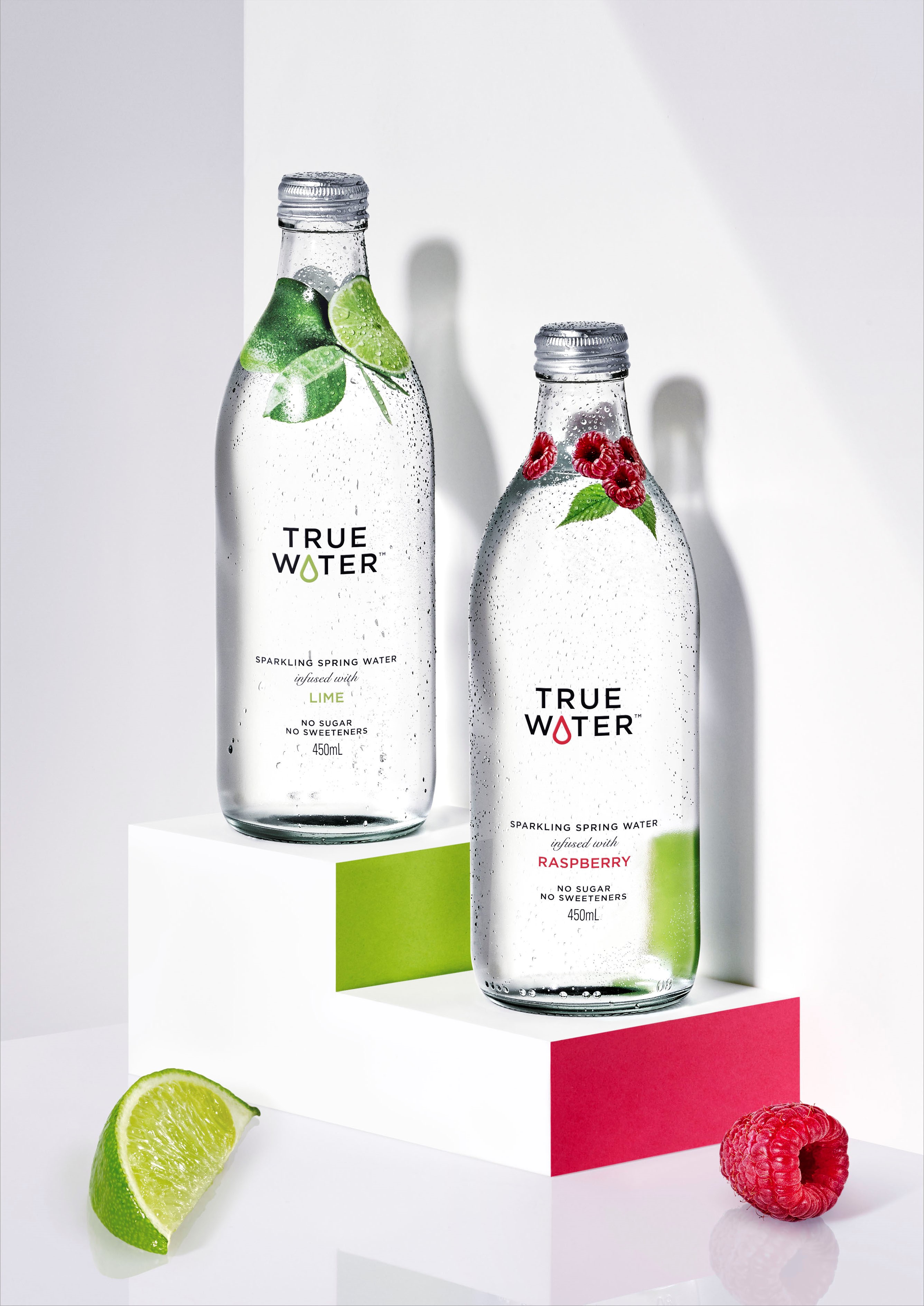
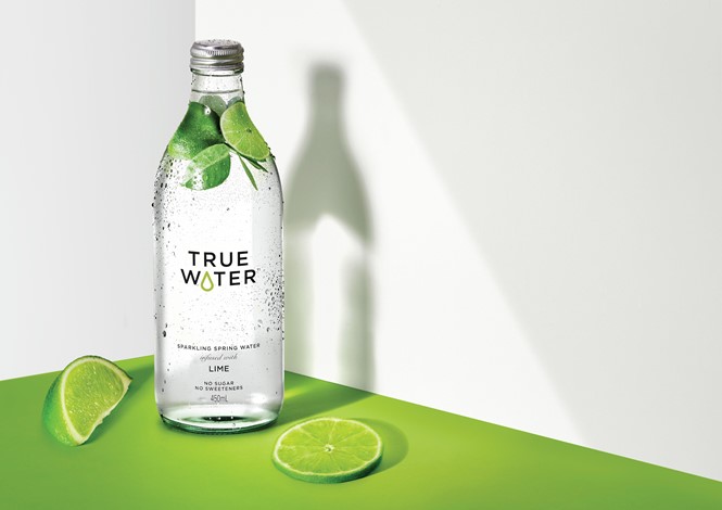
That is the case for Frucor Suntory, which has unveiled a new range of spring water with fruit infusions. The beverage company worked with Sydney-based brand agency Denomination to develop the sub-brand and the packaging for the new True Water range.
The agency wanted to focus on the brand’s positioning as a healthy option and use design to differentiate True Water from its competitors. To do so, the agency chose a clear glass bottle with simple graphics that communicate about the fruit infusions, without overwhelming the water – much like the taste itself. The logo was designed to include a drop of water, allowing the range a brand asset that can be used across its communications. It also operates as a visual cue signifying the different flavours of each individual product. Because of the audience’s desire for sustainable products, the bottle was designed to encourage consumers to refill it.
Rowena Curlewis, CEO of Denomination, says, “Pared back, simple designs can be the most challenging to execute beautifully but they’re often the most enjoyable to create. Every expression has to be crafted perfectly and there’s nowhere to hide. We believe the creation of the drop in the logotype gives True Water the level of desired distinctiveness and ownability without resorting to conventional FMCG cues. Coupled with the unique shrink sleeve design, the packaging communicates the quality of the water inside clearly, creating something that’s photo-ready for those Instagram moments.”
Representatives from Frucor Suntory say the packaging evokes the ‘good for you’ aspects of the product and sets the brand up with an effective architecture that can allow it to expand in future.
Penny Cheung, head of innovations, Frucor Suntory, adds, “We were looking for a non-FMCG agency to disrupt the traditional water cues (blue and white snowy mountains!) by bringing in some emotion and pleasure to what is a generally boring drinking experience. Denomination’s expertise in creating wine designs that are beautiful, simple and premium made them the perfect choice for us.”