Branding that tricks the eye for Leonardo DiCaprio Foundation
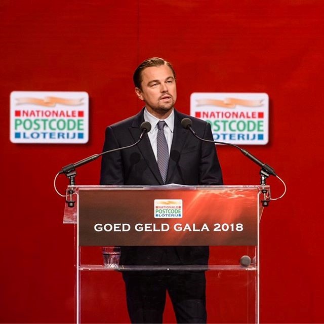
Apart from his award-winning movies, Leonardo DiCaprio is known for his dedication towards helping environmental causes and his ongoing, dynamic effort to raise awareness regarding those issues. As he says, “The destruction of our planet continues at a pace we can no longer afford to ignore.”
Now, the Leonardo DiCaprio Foundation has launched two new animal protection projects designed by Superfried Studio in an effort to protect elephants, sharks and stingrays. The 20 year-old charity, dedicated to the long-term welfare of all Earth’s inhabitants and founded by the well-known Hollywood actor, has turned its focus on its marketing strategy, realising that an intriguing campaign can create a buzz which will in turn help the projects reach more people.
Superfried Studio, an independent design studio based in Manchester, undertook that task of creating the visual identity of two separate funds, the Shark Conservation Fund and the Elephant Crisis Fund. Optical illusions were used to display several images at once within each logo, representing both the species and their natural habitats at the same time.
Superfried Studio’s creative director Mark Richardson says, “I am a big fan of op [optical illusion] art, especially M.C. Escher. I am always looking to simplify, and whenever possible, try a new direction that I have not explored before. So if I could represent both species within one expression, rather than having them as two separate entities, I felt this would lead to a more intriguing and elegant solution. The ocean waves and shark fins were conveniently similar in shape.”
The Shark Conservation Fund’s logo is an aqua-coloured circle with a shark symbol as its base and a ray symbol layered over. The wing of the ray becomes the fin of the shark, creating the image of ocean waves. Similarly, the Elephant Crisis Fund’s logo features a profile image of an elephant in grey, which has been filled in with topographic contour lines to resemble the landscape.
The projects were based on attention grabbing visuals that trick the eye and invite people to take a closer look in order to, as Richardson says, “Connect with people” and, “Cause them to take notice, therefore raising awareness for the important causes.”
For more from Transform magazine, follow us on Twitter @Transformsays


