Aldo puts best foot forward
A once-average high-street brand has now given way to an elegant retailer that celebrates the street-style aesthetic and can compete with brands like Topshop and Zara in terms of timeliness, quality and accessibility.
Aldo, the Canadian-based well-known footwear and accessories company with a 42 year presence in global retail, has reached out to New York and California-based independent design company Collins for the launch of its new brand identity.
Collins says, “Our goal was to push Aldo away from discount retail and into a more premium position and expression. Every aspect of the experience now works to build the trust and enthusiasm consumers have for Aldo products.”
The introduction of a new design structure and the alternation of basic, fundamental elements, such as the logo, was only the beginning of the plan for Aldo’s evolution in every part of the brand experience, from packaging, in-store signage, digital displays and digital advertising, to web and mobile expressions.
In an effort to attract a younger and audience, Collins designed a brand inspired by the urban aesthetic for Aldo. The logo itself did not change dramatically, a conscious choice Aldo made due to the recognition of the previous design.
However, although the changes to the logo are few, with the use of bold font and GT Sectra – which is a contemporary, serif typeface combining the calligraphy of the broad nib pen with the sharpness of the scalpel knife – being basically the focal point, the rebrand focused on changing the general feel of the brand.
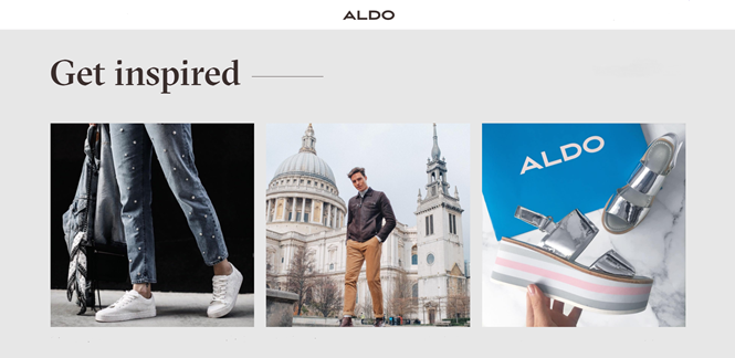
In the rebrand’s framework, a new approach to ads and other layouts has also been adopted. This includes collage-like images taken from different angles with a consistent colour palette that look fresh and fun, straying from the norm of retail advertising that can at sometimes be trite and predictable.
For more from Transform magazine, follow us on Twitter @Transformsays