Akashi-Tai sake reveals new brand identity and artisan design
Resulting from the fermentation of rice and the polishing of its bran, sake is Japan’s national drink. Often served ceremonially, its become synonymous with the joviality and socialising that surrounds the consumption of Japanese food. Yet, with so many brands available and such an iconic history to preserve, it can be difficult for sake drink packaging to stand out in a crowded marketplace.
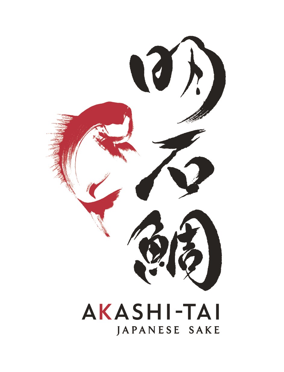
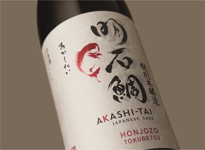
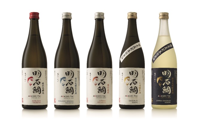
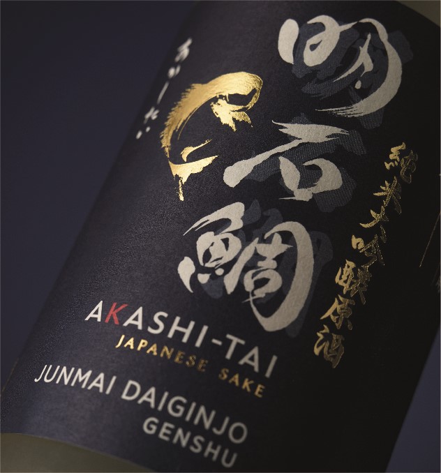
Expanding its global appeal and securing leverage across the Japanese market, the Akashi-Tai Brewery has recently unveiled a new rebrand. To distance itself from the previous fish imagery with which the product had become associated, the brand turned to the London office of global design agency Cowan to develop a bespoke identity for its five-strong range.
“Creating sake packaging was a true privilege,” says Elizabeth Finn, managing director, Cowan London, says. “It’s very rare for a design agency outside Japan to be given that honour, but with our team’s extensive experience in alcohol branding, and our four offices in Asia, we were ideally placed to help Akashi-Tai realise its vision of bringing sake to the wider world.”
Akashi-Tai is unique in the western market due to its traditional production methods, a trait the brewery prides itself on. Immersing itself in Japanese visual cues, including iconography, calligraphy and imagery, Cowan London created a remake of Akashi-Tai’s sea bream. With a subtler design and a focus on its reflecting artisanal artistry, the resulting label and packaging distances the brand from its dominating fish imagery.
Samantha Dumont, creative director of Cowan London, says, “We needed to ensure that Akashi-Tai remained highly credible in Japan, whilst appealing, in a less expected way, to an increasing number of intrigued Western consumers. It seemed natural that the Tai icon and kanji calligraphy should take centre stage on the label, but once we understood the nuances of Japanese symbolism and the construct of Japanese design, it was interesting to discover that we had to un-learn some of the usual graphic design rules that we apply in the UK.”
Renowned Japanese artist and calligrapher Hirano Sogen was commissioned to create the Akashi-Tai kanji brand mark. A powerful yet fluid mark, Sogen’s work exudes confidence and and works with the tai illustration to ensure Japan’s historic sake production process is not forgone - despite the luxurious packaging twist.
With the rebrand already rolled out in the US, there are plans in place for a UK launch, followed by further brand expansion into France, Germany and Europemore widely. Dumont adds: “We are delighted with this iconic representation. It is fluid and elegant with a style that really expresses the curiosity and tenacity of the fish and the progressive nature of the Akashi-Tai brand.”
The result is a globally-inspired, illustrious packaging design that appeals to a wide audience without compromising its Japanese heritage. Akashi-Tai’s brand team says, “The new design perfectly balances Japanese purity with an iconic and visually powerful aesthetic that will appeal to the Western eye, whilst at the same time retaining unquestioned traditional credibility in the domestic market. The brand is now in a perfect position for growth.”
“This was an incredibly challenging project. Tackling a seemingly impossible challenge, it required a solid and tight working relationship and real commitment from our agency. Cowan was brave enough to take on the challenge and was with us every step of the journey.”
Cowan London won ‘Best packaging design’ for Akashi-Tai at the International Beverage Awards at Drink Japan on June 27.
For more from Transform magazine, follow us on Twitter @Transformsays