Typography-led identity for Alpine city of Annecy
Annecy, a city located in the Haute-Savoie department in the French region of Auvergne-Rhône-Alpes, close to the borders of Switzerland and Italy, is one of those rare places which offers something for everyone. Crystal clear waters lure swimmers, bathers and water sport enthusiasts into its lakes during summer months. Its fringe of hiking trails and paths is perfect for explorers of Annecy’s surrounding Alpine environment, while the mountainous retreat comes into its own during the winter season. There is plenty for the more relaxed traveller, too, including boat trips, cycle rides and a plethora of bars, hotels and restaurants into the city’s midst.
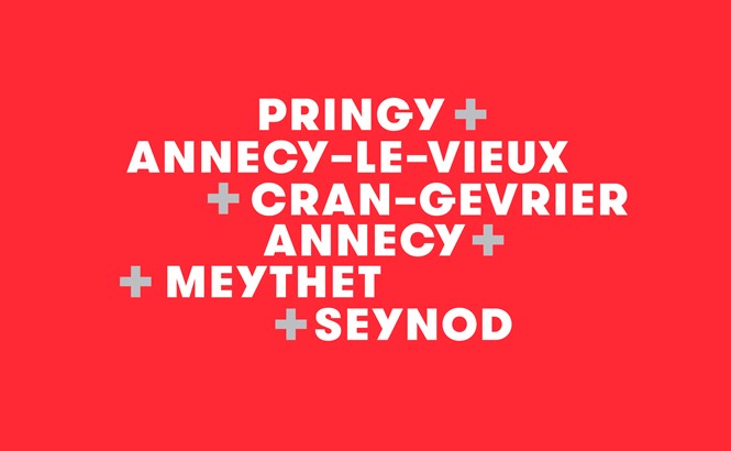
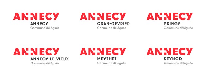
Yet communicating this offering to France’s 83 million annual visitors has proved problematic, not least due to the shifting geographical nature of Annecy and its surrounds. Until January 2017, the Haute-Savoie department and its corresponding place brand was defined by all six logos of its cities – Annecy, Annecy-le-Vieux, Cran-Gevrier, Meythet, Pringy and Seynod. A municipal council decision, however, saw the six areas combine under one place name, Annecy. Chosen due to its prominence as the department’s largest and most recognised city, its main asset is its namesake Lake Annecy, which lies to the city’s south.
Annecy city’s new visual identity, released in November 2017, now represents a region of around 125,000, three times more than the 50,000 of 2016. And, with the recognition of this singular identity, the once disparate brand architecture of the Haute-Savoie department has necessitated the creation of a unified place brand which sufficiently encompasses all six previous towns.
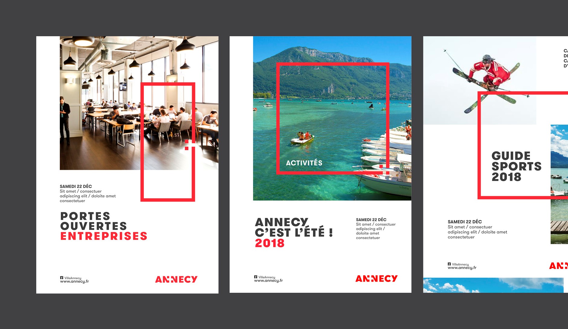
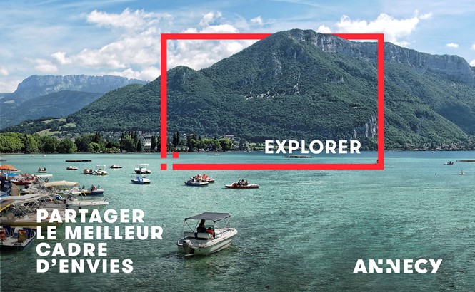
Encapsulating the beauty of the area, the Annecy place brand defines the region through a series of visuals based on Annecy’s heritage – including the red and white flag of Savoie. Graphic design agency Graphéine, which led the rebrand project, uses the flag’s cross to create a frame effect. This accentuates the area’s major draws and firmly cements its new identity to its impressive landscapes, while providing a clean backdrop on which the dominant typography can lie.
However, the typography is, for Graphéine, where the strength of the branding project lies. Led by GT Walsheim, the logo opts for a clear rendering of the Annecy name overlaid on striking images of the lakes and the city’s other offerings. “The name "Annecy" enjoys a widely spread image, that of an exceptional living environment on the shores of the lake and mountains,” says the Annecy project page on Graphéine’s website. “This name already carrying values of quality of life and exceptional setting, we deemed useless to illustrate them in the logo. We therefore opted for simplicity by creating a typographic logo.”
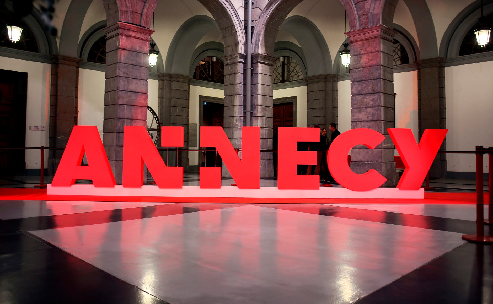
Functionality was therefore the crux of Annecy’s new place brand, and particularly its logotype. “The main challenge of a city's visual identity is to make the institution and its actions legible,” says Graphéine, about Annecy. “In this context, the logotype's signage function is very important. It is also about designing a sign that will last as long as possible. Annecy being the economic capital of Haute-Savoie, it seemed relevant to capitalise on the symbol of the Savoie flag, an internationally known sign, that conveys the values of this territory.”
To communicate Annecy’s impressive and extensive offering from the local to the international scale, Graphéine pairs clarity and functionality with a recognition of what Annecy offers. The city’s place brand identity is led by the values through which life in Annecy is driven, says Graphéine – “Rigor, openness, efficiency, initiative, frugality.” Acknowledging its past while looking to the future, its new place brand will ensure Annecy retains its universal appeal and is noticed in the melee of competing French holiday locations.