#TransformTuesday: 28 March
Every week, Transform examines recent rebrands and updated visual identities. This week's picks are below. For more from #TransformTuesday, follow @Transformsays
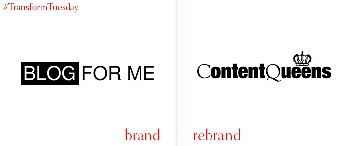
Content Queens
Manchester, UK-based Content Queens is a content marketing service owned by small consultancy, Oddsphere. Initially named ‘Blog For Me,’ the name change to Content Queens – as well as a visual brand overhaul – aims to project the services, other than blogging, offered by the firm. The name is based on nicknames for the service’s director Hayley and content executive Amanda, as well as being a feminine take on the oft-referred to phrase, ‘content is king.’ Director of Oddsphere and Content Queens, Hayley Cowburn says, "Under the name Content Queens, we are free to promote all the content services we offer and to be as creative as we like with a brand that reflects our personality.”
Dacha Media
Dacha Media is a Berlin-based consultancy providing English language, editing and translating services. Its visual identity has been updated by Berlin-based brand agency, Startling Brands, to emphasise the link between Dacha Media and its media-based work. A simplistic royal blue, grey and white colour palette giving the consultancy’s identity clarity and cut-through in a heavily media-centric city. Commenting on their work, Startling Brands says, “The creative approach to Dacha Media’s identity system is primarily based on the typography used in bold newspaper headlines. The company’s media focus is also the inspiration for its logo, which features the letters D and M, which have been tilted in order to create the resemblance of an open publication.”
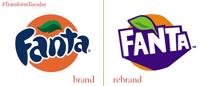
Fanta
One of the best-known carbonated soft drinks, Fanta, has overhauled its visual identity and packaging design for UK consumers. The brand’s previous logotype, designed into a circle, is replaced with an angular design; the brand’s original colour palette is now inverted. However, the bottle – redesigned into a spiral form by London-based consultancy Drinkworks – is the rebrand’s main focus. Reflecting the playful aspects of the Fanta brand, Drinkworks claims the bottle is ‘a world first’ for carbonated soft drinks. “Embodying the brand’s playfulness and naturally fruity flavour through a uniquely twisted, segmented bottle. Driving ownability, shelf pop and tactile engagement,” says Drinkworks.
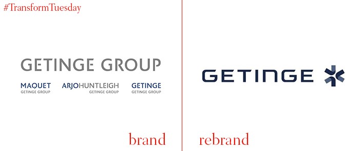
Getinge
Global medical technology company, Getinge, was founded in Sweden in 1904. Earlier this month, the company announced it was unifying its divisions – infection control (Getinge), extended care (ArjoHuntleigh) and medical systems (Maquet) – under one brand, Getinge. This includes a new visual identity for the company and retirement of the previous Getinge Group name, as well as transferring the Getinge name from endorser brand to main brand. Joacim Lindoff, acting president and CEO at Getinge, says, “Unifying the company under one brand is in line with our ongoing transformation program that aims at making Getinge even more market and customer-centric. The single brand approach will also continue to reinforce our position as a leading global medtech company.”
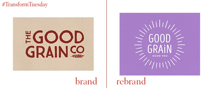
Good Grain
Good Grain, a healthy breakfast cereal brand owned by specialist cereal manufacturer Brecks, has repositioned and updated its visual identity to clarify its brand offering. The rebrand, carried out by Leeds-based creative agency Robot Food, aims to reject category norms and convey Good Grain’s simplicity. A tagline, developed by Robot Food, emphasises the healthy start to the day provided by the cereal – ‘Good grain, good you.’ Simon Forster, creative director at Robot Food, says, “This is a category dominated by massive brands with dubious claims, and a plethora of rustically charming brands targeting the affluent middle class. In well-timed contrast, Good Grain is now a compelling brand for everyone interested in maintaining a healthy lifestyle.”

SXSW
One of the US’ most well-known annual festivals, South by Southwest (usually known as SXSW), has revealed its visual identity for the 2017 iteration. Lasting around 10 days, SXSW is held in Austin, Texas, and is a showcase of conferences, interactive sessions, music and film attracting around 72,000 acts and attendees. Each year the festival completely renews its identity, signage and architectures under the guidance of Texas-based branding agency, Foxtrot. This year’s offering strips back a previously busy identity, employing a simplistic monochrome palette and optimising the logo for digital proliferation.
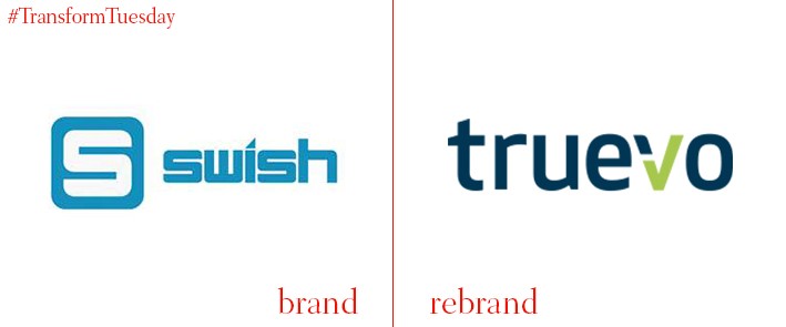
Truevo
Malta-based card acquirer and payment solutions provider previously known as Swish Payments has rebranded, including a name change to Truevo. Founded in 2012, Truevo allows customers to easily accept transactions across various channels, from instore to digital and phone-based payments. The changes to its visual identity include moving from a predominantly blue-based colour palette to a clearer, crisper white background, on which the logo is clearly visible. Truevo CEO, Steve Grech says, “The rebranding decision was taken to avoid confusion in the marketplace with a similarly-named peer-to-peer payment solutions company in Sweden.”


