#TransformTuesday: 26 September
Every week, Transform examines recent rebrands and updated visual identities. This week's picks are below. For more from #TransformTuesday, follow @Transformsays.

Colostomy UK
National organisation Colostomy UK exists to provide help and support for people living with a stoma due to a bowel condition. The charity has recently announced a name change and rebrand, carried out by a mixture of Reading-based creative agencies and the Colostomy UK in-house team, to clarify the extent of its involvement and commitment to campaigning and running projects. Previously known as the Colostomy Association, the charity hopes the new name will reflect its future-facing ambitions. Clare Matthews, marketing and communications manager at Colostomy UK, says, "We wanted to get the message across that we are more than an association for patients. We also wanted to refresh our image and engage with more people, particularly younger ones."

FlyDSA Arena
Doncaster, UK-based creative agency, Moirae Creative, has revealed its branding and design work for Sheffield’s FlyDSA Arena. Previously known as Sheffield Arena, the rebrand and name change resulted from a three-year partnership deal between Doncaster Sheffield Airport and Sheffield International Venues. Using a client service-based approach, Moirae developed brand that firmly ties the arena with both its proximity to the airport and its sponsor brand, while retaining its regional identity. Creative designer at Moirae Creative, Daniel Jones, says, “Our first reaction was that ‘Doncaster Sheffield Airport Arena’ was too wordy…‘FlyDSA Arena’ was the best naming convention; it’s concise enough and refers to the airport’s own URL. However, we also wanted to add an exciting but light-hearted edge which reflects the fact that the FlyDSA Arena is ultimately an entertainment venue. We introduced a typographical style which combines a fun script font with a vapour trail and plane graphic.”
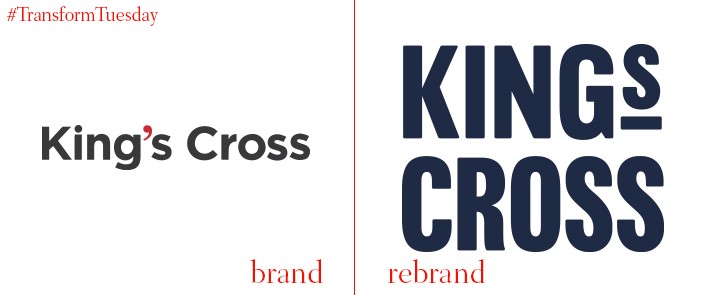
King's Cross
An iconic part of London, King's Cross is more than just a transport hub. Subject to development plans and place brand strategies over the 20th century, the area has a variety of uses and welcomes an array of industry. London-based brand studio SomeOne, along with type foundry Colophon, has rebranded King's Cross to consolidate its competing influences under one identity, while ensuring to still reflect the area’s diversity. A KX monogram denotes a shortened version of the King's Cross name, with the type that forms the area’s full name derived from ‘ghost signs’ found around the neighbourhood. Simon Manchipp, founder of SomeOne, says, “An overwhelming sense of individualism was found in all parts of the research. Very few areas of London offer such a rich collection of things to see, eat, drink and do. It's time people start to discover what's happening at King’s Cross.”
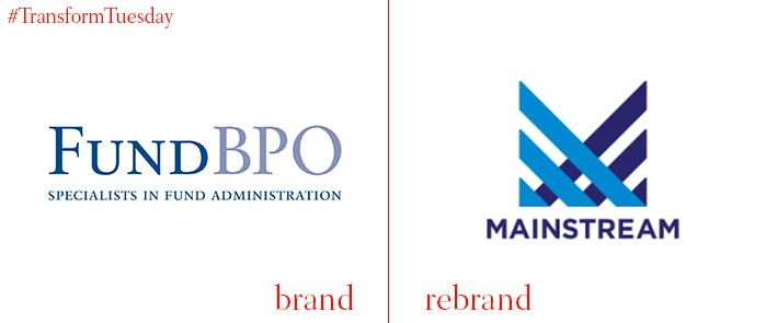
Mainstream Fund Services
Founded in 2006 as FundBPO, the company now known as Mainstream Fund Services is one of Australia’s largest locally-owned fund administrators. However, with the company’s success over the past decade seeing its reach extend internationally, Mainstream Fund Services has rebranded to unite its operations and reflect this growth. Commenting on the rebrand, group chief executive officer Martin Smith says, “Our new branding and global operating model reflect our commitment to clients that we are agile and efficient in adapting to ongoing change in the managed funds administration sector both in Australia and offshore.” Beginning in Australia, the company’s new brand will be rolled out across all markets by the end of 2017.
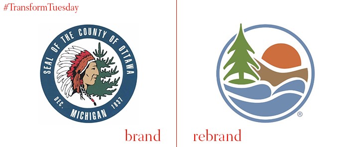
Ottawa County
Located in the US state of Michigan, Ottawa County was organised in 1837 and its known for its varied landscape. In a project led by Grand Rapids, Michigan-based PR firm SeyferthPR, Ottawa County had updated the place logo it has held since the 1980s. Moving away from the native American emblem, which it says rooted the county to its past, county officials hope to embrace a peaceful, visual representation of Ottawa County’s diverse countryside while symbolising its forward-facing attitude with a modern design and colour palette. Ottawa County also hopes to consolidate its various brand assets, such as signage and marketing materials, under the new, unifying emblem. Ottawa County administrator Alan Vanderberg says, "The new logo is our go-forward piece meant to align with the high calibre, forward-thinking Ottawa County organisation. The logo and text of the new brand aligns with who we are and will take us into the future.
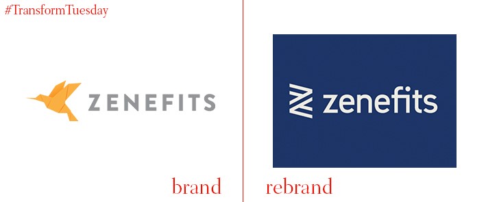
Zenefits
North America-based cloud software providers, Zenefits, has carried out an in-house rebrand following a change in leadership. Reflecting the need to more closely align company culture with its external offering, the new Zenefits brand retains its well-known name while distancing itself from the yellow paper bird which had become the start-up’s signifier. Choosing instead a navy blue and white colour palette, the new Zenefits brand aims to refresh the company narrative and increase its addressable market. Jay Fulcher, CEO of Zenefits, says, “People are excited about what we’re doing, they’re excited about the refreshed brand, they love the problem. The market we’re focused on is the backbone of the US economy. The noble purpose here isn’t lost on anyone and we have a very specific execution plan that we’re in the middle of working on.”


