#TransformTuesday: 25 July

Every week, Transform examines recent rebrands and updated visual identities. This week's picks are below. For more from #TransformTuesday, follow @Transformsays
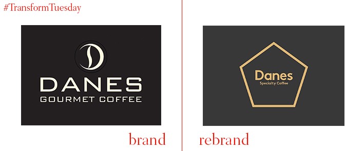
Danes Coffee
Brand identity and design consultancy Iconika, based in Sydney, Australia, has led the update for New South Wales-based specialty coffee producer and seller, Danes Coffee. Moving the brand away from its previous retail-oriented identity, Iconika has created a packaging design which reflects the artisanal and gourmet appeal of coffee ground specially for an appreciative audience. With its commitment to taste the main trademark of Danes’ appeal, Iconika has been careful to ensure its surrounding marketing collateral emphasises the craft behind developing coffee catered for individual tastes. A strapline, ‘Define yourself,’ further develops this message; a sophisticated colour palette led by gold and bronze signifies its quality.
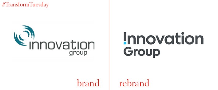
Innovation Group
Founded in 1996 as Merlinace, the insurance handling company became known as Innovation Group after its 1999 acquisition of accident management company MotorCare. The group, which handles claims from 15 of the world’s top 20 general insurers, has unveiled a rebrand carried out by Cardiff, Wales-based design and communications agency Clout Branding. The updated visual identity aims to emphasise the innovation inherent to the Innovation Group, which while present in its name was previously absent from its visual identity. “We developed a central brand idea around the notion of 'Going beyond,’ says Clout Branding. “The new global brand identity reflects this idea, along with a renewed sense of purpose. It all starts with the new logotype where an inverted ‘i' becomes an exclamation mark creating a twist on the conventional world of insurance.”
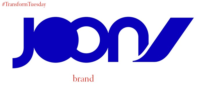
Joon
Following a recent trend whereby airlines release new fleets targeted towards specific audiences, such as International Airlines Group’s (IAG) recently launched Level, Air France has complied. With a launch date of 2018, the airline’s latest offering is named Joon and, as firmly stated in the press release, is ‘not a low-cost airline.’ Its visual identity, developed and designed by Air France’s in-house design team, aims to appeal to the ‘young and connected’ generation whose lives are apparently focused on digital technology. Caroline Fontaine, VP brand at Air France, says, "Our brief was simple: to find a name to illustrate a positive state of mind. This generation has inspired us a lot – epicurean and connected, they are opportunistic in a positive sense of the word as they know how to enjoy every moment and are in search of quality experiences that they want to share with others. Joon is a brand that carries these values.”
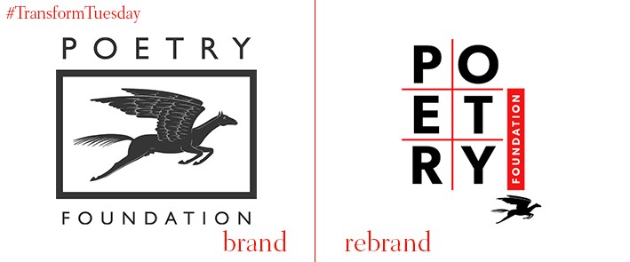
Poetry Foundation
Not-for-profit, charitable foundation the Poetry Foundation has been promoting poetry in wider culture since its predecessor, the Modern Poetry Association, was founded in 1941. Global independent design consultancy Pentagram has unveiled a new logo and visual identity for the foundation’s magazine. The Poetry’s Foundation’s website has been updated by Chicago-based consultancy Fuzzy Math. Led by Pentagram partner Michael Bierut, the new design puts poetry at the heart of the foundation’s identity – its ability to adapt to its various applications is said to be representative of poetry itself.
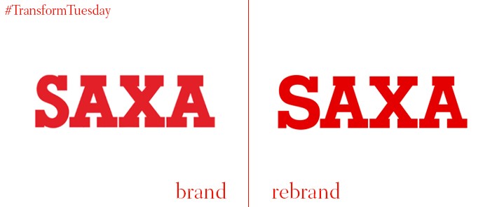
Saxa
Leeds-based branding design agency Robot Food has released its update to historic UK salt brand, Saxa, which has been owned by Premier Foods since 2007. First launched in 1907, the Saxa brand is associated with longevity and heritage – factors carefully considered by Robot Food throughout the rebrand strategy and development. The brad is, however, facing competition from challenger brands, particularly in the face of an artisanal food movement which often makes use of sea salt or different salt varieties. Dave Timothy, client director at Robot Food, says, “Saxa is one of those brands we all grew up with and they’ve always done one thing very well. We love helping brands with self-esteem and Saxa can stand tall and proud in what’s now a hugely progressive category.”
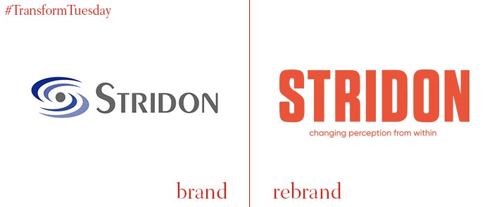
Stridon
Managed service technology provider, Stridon, has recently rebranded its visual identity. In a project carried out by the London office of international brand agency, Pixeldot, Stridon has shed its previously genetic, tech-oriented visual identity in favour of a bold logotype. The addition of Stridon’s new slogan, ‘Changing perceptions from within,’ represents the company’s value proposition which aims to rethink how IT service providers do business. Described as ‘bold, aspirational and thought-leading,’ Pixeldot Creative has developed a brand which reflects Stridon’s confidence in being the market leader for change.
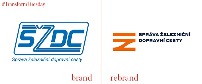
SŽDC
Správa železniční dopravní cesty, Railway Infrastructure Adminstration in English or SŽDC for short in Czech, manages the national railway infrastructure of the Czech Republic. While under public ownership, SŽDC last month released its updated logo and visual design which has been developed by Prague, Czech Republic-based design agency, Marvil. Although the corporate identity has not yet been released across the administration’s platforms, marketing materials and livery, it is expected SŽDC will have undergone its overhaul by 2018. The design is based on a railway tracks forming a Z, which is the first letter of the translation of railway in Czech (železnice).


