#TransformTuesday: 22 August

Every week, Transform examines recent rebrands and updated visual identities. This week's picks are below. For more from #TransformTuesday, follow @Transformsays
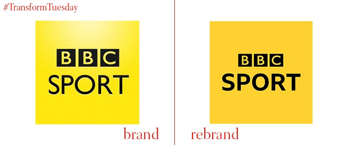
BBC Sport
The sporting arm of UK media institution, the British Broadcasting Corporation (BBC), has released the latest iteration of its logotype. Leaving behind the previous shadowy background, the creative agency behind the brand update, Studio Output, settles on a warmer yellow which works harmoniously with other colours in the BBC’s palette. The brand evolution reinforces BBC Sport’s heritage; the update brings the brand in line with contemporary digital brand best practice. Significantly, BBC Sport is the first BBC output to showcase a bespoke new typeface. Designed by Bruno Maag of type foundry Dalton Maag, BBC Reith allows for better viewer interaction while creating a brand clearly distinct from other channels. It will be adopted by other BBC channels over the coming months.

Cincinnati Ballet
The Cincinnati Ballet has released a new logotype in place of its previous identity, designed by global brand design agency LPK. The updated visual identity was released to mark the ballet’s 20th season under Victoria Morgan, the ballet’s artistic director since 1997. The Cincinnati Ballet has also recently welcomed a new executive director in Scott Altman. The logotype combines the ‘c’ and ‘b’ of the brand name, bringing them together in a monogram evocative of the fluid, smooth movements for which ballet is famed. It is hoped the rebrand will consolidate the ballet’s innovative future vision to drive local and national ticket sales, and continue to cement the Cincinnati Ballet as one of the city’s leading cultural events.
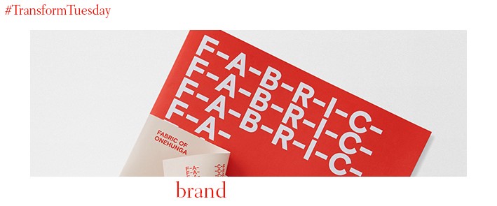
Fabric
Onehunga, a suburb of New Zealand’s Auckland City located on the Manakau Harbour, has recently seen the development of property complex, Fabric. Led by real estate developers Lamont and Co. and Colliers International, the two companies approached Auckland-based graphic design studio Richards Partners to develop a place brand for Fabric – the name of which derives from the area traditionally being a destination for clothes-making. Hyphens representing stitches are visible along the logotype, the white on red colour palette emphasising the suburb’s industrial heritage. However, contemporary design cues root the development in the 21st century with sans serif font Basis Grotesque and nods to the modern living environment the complex offers residents.
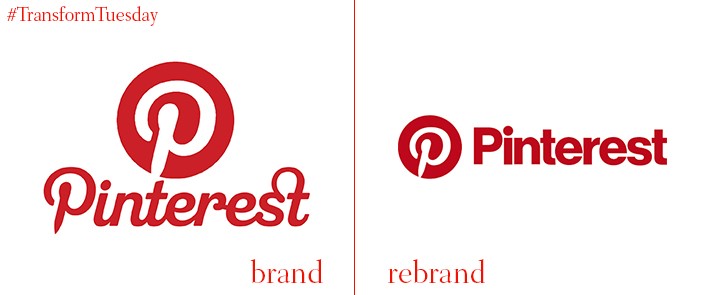
Pinterest’s in-house design team has released an updated logo and visual identity for Pinterest, one of the most popular idea- and image-based social media sites available. Dropping the artisanal, design-focused script of the previous wordmark, Pinterest has adopted a darker red shade and the blockier Neue Haas Grotesk font. This is perhaps to highlight Pinterest’s credentials, like Instagram, as a digital site which began for the younger generation but is now seen as another platform on which brands can market and publicise themselves.
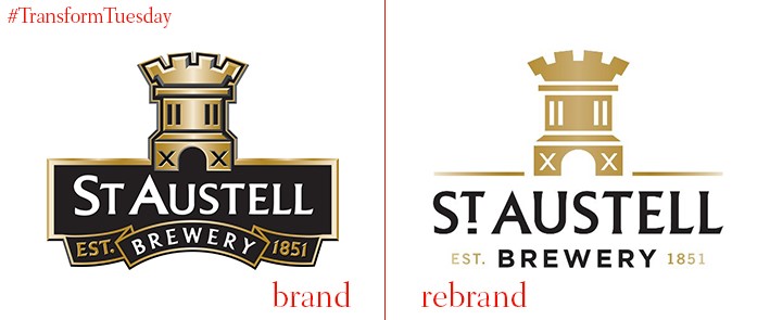
St Austell Brewery
Founded over 160 years ago, the Cornwall-based St Austell brewery is one of the oldest breweries on the UK’s south west coast and produces some of the nation’s favourite ales – Tribute is perhaps its best known. Brighton, UK-based design studio CookChick Design has carried out a rebrand of St Austell brewery and its beer products, including the visual identity and its packaging. The classic logo is brought into the modern age, rendering it more applicable for digital platforms and a wide range of marketing materials. However, many of the brand’s classic signifiers remain, including design cues lifted from some of the St Austell brand’s earliest iterations.
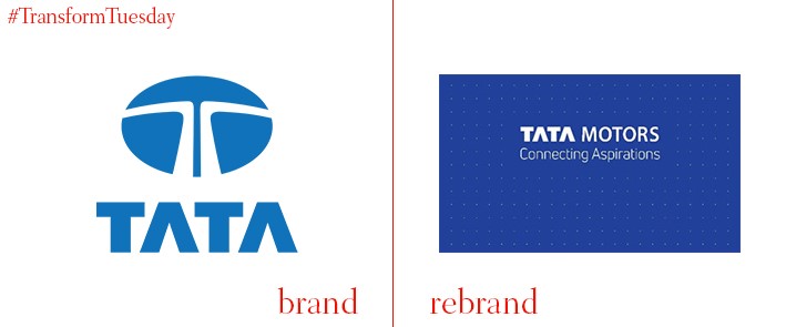
Tata Motors
India-based Tata Motors is arguably one of the most well-known global brands. The company, in conjunction with an agency, has announced the addition of a new tagline and update visual identity, which emphasises Tata Motors’ forward-thinking mindset while ensuring its internal and external stakeholders remain part of its journey. The tagline, ‘Connecting aspirations,’ reflects the notion of cars as a commodity while being applicable to the many scales, from country to individual, on which Tata Motors operates. In a press release, Tata Motors says, “Driven by passion and imagination, Tata Motors has introduced enriching offerings in line with customer aspirations and continues to stand strong as a symbol of innovation and disruption for its customers. The acquisition of every Tata Motors vehicle, regardless of segment, marks an important milestone in the realisation of a bigger, much-coveted aspiration or dream.”

