#TransformTuesday: 19 September
Every week, Transform examines recent rebrands and updated visual identities. This week's picks are below. For more from #TransformTuesday, follow @Transformsays
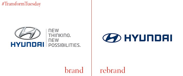
Hyundai
Creative Works, the South Korea-based in-house design group for global car brand Hyundai, has relaunched the company’s visual identity. Aiming to consolidate the previously inconsistent brand across its key global markets and develop the identifiers which make Hyundai unique among automobile manufacturers, Creative Works drew inspiration from its Korean roots. Working to the brand creative direction, ‘Richness in simplicity,’ the design group focused on drawing out the small details which sees Hyundai stand out above its competitors. A bespoke typeface, Hyundai Sans, was designed specifically to ease the challenges of communicating in 103 languages, across 193 countries. Creative Works says, “To be distinct in the competitive automotive industry, we drew inspiration from our Korean roots; natural materials such as linen and wood; our culture; our values of balance, harmony and warmth; and the four elements depicted in the Korean flag - water, earth, fire, and wind. They come together harmoniously to form the basis of our redefined brand assets.”
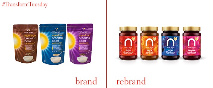
Naturya
Niche superfood brand-turned everyday health food brand Naturya has launched a new product identity based on the strategic direction, ‘Whatever you do, do it for real.’ Crafted by global branding agency Futurebrand, the product revamp follows the release of the brand into national UK supermarkets including Sainsbury’s, Waitrose, Whole Foods Market, Planet Organic and Boots. The new colour palette is designed to represent themes such as nature and energy; gold adds a premium feel. Marie-Therese Cassidy, executive creative director at FutureBrand, says, “Naturya makes you feel alive, bursting with energy – we wanted to ensure this positivity and abundance through the design language. Previously, the logo was hidden, or used more as an endorser. The new logo places the emblematic brand mark centre stage, at the heart of the new visual language.”
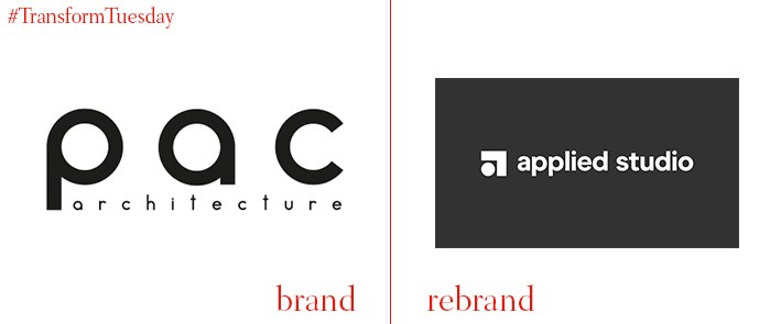
Applied Studio
London-based integrated branding agency Ragged Edge has transformed the identity of London-based architectural firm Applied Studio. Previously known as PAC Architecture, the new brand identity is modelled around the brand direction ‘creative works.’ This allowed Ragged Edge to bring to the fore Applied Studio’s dedication to bringing creativity and elegance into their practical work, while retaining the importance of functionality which lies at the heart of architectural work. Max Ottignon, co-founder of Ragged Edge, says, “Applied Studio brings together exciting, emotive design, with a hands-on, collaborative approach. It creates beautiful, pioneering spaces for people to enjoy. Places that work, effortlessly. We zeroed in on this visionary, yet practical ethos to coin the proposition ‘creative works’.”
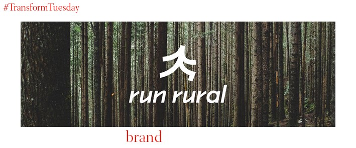
Run Rural
Launched only in the past few months, Run Rural is a Kent, UK-based social enterprise which aims to promote the benefits of regular exercise and running among its members. Aimed at people of all abilities, Run Rural approached London-based brand agency Lantern to create a unique identity which highlights the club’s non-competitive nature – as well as encouraging people to take up the sport. Lantern London says, “The logo combines a running form with a tree, bringing energy and personality to the identity. The simple shape, core colour palette of black and white and slick typography is a nod to the minimal and accessible nature of running.”
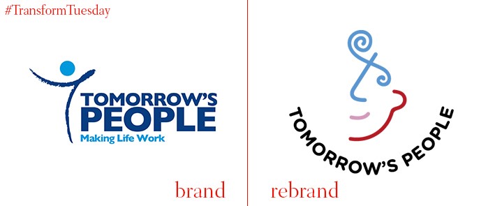
Tomorrow’s People
London-based charity Tomorrow’s People focuses on helping unemployed youth find the path in life through which they will get the best out of their future. However, its previous branding had a generic aesthetic, unreflective of the passion at the heart of the charity’s mission and its desire to help young people find jobs. Tomorrow’s People therefore turned to London-based creative agency the Gate to develop a personal, compelling corporate identity based on the narrative, ‘A trapped young person breaks free.’ Jamie Elliott, CEO of the Gate, says, “It’s a tragedy that so many of our young people are not in employment, education or training – and receiving little or no help to change this. We’re proud to be partnering pro bono with Tomorrow’s People to help put this right and we’re proud of this first step, which is to develop an identity that better reflects their personality and spirit.”
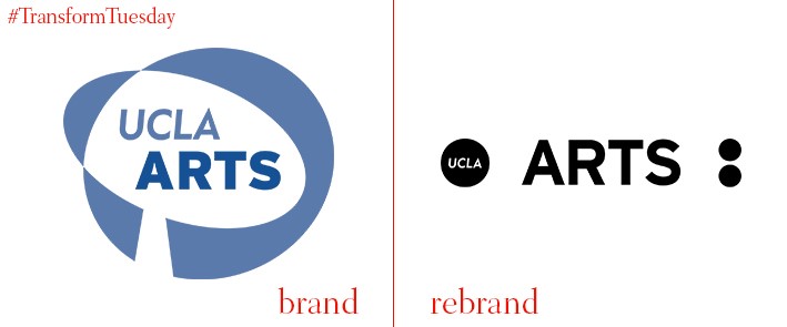
UCLA School of Art and Architecture
LA, US-based design studio Use All Five has redesigned the logo and visual identity for LA-based art school, UCLA School of the Arts and Architecture. Progressive, diverse and proud of its unique community, the school needed an identity which reflected its commitment to both teaching the arts, and using the arts to spread its message of tolerance across the wider nation – and the world. Use All Five’s project page says, “We built a progressive identity system around the colon mark to symbolise, and manifest, dialogue between the school’s various people, programs and museums. The colon signifies more to come, allowing for a deeper rendering of an idea, or attributing an idea to a speaker.”