#TransformTuesday: 18 July

Every week, Transform examines recent rebrands and updated visual identities. This week's picks are below. For more from #TransformTuesday, follow @Transformsays
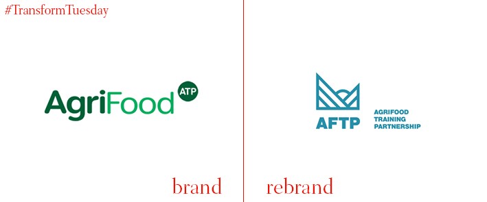
Agrifood Training Partnership (AFTP)
UK-based brand experience agency IE Brand has created a new visual identity for AgriFood Training Partnership (AFTP) industry website and brand, which provides training across the whole agrifood supply chain process. A collaboration between the UK universities of Aberystwyth, Bangor, Cranfield, Harper Adams, Nottingham and Reading sees AFTP reimagined as the bridge between industry and academia. Its postgraduate courses translate academic research into applied industry expertise, helping deepen industry skills and strengthen progress. The new AFTP visual identity firmly reflects the agrifood sector and aims to celebrate the best the industry has to offer.
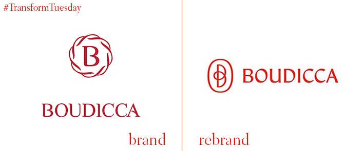
Boudicca
Named after the warrior queen of the British Celtic Iceni tribe, who led an uprising against the occupying Romans at the turn of the Millennium, Boudicca is a shareholder solutions agency based in London. Creative design studio Planning Unit has redesigned Boudicca’s visual identity, developing the battlefield analogy with the motif of a blood-covered lion representing the often difficult struggle between corporations and shareholders. This trope is also repeated throughout the brand’s application and marketing collateral, a theme intended to portray the business’ unique approach in a saturated sector. Boudicca's Celtic heritage is reflected in the specially-selected typeface and symbols.
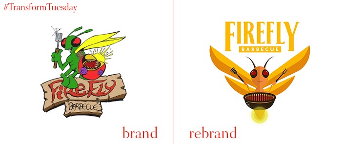
Firefly Barbecue
UK-based barbecue brand Firefly Barbecue was originally created in a bid to better the experience of barbecuing in a country traditionally unaccustomed to good weather. It has been rebranded by London-based graphic design agency, WONDERLANDwpa, which aims to help challenger and start-up brands carve out a unique market position. The agency was tasked with retaining the fun, light-hearted element of the Firefly brand, while ensuring the monograph stands out amidst a competitive sector. WONDERLANDwpa says, “Colour is used across to the range to reinforce flavour and ensure clear differentiation. Language is used to add character to the product descriptors which is supported by Firefly’s very own ‘Heat Meter’ telling you just how hot (or not) each product is.”
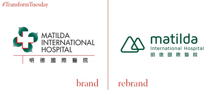
Matilda International Hospital
Hong Kong-based branding and marketing communications agency Stepworks has created the new brand strategy and identity for Matilda International Hospital, a private establishment formed in 1907. Encompassing every aspect of the Matilda International Hospital’s brand journey, including brand identity development, logo design, copywriting and brand building support, Stepworks developed a strategy which allowed the institution to embrace forward-thinking while acknowledging its rich history. Says Stepworks of the design process, “Located atop the iconic Victoria Peak, Matilda is popularly known as the Peak hospital. This inspired the basic form of the new logo. The simple, confident, contemporary identity and approachable design differentiates Matilda from the staid outdated formality of most Hong Kong hospital branding.”
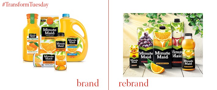
Minute Maid
Iconic US-based soft drink, Minute Maid, has undergone an update to its packaging and overall visual identity in order to retain its position as one of the world’s most popular fruit juice brands. In a project led by Bristol, UK-based Taxi Studio and the global design team at Coca-Cola, which owns Minute Maid, the 1000-strong juice portfolio which made up the brand’s previously disparate product offering are now under one coherent identity. Minute Maid’s juices are now organised into four categories – essentials, refresh, nutri and delight – and each box or bottle is colour-coded according its corresponding category.
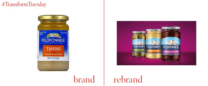
Peloponnese
Named after the geographic region of Southern Greece, Peloponnese was launched in 1983 and is a speciality Mediterranean food brand supplying product such as olives, peppers and dips to wider markets. The New York office of design agency Bulletproof has updated the brand’s packaging design and visual identity, for its parent company Source Atlantique, to inspire creativity in cooking. Its new design aims to reflect the true Mediterranean passion for cooking and is a nod to its heritage, which stems from the region. Bulletproof says, “Working from a design platform of ‘heartfelt foods,’ Bulletproof created a new brand identity and packaging design that strengthened the core equities of the brand, showing the village of Peloponnese, redrawn in a more contemporary style, evoking the idea of the small batch kitchens where the specialities are carefully yet passionately created.”
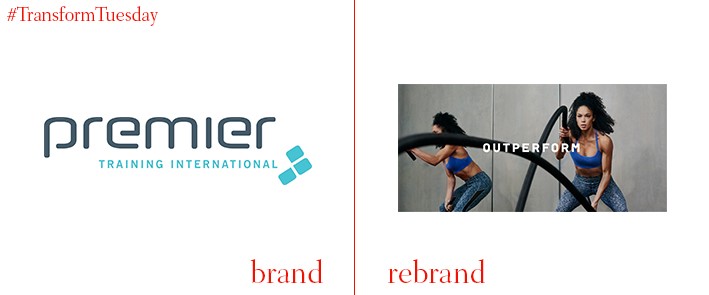
Premier Global
Independent London-based brand consultancy The Clearing has updated the brand for Premier Global. A leading education provider for health and fitness professionals, Premier Global’s current branding had worn thin and the company needed to reclaim its position as the go-to place for knowledge on the health and fitness industry. The Clearing led the rebrand with Premier Global’s two unique proposals in its partnership with the National Academy of Sports Medicine (NASM) and its quality of personal training, developing an identity based on the brand promise of ‘Outperform.’ Jon Norton, senior designer at The Clearing, says, “We wanted to tap into the reality of being a personal trainer, the social side and impact on people’s lives. We took our inspiration from the world of sport, which is a new approach for personal training education. The new brand identity represents the shift the fitness industry has made towards health, fitness, nutrition and a lifestyle choice.”


