#TransformTuesday: 17 January
Every week, Transform examines recent rebrands and updated visual identities. This week's selections are below. For more from #TransformTuesday, follow @Transformsays.
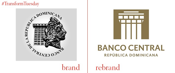
Banco Central de la República Dominicana
The Central Bank of the Dominican Republic, or Banco Central de la República Dominicana as it is known in Spanish, has been the country’s central bank since 1947. A recent update to the building’s visual identity, as completed by the Santo Domingo-based agency Young & Rubicam Damaris, sees the logotype completed in gold – emphasising its importance, as the bank is literally inside the building. Hector Valdez Abizu, governor of the central bank, says, "[The rebrand] synthesizes what we are, our essence, and reflects our strength, our excellence and our commitment to society, while conveying the firmness, confidence and transparency of a Central Bank that fulfils its current mission of ensuring price stability and ensuring efficient regulation of the financial system.”
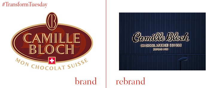
Camille Bloch
The country of Switzerland is, among other things, famed for its chocolate. Keeping with tradition, historic chocolate manufacturer Camille Bloch has rebranded, basing its new logotype and marketing materials on its original 1930s signature. Seduction and temptation play a large conceptual role in the redesign. Developed by Swiss marketing agency, By Heart, it also uses classic images of the Swiss landscape combined with close-ups of the chocolate product; Camille Bloch chocolate is tied indubitably to its country of origin. In a description on its website, By Heart says, “The playful, lusty production of Juliette Chrétien's image world gives the chocolate and the brand their lively authenticity, for which Camille Bloch has been known for decades.”
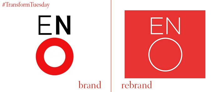
English National Opera
London-based design and communications agency, Rose, has updated the identity of the English National Opera (ENO) in an 18-month project. The project aims to open opera to a wider audience in the face of Arts Council England cuts, which is costing the ENO an estimated £5m in funding. A streamlined logo and simplified website aim to dispel the myth of opera being only accessible to the elite. Its low prices and English-speaking productions are also highlighted in newly-developed, bold posters around the venue. Digital agency, Substrakt, developed ENO’s renewed online offerings.
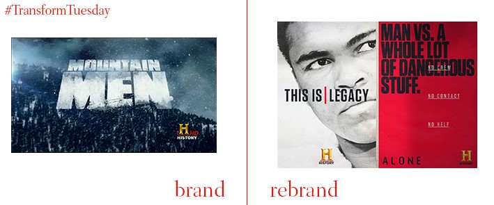
HISTORY
Given recent competition facing global Freeview, cable and satellite networks, channel rebranding is increasingly necessary to regain viewer interest. DixonBaxi, an international brand and creative agency, has applied a new strategy to US-based HISTORY channel which aims to dispel the notion of history being the preserve of aging university academics. While HISTORY was keen to retain its iconic logo, DixonBaxi has combined this with a marketing and communications campaign highlighting the resonance of history in the modern world. Co-founder and executive creative director of DixonBaxi, Aporva Baxi, says, “The new look is very much built on typography and storytelling. The language is critical in telling immersive stories…There’s quite a stylised, graphic feel to the photography and a focus on revealing the stories of different characters.”
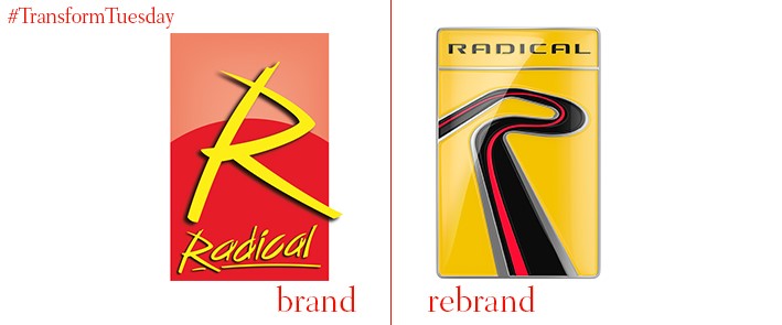
Radical Sportscars
In 1997, amateur drivers Mick Hyde and Phil Abbott created Radical Sportscars, a company which manufactures open cockpit sports cars and purpose-built racing cars. The company’s ever-evolving identity has been captured in a rebrand project undertaken by London-based design and branding agency, The Allotment. Using bold graphics and bright colours, The Allotment emphasise the unique cultural attributes inherent to the Radical Sportscars brand and using the fast-paced experience as the cornerstone of its branding strategy. Taking the letter R of ‘radical’, a flexible and dynamic logotype is created to be applied across the company’s marketing materials; its overall aesthetic is in-keeping with classic racing brands.
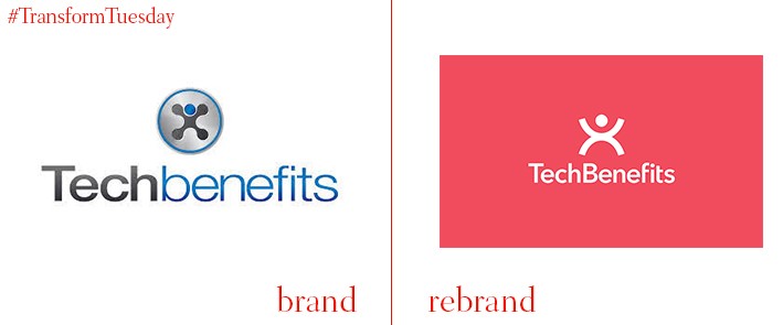
TechBenefits
Salary sacrifice scheme, TechBenefits, allows employees to select certain tech such as iPhones or laptops in return for a monthly salary deduction. For its consumer brand to be digitally optimised, TechBenefits chose UK-based branding agency, Mr B & Friends, to refresh its visual identity and develop a responsive eCommerce site. Agency and company worked closely together to develop the idea of ‘sacrifice nothing’, which reflects the simplicity of the TechBenefits business structure. Design director at Mr B & Friends, Sheena Mistry, says, “We knew from the very start that a seamless digital experience was very important for both employees interested in sourcing new tech, and for employers looking to motivate staff… We were able to build experiences for both employees and employers as well as a completely new shop and product pages.”


