#TransformTuesday: 10 January
Every week, Transform examines recent rebrands and updated visual identities. This week's selections are below. For more from #TransformTuesday, follow @Transformsays.
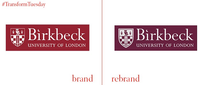
Birkbeck, University of London
Birkbeck, University of London, is an evening-based university aiming to provide courses which fit around its students’ everyday life. The London office of international design firm, Pentagram, has led the update to Birkbeck’s logotype and accompanying marketing materials. This is a profound change which its master, Professor David Latchman, describes as the university’s ‘first ever visual identity.’ Moving away from Birkbeck’s more serious side, Pentagram uses the owl which sits atop the university’s crest and applied it as the main image on some of its brand assets. The agency has also expanded Birkbeck’s colour palette, initially restricted burgundy and blue, to include ten more colours and make its overall identity more dynamic and applicable to branded goods.
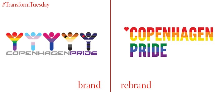
Poulsen Projects, a brand-new New York-based design agency, has unveiled its identity for the capital of Denmark’s annual LGBTQ+ celebration ceremony, Copenhagen Pride. The rainbow flag, a symbol synonymous with pride events worldwide, is used as the leading image across Poulsen Projects' brand portfolio. It has also been applied throughout its promotional materials. Block colouring allows its overarching message, of inclusivity, to be carried across all iterations, while use of white font ensures it stands out from the bright background colour.
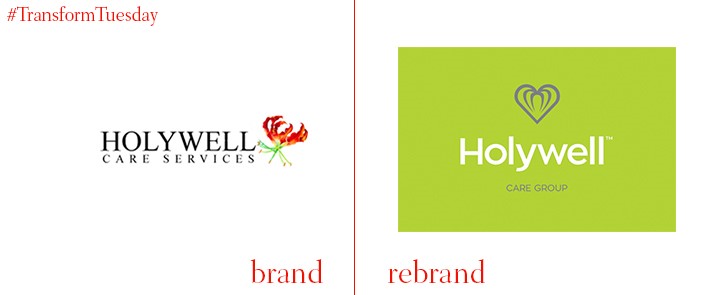
Based in the north west of England, Holywell Care Services is a professional, personal care service for both local authority needs and private clients. Previously, a fully integrated and coherent identity did not exist across the Holywell brand and its various assets; the group approached creative brand consultancy, Tony Lythgoe, to develop Holywell Care Group’s identity. Through a series of workshops, Lythgoe identified how the Care Group identity allows the parent brand to stand alone, while highlighting each of the Holywell services. Lythgoe says, “My plan was to create a simplistic, minimal and unambiguous new brandmark. Several iterations resulted in a pleasing logomark which was designed to work digitally, another new direction for Holywell. The new typography was always intended to be crisp, clear and contemporary but not beholden to any particular trends. The clean approach that was used sits alongside the logomark on a confident, healthy and uplifting green. We even changed their uniforms to match this new colourway.”
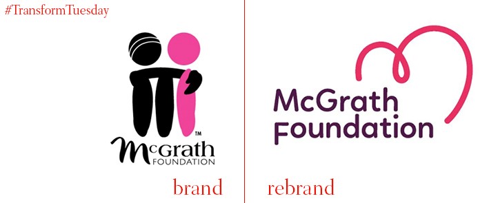
Australia-based branding agency, Hulsbosch, has revealed a new visual identity for leading Australian breast cancer alleviation charity, the McGrath Foundation. A new graphical element, which surrounds the charity’s name in bright pink, represents the experience of those affected by breast cancer and the optimism of the McGrath Foundation. As the foundation is named in memory of Jane McGrath, wife of Australian cricketer, Glenn McGrath, cricket plays a key role in fundraising for the charity. Thus, despite the logo update, its new identity is launched to coincide with the Sydney Pink Test. Co-founder of the charity, Glenn McGrath, says, “The new McGrath Foundation logo represents the warm embrace of the care and support provided by McGrath breast care nurses, and also reflects the energy and vitality of supporters, and friends of the McGrath Foundation. The new logo not only reflects the help our McGrath breast care nurses give to families right across Australia but also ways that the McGrath Foundation continues to grow and innovate.”
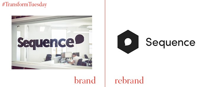
UK-based digital agency, Sequence, has completed an in-house redesign of its visual identity. This followed a reassessment of its brand positioning, which Sequence says highlighted six core values on which the organisation was keen to build: challenge, people, design, quality, passion and insight. The simple yet bold and clear typeface reflects the motivations of the company; a monochrome aesthetic coupled with sophisticated animated effects lends a professional look. On the Sequence website, art director Steven Goldstone says, “Evolution rather than revolution was always the aim of the exercise. Our previous identity had history. We didn’t want to lose that brand equity. We simply wanted to bring it in-line with our new direction and focus.”
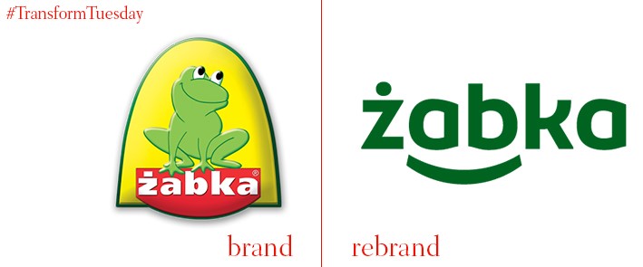
Poland-based grocery store, Żabka, has around 4000 stores across the country and is one of Poland’s most popular retail outlets. The company has updated its visual identity with the help of Warsaw-based branding agency, BNA (Brand New Attitude). Żabka literally translates to ‘frog’ in English; the literal frog logotype of its previous identity has been replaced by a wordmark which hints at a frog through the positioning of its letters. According to the BNA website, the update signifies affirmation of Żabka’s positioning as a convenience-oriented grocery store. The agency also updated its in-store communications and navigation, and online presence.


