#TransformTuesday: 1 August
Every week, Transform examines recent rebrands and updated visual identities. This week's picks are below. For more from #TransformTuesday, follow @Transformsays
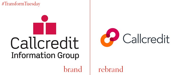
Callcredit
London-based strategic and visual brand agency, Sea Design, has released a new visual identity for Callcredit. In July, the analytics and data provision company announced an 18% increase in gross revenue to £201m, from £170m in 2015; its renewed strategic focus and new brand guidelines aim to reflect and facilitate Callcredit’s continued growth. With a brand strategy developed around Callcredit’s vision of ‘empowering information,’ Sea Design took tropes of human interaction and security to develop an identity which is at once innovative and reassuring. From the logotype to Callcredit’s signage and wayfinding, its brand purpose extends across all touchpoints. Ryan Jones, design director at Sea Design, says, “With personal data security being vitally important, we wanted to create a symbol that looks reassuringly solid. The interlocking Cs provide no escape while the overall shape creates an infinite loop and sense of movement.”
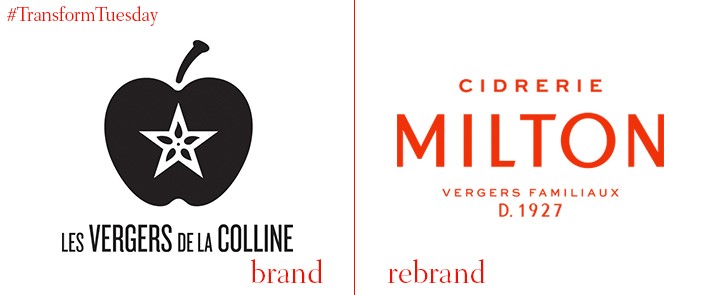
Cidrerie Milton
Canada-based integrated agency lg2 has revealed its updated design for the logo, online application and visual identity of Quebec-based Cidrerie Milton. Previously known as Les Vergers de la Colline (the Orchards of the Hill) since being founded in 1933, the name change and brand development signals Cidrerie Milton’s aim of becoming a high-end leader in the Quebec cider industry. This shift in purpose reflects in an update to Cidrerie Milton’s cider packaging. Named Cid, lg2 has eschewed the previously industrial feel of the product design in favour of an elegant typeface, offset with interesting and quirky illustrations of animals behaving in various anthropomorphic manners. The lg2 product page says, “The creative team chose colours inspired by the company’s heritage and the raw material itself – green – and its boldness – a bright, solid orange. The objective was to give the company, a leader in Québec’s cider industry, winning conditions that would catch the consumer’s eye with a brand and products that are both more distinctive and easily recognisable.”
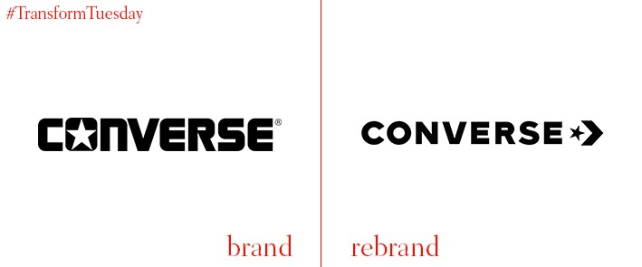
Converse
One of the most iconic shoe brands in the world, Converse, has updated its company wordmark and logo to better incorporate a most iconic design trope – the star chevron. While the logo for the Converse All Star/Chuck Taylor brand shoes remains the same, the Converse in-house design team has developed an identity to signify the company’s heritage. It is not, however, a compelte departure for Converse; the brand has used its new logo iteration in previous shoe designs. However, its incorporation of the chevron intends to signal its forward-facing direction. The change also better renders the Converse visual identity for digital and will roll out across more of the brand’s applications over the coming months.
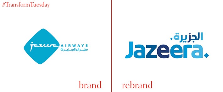
Jazeera Airways
Kuwait-based regional airline, Jazeera Airways, was founded in 2004. Now Kuwait’s second most popular airline, Jazeera Aiways has also succeeded in popularising low-cost travel in the region. It has recently released a new visual identity for its brand applications, including corporate logo, digital platforms and aeroplane livery. Rohit Ramachandran, the chief executive officer at Jazeera Airways, says, “As we solidify our position regionally and venture into more international markets with new routes, we reiterate our commitment to our customers. To this end, we are launching a new website to act as a gateway to providing ease and comfort from the very first click. We are geared with renewed efficiency and vitality to embark on a new journey with our customers as many exciting launches lay ahead of us.”
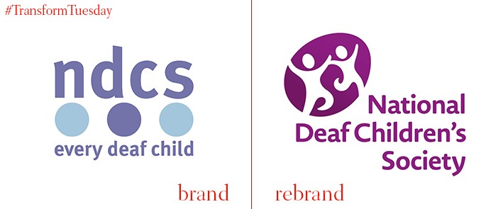
NDCS
The UK-based National Deaf Children’s Society (NDCS) has rebranded and launched an ‘Overcoming barriers strategy 2017 – 2022.’ These aim to raise the charity’s profile and respond to cuts in public services which, it says, are putting deaf children at risk. The rebrand has aligned the charity’s previously disparate brand architecture, pulling together applications such as websites under a more united digital strategy. NCDS also aims to launch a new website in the next few months, optimised for mobile use. Chief executive at NDCS, Susan Daniels, says, “Extending our reach has never been so important. Too many deaf children are still being let down by vital services and they still don’t have the same opportunities as hearing children.” National sign agency Sign Express has also crafted a series of bespoke signs, designed by the NCDS, for the charity to display during its rebrand rollout.
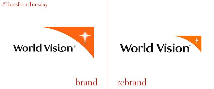
World Vision
Founded in 1950 by the Reverend Bob Pierce as a religious, not-for-profit organisation, World Vision aims to use its Christian values to help the world’s most needy. In a brand project led by the Australian office of international brand agency Interbrand, changes to the World Vision logo and overall identity aim to capture the imagination of a new generation of supporters and charitable donations. Its updated identity is now more suitable for use across products and applications integral to the charity’s many relief efforts. Gill Sans as the key font, along with a bolder and subtler wordmark design, means the posters with which the wordmark is paired stand out and truly reflect World Vision’s mission.


