The original Calvin

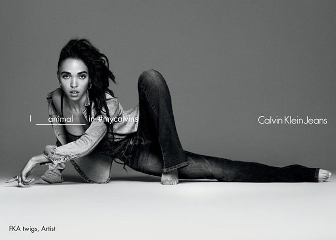
In 1968, Calvin Klein founded a fashion line in New York City with a loan of $10,000 from a friend. Fifty years on and Klein now rules over a fashion empire with an estimated net worth of $700m. His global success can be attributed to Calvin Klein’s revolutionary, and often provocative, advertising of basic garments, such as jeans and underwear. The iconic brand has evolved over the decades, and now in 2017, has implemented a logo change that is reminiscent of its earlier beginnings.
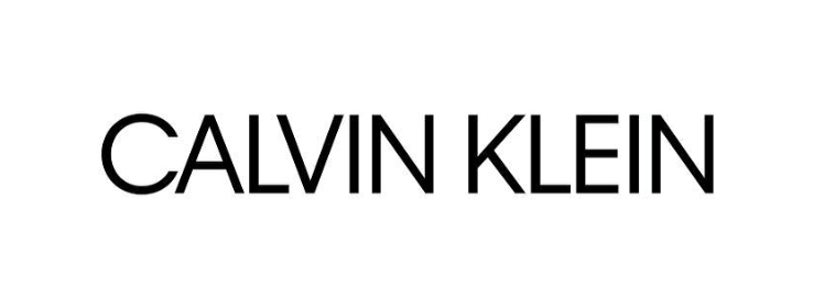
The new logo was recently revealed on the fashion label’s Instagram account and pays tribute to the company’s namesake, Klein, and signals a “return to the spirit of the original.” Raf Simons, the in-house art director who joined the label in August 2016, collaborated on the logo design with graphic designer, Peter Saville.
Almost synonymous with underwear, Calvin Klein’s brand identity has long been grounded in its household name. Klein’s understanding of the intersection between functional and high end fashion has secured his position as the authority on practical, yet aesthetically pleasing design in the fashion industry. Calvin Klein has gone beyond simply selling couture fashion and has cemented itself as a global lifestyle brand.
The Calvin Klein brand became iconic in the 1970s with the “cK” emblem designed by Jeffrey Banks, partly owing to its prominent positioning in clothing. In the recent rebrand however, the fashion label switched out the lowercase logotype for an uppercase one, with smaller kerning between letters, while preserving the black and sans-serif font, to evoke the shape of the original typeface.
The continuation of the simple, bold design gives a nod to the minimalism that has defined Calvin Klein’s brand since its inception. This approach is seen elsewhere in other premium fashion brands the likes of Michael Kohrs and DKNY, labels that offer high fashion but with more accessible price tags. Inspired by an archival font from the 1970s, the recent rebrand of Diane von Furstenberg ahead of its spring/summer 2017 collection also sees the brand adopt a heavy set sans-serif logotype, and a marked departure from a feminine serif font. The trend for these high-end fashion houses to embrace a simple, almost effortless block lettering may allude to their global popularity and the need for quick brand recognition on clothing labels.


