Spotlight on Zendesk
Customer service software brand Zendesk has seen shift in its visual identity and positioning as its sector takes shape. Amy Sandys explores the flexible, energetic new brand
C ustomer service software is historically the preserve of generic logotypes and visually uninteresting brands. A Google search of ‘customer service software logos’ spurs 344m results but the ‘image’ section is awash with blue and grey. Such simplicity is understandable. For a sector often perceived as complicated to understand, creating brand identities that convey its purpose while remaining both digital- and user-friendly is a priority.
When customer service software provision gained traction during the 1990s-tech boom, it disrupted the market in ways previously unseen. Yet the identities it harbours have remained, in general, unchanged.
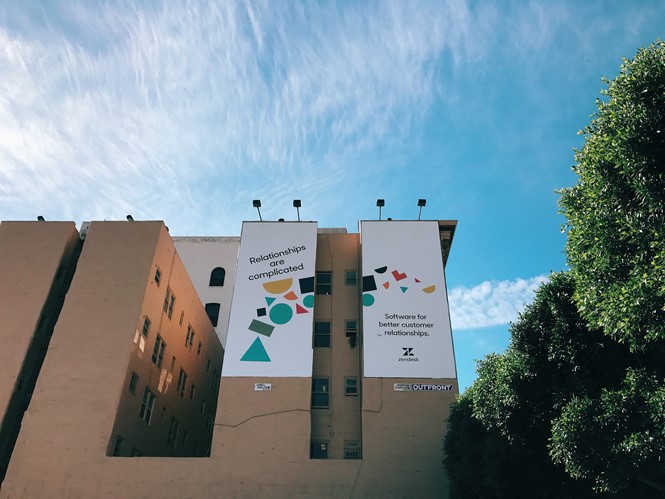
However Danish start-up-turned-global company, Zendesk, ripped up the branding rule book from day one. From its inception, a decade ago in Copenhagen, when three friends – Mikkel Svane, Morten Primdahl and Alexander Aghassipour – developed a customer service tracking system using early cloud technology, Zendesk portrayed itself differently. The founders identi ed a niche in the customer service market, and a bright and contemporary identity created a niche for its unique branding. In 2017, the company’s latest rebrand embraces shapes, patterns and personality to re ect its people-centric focus.
During the 2000s, Zendesk went from a Danish start-up to leading the customer service company in its space. Revolutionary through both its left- eld design and innovative approach to monitoring customer service provision through a ticketing system, its software allowed customers to contact companies and deal with queries and complaints in a succinct manner. Yet a decade ago, customer service software branding was cumbersome and lacking imagination. Using an innovative approach mixed with a certain amount of risk, Zendesk ourished in a design environment which generally remains rigid. Today, the company has deployed classic Danish construction cues in the latest update to its customer- facing offering.
Toke Nygaard, Zendesk’s chief creative of cer, designed the company’s original branding, as well a its new iteration. His challenge in designing and applying a brand to a company which felt constrained by the aesthetics of its sector was a challenge – as well as having no products. Nygaard says, “Back then, we had no customers and no product. It was essentially just a bet on building something and having a dream about what we could achieve.”
But for the Zendesk team, being different worked. Nygaard adds, “You have no clue with where you’re going, so it’s just building something out of a gut feeling. And what we wanted to do back then was to create a brand that stood out and told people that there’s a different solution to really dull old software. We wanted to give them a glimpse into this new way of cloud-based software that we’d built for the customer service segment that was quite new at the time.” This entrepreneurial spirit drove Zendesk’s original brand, during a period in which cloud technology emerged as a serious attribute to the software market. Nygaard says, “So, what we did back then was do the little happy guy with the headset and make it very funky, more so than the old corporate software that people were using at the time.”
And so this ‘little happy guy,’ a bare torso-ed Buddha with draping orange robes, formed the visual identity of Zendesk for 10 years. Fuelled by a desire to better the relationships between businesses and customers, the emblem conveys a sense of calm and serenity, smiling into its customer service headset. Set atop a lime green background, using a lotus ower with a heart as its carpel. Zendesk’s determination to create a brand whose visual identity broke the mould of customer service software is clear. Yet, despite the brand’s longevity and recognition, a point came at which the Zendesk creative team decided a change of identity was needed – even if this meant getting rid of the Buddha.
“We had to get rid of all the old stuff, because it was part of the old mindset of
a young start-up. We’ve gone down a different road and we’re appealing to a different audience”
Soon after Zendesk was launched in 2007, its headquarters moved from Copenhagen to San Francisco, US, where its neighbours were the likes of Google, Apple and Facebook. Its striking identity failed to stand the test of time as pressure from other tech companies emerged. “One of the issues we are having is to carry that brand into the product space, and we’ve been struggling with that for a long time, with the old brand regarding the space around the use of colour and the space around the Buddha,” says Nygaard. “We never wanted to do anything with the Buddha and we can never really t him into the products either because it’s a very cartoony character, which is not necessarily the experience you want to give people.”
As Nygaard explains, the brand was recognisable but rigid. The light-hearted features which served to distinguish the company from its more monochrome counterparts limited Zendesk’s ability to adapt for a digital and social audience.
Nygaard says being locked into a single style for nine years had been limiting. He says, “Now that we are changing the way we do our software, from just one piece of software to a handful of smaller offerings, it felt like it was a good time to rethink our brand and create a more exible system that can embrace all these new products.” And a more exible brand requires a more exible approach; both in theory and composition. But what worked in 2007 does not necessarily work in 2017, “That’s why we had to get rid of all the old stuff, because it was part of the old mindset of a young start-up. What we have now, nine years later, is very different,” Nygaard says. “We’ve gone down a different road and we’re appealing to a different audience.”
For a new audience, a new concept emerged. Companies such as Google and Microsoft create brand identities in the Silicon Valley aesthetic, with bold colours and strong type intended to be heard among a melee of competitors. While effective, it can be unoriginal. But Zendesk had on its side a Danish heritage inherent to the company’s very philosophy. Nygaard explains, “We thought we’d try to take the Danish balance as a starting point and use that as inspiration, looking into Danish design and what does that mean? We tried to nd inspiration in what [Danish and Swedish designers] did so it’s a lot about clean lines and colours and shapes and there’s a lot of fascination with really cool wooden toys, blocks, Lego.”
Such concepts, while easily transferrable to clothes, paper, stationery, cushions – just about anything – it seemed a risk to Zendesk to move away from its easily identi able Buddha gure. For one of the company’s founders, Aghassipour, this sharp change in direction took a little persuading. In a video on Zendesk’s website, he says, “Taking our lotus ower and the heart and replacing it with something new challenged almost 10 years of ‘Okay, this is what we build our brand on.’” A logo so ingrained within the company’s fabric is inevitably hard to part with. But what Zendesk’s new visual identity offers builds on the concept the Buddha started – open dialogue.
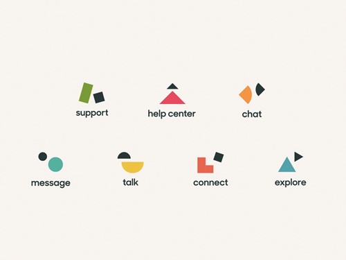
Nygaard says, “We began to look into the components of what we were building and then slowly that transformed into basic shape.” Hence, Zendesk’s brand signi ers are now composed of ‘relationshapes.’ As well as the main Zendesk logotype, constructed out of four shapes supporting each other, the brand’s wider remit now houses seven separate logos. Each is an extension of the main Zendesk ‘Z’ logo, with all composed of two simple yet interacting shapes. Each also highlights one of the company’s main focuses: support, help centre, talk, message, connect and explore. The soft colours stand in clear but not stark contrast to the dark blue ‘Z’ logotype. A welcoming video on Zendesk’s homepage sees each ‘relationshape’ play together before nally falling into the perfect position. For Nygaard, this perfectly exempli es the Zendesk purpose.
“It doesn’t have to be serious, it can be fun and quirky. I feel like that’s what we’ve done again, just trying to relate to people,” he says. “We’re not using stock photography and make believe, we’re very much straightforward and speaking in a voice that goes straight to the point. And using imagery that appeals to basic human emotions as well. It’s all about relationships, so that’s the theme we carried through.”
Nygaard adds, “It’s much more than a visual identity. It hangs really deeply into our narrative that relationships are complicated and it can tell that story of relationships between the two parties.” Given the rise of digital platforms and now online networks optimised to host video, bouncing ‘relationshapes’ is Zendesk’s way of bringing a much-needed energy into the staid world of customer service software branding. Like its previous Buddha incarnation, Zendesk’s designers refute any perception that the industry is con ned to a bland and generic identity.
Unlike the Buddha, ‘relationshapes’ are based on the concept of, “Making businesses have dialogues with the people they deal with on an ongoing basis.” Essentially what the company has become, rather than what its founders hoped it might be. The determination to reach new audiences while retaining a distinguishable identity contributed to the popularity of Zendesk, nearly 10 years ago. Connecting with its ever-changing but always-engaged audience is what drives it today.
Peer review
Max Ottignon, co-founder, Ragged Edge
I think the rebrand of Zendesk has been hugely successful. it has replaced slightly obvious and clichéd semiotics with a more sophisticated, rewarding visual langauge that's adaptable and communicates the company's product benefits on a more emotional level. It has created a sense of calm reassurance through the simplicity of the shapes and use of colour. The round forms of the typography add to this feeling, while retaining a sharp professionalism.
The modular nature of the graphic system means that there's constant scope for experimentation and reinvention within the framework while staying true to the brand.
Zendesk has also used animation to great effect. The way the shapes move and bounce gives them bags of personality and helps communicate the message behind the product logos instantly.
Zendesk's new brand is a perfect balance of sharp professionalism and friendly playfulness.