Spotlight on Foster's Freeze
With flagging growth and an ageing identity, Fosters Freeze chose to rebrand to capitalise on its heritage, existing brand assets and unique positioning. Brittany Golob reports on the Californian icon
In 1946, California had been a member of the United States for only 96 years. Its population was nearing 10 million and it was beginning to find its feet as one of the primary agricultural producers in the country. Hollywood was booming, but would soon be thrust into a dark age overshadowed by the infamous blacklists stemming from the fear of Communism. Native-born Californians would, over the next decade, become the dominant demographic for the first time in the state’s history. California was developing, but was still bereft of national sports teams as it awaited the arrival of baseball clubs from New York – the Dodgers and the Giants – which would relocate in 1957.
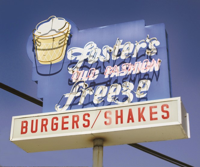
In these relatively early days of modern California, a man named George Foster set up shop in the Los Angeles area of Inglewood. He would sling shakes, malts, burgers and fries, and – what would become his signature – soft serve ice cream – to the suburban neighbourhood. The first Fosters Freeze set the tone for its subsequent 71 years of operation. The company’s iconic Googie-style architecture, cool, sky blue roofs and walk-up windows were soon dotted across the state. Over 360 locations were opened by Foster by 1950.
The entrepreneur had purchased the rights to the Dairy Queen brand in California, intending to help the chain expand in the west. But, unable to use the moniker due to conflicting rights, he dubbed his restaurants Fosters Freeze. The franchise has changed hands numerous times over the years and, after the emergence of national and international fast food brands, the adoption of vehicle transportation and competition from modern formats, Fosters Freeze declined. But, with 85 of its original sites still going strong in California, the brand’s new owner turned to London and Los Angeles-based agency Mystery to reinvigorate the brand.
Mystery found that generations of Californians had been part of the Fosters Freeze family and had nostalgia for the brand, despite its flagging fortunes of late. But, the challenge lay in building on the nostalgia and brand heritage inherent with Fosters Freeze, but declaring it as a modern brand that caters to the California of the 2010s, not the 1940s. “There was a sense of nostalgia that was really powerful,” says Dan Einzig, Mystery’s founder and CEO. Despite some of the locations being somewhat run-down, Einzig says, “People, even people that didn’t go there, had a very fond connection with the brand. They remembered it with a golden halo around it, rather than seeing it as it actually was.”
The consumer challenge required a reexamination of the menu, customer experience, takeaway packaging, brand positioning and marketing. But the other challenge dealt with the Fosters Freeze business model. Fosters Freeze LLC, which purchased the brand in 2015, is the latest in a slew of franchisors. Engaging with its franchisees around the brand revitalisation was an opportunity for the new owner to show its commitment to the brand and its improvement. Sanjay Patel, CEO of Fosters Freeze, says, “Over the 70 years of Fosters Freeze’s existence, the brand image and operations haven’t been consistent. With a great brand design and guidance, we are able to pull the brand message together and align the future direction of the chain.”
The first step toward achieving those objectives was research. Einzig and the Mystery team explored the existing Fosters Freeze brand and discovered that, along with the evident nostalgia for the brand, it formed a valuable addition to its local communities. Fosters Freezes sponsor local high school sports teams and play host to their trophies and awards in store. They often act as the central meeting point for classic car clubs. They’re where grandparents take grandchildren. That was something Einzig says, “We felt we could build on.” Patel agrees, adding, “Fosters Freeze has a deep Californian heritage and a vintage feel. We definitely didn’t want to alienate our existing patrons who have been so loyal over the years. But we also wanted to attract a new generation of guests and have them be able to relate to the brand. With an updated store design and marketing collateral, we want to make our locations more inviting.”
“We tried to create something that people will feel proud to actually carry. In the same way that fast casual elevates the food product, we’re elevating
the brand design”
Other aspects uncovered through research had to do with the brand’s unique California heritage. Mystery found that Californian brands have a specific allure for people outside the state – offering potential for wider franchising – but also, within the state itself. There is an aspirational lifestyle inherent to California in which people aspire to “live the dream,” as Einzig says. Finally, Mystery looked at Fosters Freeze’s position in the fast food market. One of its peers is native Californian brand In-N-Out, a burger stand with a cult following. As In-N-Out is family owned and operated and not available for franchise, Einzig says the rebrand should help Fosters Freeze compete for those potential franchisees who wish to include a native California brand in their portfolios.
All those insights helped shape the ultimate positioning built around innocence. The nostalgia, friendliness, local focus, heritage, California lifestyle and franchise model contributed to the new Fosters Freeze brand which is designed to spread sunshine and happiness. That sense of optimism is reflected throughout the tone of voice, even the ‘Franchise’ section on the new website states, “Living the dream: Own an iconic piece of Californian legacy.”
This innocent, nostalgic, but modern reinterpretation of the Fosters Freeze positioning, informed the visual identity. Fosters Freeze has always effectively owned the light blue of its mansard-style roofs. But over the years, its other brand touchpoints, including a script wordmark, soft serve ice cream cone mascot and ‘Old fashion’ strapline had become muddied and dated. But, instead of throwing them out and starting afresh, Mystery modernised the brand and rediscovered the lost value in its historical assets, particularly the ‘Old fashion’ slogan.
“I imagine 90% of agencies would recommend that their client remove that as a potential negative,” Einzig says. “But when we started thinking about it, we saw that ‘old fashion’ was a positive statement when you align it with the values. When you align it with the innocent personality and archetype, which is full of happiness and optimism, you take the idea that simple pleasures are the key to a moment of happiness.”
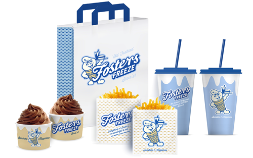
‘Old fashion’ stayed. As did the soft-serve icon, another touchpoint most brands would have consigned to the bottom of a drawer. But, taking the same approach that Fiat did when it relaunched its Fiat 500 and rebrand in 2006, Mystery looked to two eras in Fosters Freeze’s past to reimagine the little mascot. From the 1940s, the character’s soft serve hair quiff was retained. From the 1960s, its burger and shake on a tray were included once again. Those elements, combined with a reimagining of the face and ice cream cone shape, contributed to a mascot relevant to the brand’s past and present.
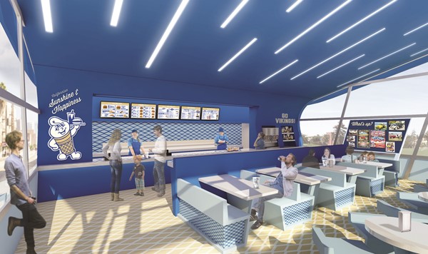
The logo, too, was reworked, drawing less on the garish yellow-and-red 1990s edition and more on the traditional roadside signage that helped the brand proliferate in the mid-20th century. Marketing, signage and packaging were all redeveloped with a modern brush over classic, midcentury styles. “We tried to create something that people will feel proud to actually carry,” Einzig says of the takeaway packaging. “In the same way that fast casual elevates the food product, we’re elevating the brand design.” Inside the restaurants, a new digital menu has been introduced as has a built-in trophy case and the community message board has been given more prominence. The interiors were designed to offer a more comfortable customer experience.
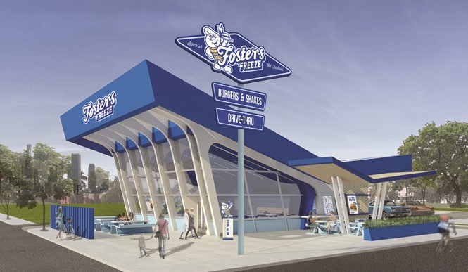
But, like many fast food chains, roadside appeal and architecture have been contributing factors toward the brand’s success. Fosters Freeze came to prominence at the height of the Googie architecture era – which was born only 13 miles away from the original Fosters Freeze location. Googie is defined by sloping roofs, geometric shapes, colourful glass and neon. It was influenced by the space age, reflected in its starburst shapes and futurist tone. One of the best remaining examples is the ‘Welcome to the Fabulous Las Vegas’ sign on Las Vegas Blvd in Nevada.
Googie represented the midcentury hope for a better tomorrow, a future defined by flying cars and space tourism. Walt Disney’s Tomorrowland featured Googie architecture as does the Los Angeles Airport’s iconic, flying saucer-esque Encounter restaurant. Fosters Freeze grew up with this trend, resulting in a number of its sites featuring the upswept roofs and glass frontages common of the era. Drawing on that, Mystery designed the flagship for the new Fosters Freeze as a modern interpretation of classic Googie architecture. The upswept roof and glass frontage join a modern drive-thru and modular design – for ease of adoption.
“What we didn’t want to do was create something that wasn’t going to be recognisable,” Einzig says. “We took that very recognisable blue roof, elevated it and restyled it deliberately along the lines of the quintessential Californian Googie architecture style. On the inside, we’ve tried to be forward-looking in terms of a modern and clean approach to the interior, while recognising that that modernity is inspired by the streamlined, midcentury futurist style.”

For consumers, the rebrand addresses the brand’s nostalgia, improves experience, builds awareness and may help transform Fosters Freeze into an aspirational brand once more. But for franchisees, the case for the rebrand relied on building trust between the franchisor and franchisees. “Part of our role was to create a brand vision that would inspire the existing franchisees to reinvest in their units. As part of that we’ve done a refurbishment guide which looks at different price levels of elevating their existing units,” Einzig says.
That step has been reassuring, but it is still a matter of selling the return on investment. Patel says franchisees have seen the rebrand as a positive change, “The reception has been great. There are franchisees who are really excited about the forward movement and looking to make improvements in the future if they haven’t already done so.” He adds that plans are already in place for implementing the new brand, “We have had multiple parties contact us expressing interest in opening up new locations. With the launch of a new website and being more active on social platforms, we are looking forward to new store openings coming soon.”
California is not the same place as it was 71 years ago. The architecture styles have changed. The demographics have changed. Major sports franchises now flock to the Golden State. Its econoy has changed. That evolution has influenced the way in which its homegrown businesses have developed, allowing the nostalgia, allure and heritage of the state’s most beloved brands to flourish.
Peer review
Eric Boulden, president, Jump Branding & Design
Taking a beloved brand with a legacy such as Fosters Freeze to new places is as much about defining new opportunities as it is ensuring that you are mindful of the patrons’ emotions and lifetime memories that have built into this brand. I set forth to take a non-partial bias towards the brand rethink.
The decision of whether to reinvent the brand image or build on the existing legacy can quite often come down to what is familiar. Maintaining brand elements and paying homage to the past is an easy bridge to cross and will most often provide expected results. Pushing the expectation of the brand can be more daunting and often is a road less travelled for legacy brands, but this approach could have a higher ROI if the brand hits with the consumer. The decision is a choice between a feel good, familiar persona or a reinvention of the brand.
The Fosters Freeze brand carries some signature architectural moments in its history playing off the Googie style architecture prominent in the California landscape. As the design team began to position the new vision they must have had eyes wide open to the various architecture and details available. It is here where the design team has maintained strong and definable moments of the brand. They have used the architecture for distinction so that the building becomes the sign for brand recognition. I personally feel the design excels and will create distinction on the streetscape.
The exterior of the building is bold, the interior becomes less so. As a result, I believe that the guests’ experience would not be much different than it was before. It is here where I feel more emphasis can be placed to enhance the guest experience. The wordmark and logo are an evolution from the past. This probably makes sense considering the brand equity that has been built over time within this brand and it fits the brand position taken on by the design team.
The take-out packaging is a great way to build awareness, but visibility and brand recognition must happen quickly.
Fosters Freeze will remain your grandparents brand visually; trusted, valued, expected. If the design brief and strategic goal was to bring this brand to a new level – one that captures the hearts of a new generation and interested franchisees, then more work still needs to be done. No doubt it will retain the memories of a simpler time.
For more from Transform magazine, follow us on Twitter @Transformsays