Rice rebrand goes against the grain
It began simply; with a relative asking founder Moni Varma to import basmati rice, a rarity in Britain in the 1980s. The need inspired Varma, who helped run a steel company in his native Malawi, to begin a rice business in the UK in 1987. Now, VeeTee Rice is one of the biggest rice brands in the country and exports products to the US and Europe.
Its younger offshoot, VeeTee Foods, has produced ready-to-eat rice since 2005. Yet, its brand was in need of a modern refresh. It partnered with London brand agency Webb deVlam to examine the brand’s strategy.
In addition to the visual identity and packaging work, the brand’s positioning was also reconsidered. VeeTee Foods is the only rice purveyor in the major UK supermarkets to use a steam-cooking method, ensuring the rice stays fluffy and white in tone throughout cooking. Highlighting this message, and the two minute cooking time’s appeal for Millennials, Webb deVlam worked with VeeTee to position the rice as the must-have for time-poor and health-conscious consumers.
Most instant rice sold in supermarkets is parboiled, or partially cooked, in order to avoid it clumping together. But, this method detracts from the ultimate texture and taste of the rice, leaving microwavable options poor substitutes to the real thing. But VeeTee’s steam cooking method allows the rice to stay fluffy and taste as good as home cooked rice. By putting the benefits of its method front and centre on the pack, VeeTee’s instant rice is better positioned for those looking for a healthy, flavourful brand.
VeeTee’s head of marketing, Taryn Weeks, says, “I’m very happy with the result. Webb deVlam has breathed new life into the brand, keeping it relevant and differentiating it from its competitors. It’s the refresh we needed and we’re confident that VeeTee will shine on shelf and reestablish its connection with the consumer.”
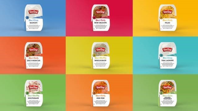
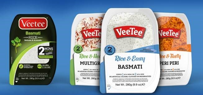
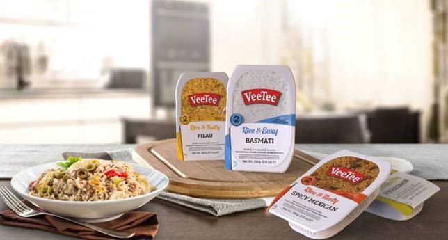
With a predominantly black package and only a small window looking into the rice, plus slightly clip-arty photos of ingredients, VeeTee’s ready-to-eat rice needed to work harder on the shelf. Its new look modernises the VeeTee logo while making the on-pack copy bolder, easier to read and more fun in tone. The range has also been segmented into three categories, ‘rice & healthy,’ ‘rice & tasty’ and ‘rice& easy’ to get the products’ benefits across more simply.