Place branding: Tatarstan


Tatarstan developed a place brand that reflected its local culture and communicated the region’s unique history, demographics and outlook. Amy Sandys reports
The forest, mountains and permafrost that covers much of Russia’s outer regions are legendary in their myth and splendour. Russia’s wilderness is the stuff of folklore; many a valiant fairy tale character has braved its climes, with only few succeeding. Yet the country’s wild landscape is also divided by urban hubs and provincial towns; much of Russia’s cultural offering comes from places not immediately apparent on an atlas. One such region is the Republic of Tatarstan, situated in the west of Russia near the Kazakh border. With a population of almost eight million and a mixture of ethnicities, nationalities and religious influences, its rich wells of heritage are easily found.
The Visit Tatarstan project officially launched in early 2016 by the London-based Institute for Identity (INSTID), in collaboration with the Tatarstan Centre for Tourism Development and the State Committee for Tourism. It focuses on collating local heritage and applying it to tourism in a way which cements Tatarstan as a place integral to the preservation of Russian heritage. Despite its focus on internal perception, says Natasha Grand, founder and director of INSTID, “[Visit Tatarstan] was outward looking. It was about communicating the value of Tatarstan for external visitors, to invite them to come and experience the region. [INSTID] has been involved with the region for three years altogether and we’ve provided the conceptual platforms for the brand, and developed the visual style for Visit Tatarstan.” And these visual stylings are carefully developed to reflect the several strands which overlap in the creation of a Tatarstan identity. Eager to move away from the notion of heritage as, Grand says, the existence of historic material objects, INSTID and the State Committee for Tourism have delved into the true meaning of being from Tatarstan.
Integral to this strategy was detaching the Tatar capital, Kazan, with the overall Visit Tatarstan place brand. With resplendent architecture and minarets dotting its majestic skyline, the success of Kazan’s tourist industry is unsurprising to both its inhabitants, and those who frequent its historic streets. “The story of Tatarstan is not necessarily an urban story, which Kazan is,” says Grand. “Kazan is slightly different. It is the capital of Tatarstan, but it’s also a famous city on its own right. We did strictly a regional brand so we looked at the values of the region, we explored the region – not just Kazan.”
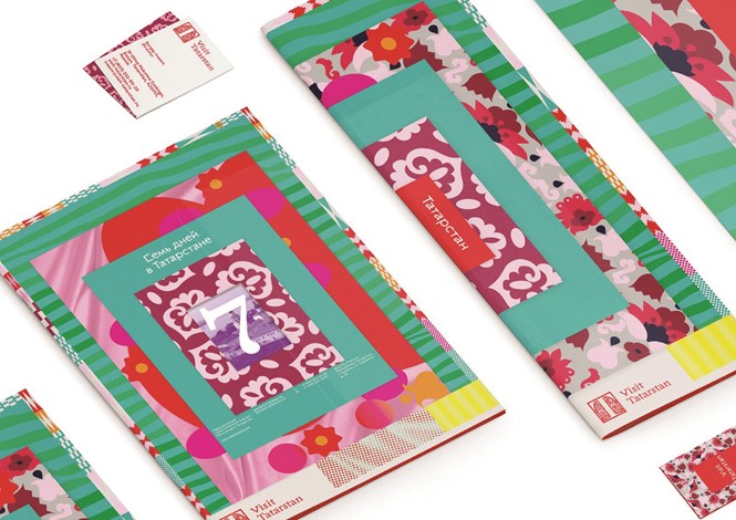
Achieving this distinction between regional and urban branding hinged on the involvement of people from all parts of Tatarstan, from provincial villages to busier centres. Grand continues, “We researched all major centres, which included other cities and towns of the region and talked to the people there. The idea was to find the common ground and explain the common ground to people of all the regions.” Find common ground, they did; in Tatarstan, heritage is mixed, but shared. Its population is split almost evenly between Muslim and the Russian Orthodox religions – 55% to 45% – who for the most part coexist harmoniously. Such shared heritage formed the basis of the Visit Tatarstan visual identity. This in turn incorporates a plethora of colours, textures, objects and dress, all designed to embody Tatarstan’s traditions in an outward-facing, welcoming way. “For the visuals of Visit Tatarstan, instead of creating one logo and a couple of visuals to follow it, we created 19 patterns which were very clearly rooted in the traditions of the region – but people could still make iPhone covers out of it,” explains Grand. “[The artists] make welly boots, suitcase covers, the things used in everyday life, and they’re happy about it. Basically, they don’t feel as if they’re old fashioned; the artists really feel as if they are cutting edge.”
And, in an approach confined not just to its cultural attributes, it is this careful balance of heritage and modernity which makes the Visit Tatarstan brand so enduring. Old and young residents were consulted in the development phase of the strategy, with the indomitable intergenerational respect and tolerance between the two reflected visually in the Visit Tatarstan’s resulting patterns and logos. Grand says, “The young people see the world exactly like the older people. They all want to be believed and they’re all very keen to keep this, so we looked to them to define the main cultural qualities. We said this was like the body of heritage and values that have been passed on from generations, irrespective of people’s ethnicities and religion. And that was actually quite fascinating, because older generations often define how people see the world in the region, but this is what it means for them to be happy.”
And ultimately, this integrated approach ensures tourists see Tatarstan not only for its connections with Kazan. For the Russians in this region, heritage is more than the objects used by generations before them; it’s a way of life. “It’s not just branding or what we’d call place branding,” says Grand. “It’s about giving people a meaning and helping them find their own place in life and in the world. I think that’s our big thing and that’s our big purpose – we’re giving the residents confidence for their actual life and tradition. “