Peer perspectives: Samuel Adams

One of the craft beers that started a revolution, Samuel Adams’ rebrand may also be revolutionary, but not in the way it intends, says Paul Taylor
Project: Samuel Adams rebrand by the Visual Chemist
Reviewer: Paul Taylor, executive creative director, BrandOpus Time ladies and gentlemen, please: Competition within the beer category has never been as intense. Shifting trends and the ceaseless emergence of new brands into the over-crowded marketplace has meant that leading brands need to work harder than ever to maintain their identity and position. Challenger brands continue to push category conventions while seeking to differentiate themselves from the established old guard. In a category awash with choice and diversity, brands must cut-through to engage with all audiences, both existing and new. Metaphorical symbols are a proven way of creating brand identities that connect at an emotive level with consumers to positively effect decision-making. The key to the success of this theory is to generate symbolism that gives you both a unique visual identity and a narrative meaning will differentiate the brand. Unfortunately in the case of Samuel Adams, I’m not sure that either goal has been achieved and it may well have overlooked the latent potential that exists within the current brand symbolism.
The right kind of revolution: I agree with the need to move the Sam Adams design on from its current guise, it is clear there was a need to reappraise and modernise the perception of the brand. But I can’t help but feel that in the spirit of ‘revolutionising the brand’ the new design is less differentiated and has potentially lost the spirit of what made it distinctive in the first place.
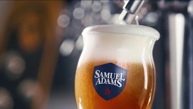
There are three main issues from my perspective. First, the adoption of the red star, which is questionable on two fronts. While the symbol represents revolution, it seems to me to connote the wrong kind of revolution for a brand that is proudly American. With it’s bevelled styling and the ‘fist like’ pint glass, it feels like a communist symbol that Americans would deride rather than embrace. The star is an overly used symbol adopted by many brands such as Macy’s, San Pellegrino and Texaco to name a few. But, most worryingly, it is the brand symbol of Heineken, a direct competitor in the beer category.
The issue here is not one of plagiarism but of uniqueness – a brand like Sam Adams should be seeking to adopt symbolism and equities that are truly different and distinctive if they are to effectively standout in such a crowded category.
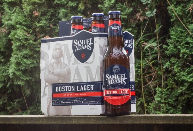
This leads me on to the second issue, the role of Samuel Adams himself. The old fashioned, full colour illustration has been replaced by a stylised representation of a statue of him. This may modernise the look of the design, but there is a fundamental shift in meaning that is significant for the brand. His depiction has moved from active to passive and from alive to deceased. The old design depicted him in the prime of his life, raising a beer to the cause, while the new design depicts him as authoritative and presidential with arms folded looking down on us. The fact he is a statue implies that this is a memorial to him and that his time has passed.
For me, the role of Adams in the identity is crucial to create the appropriate narrative for the brand, as a revolutionary himself it should be Adams who represents the revolutionary spirit of the brand rather than adopting generic symbols to tell the story.
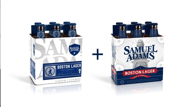
The third issue is the overall management of the design scheme in application. There seems to be a random approach when it is translated across multiple touch points. The new star symbol plays a rather minimal role, the brand name appears in the shield in some places and over the image of Adams in others, the colour palette changes dramatically from primary to secondary pack executions, Boston Lager sometimes sits on red and sometimes on blue. A less rigorous design scheme can reflect a brand’s eclecticism, but I think that there is a sense of schizophrenia with the identity in this case.
Raise a glass: While I celebrate the ambition of the new design, I can’t help but feel I would have ventured down a different path in reappraising the brands visual equities and symbolism. The existing illustration of Adams is outdated and out of touch with consumers, but it is what makes the brand different. The sentiment of Adams raising a glass to the cause could have been captured in a timeless Johnnie Walker-style identity that could have maintained the brand narrative for the modern era. The role of brand design is to deliver substance as well as style because it is the deeper meaning within your identity that connects and makes your brand memorable.