Pearlfisher updates historic UK art brand, Reeves

Prior to the year 1766, art was static canvases and fixed, messy easels. The artistically inclined were confined to paid-for studios, specifically reserved for painting and making, to develop their creations. Then the invention of the portable paint palette by brothers Thomas and William Reeves transformed the lives of not just professionals, but amateurs who wished to pursue creativity at home.
The Reeves legacy lives on in its distribution of art supplies to large retailers and specialist shops alike across the UK. And the brand, much like Thomas and William Reeves almost three centuries ago, continues to innovate – this time, with the aim of extending its customer reach
In a brand overhaul carried out by the London office of international design agency Pearlfisher, the new brief – ‘to reconnect with the contemporary creative consumer’ – signals Reeves’ recognition that the brand perhaps eludes a younger audience increasingly inclined to flex their creativity. While, for Pearlfisher, the rebrand included adapting and updating the brand’s website and other digital offerings, it was also careful to retain the authenticity which has for so long lent Reeves an edge over its competitors.
Yet this was not without its challenges. Developing a new visual identity to emphasise Reeves’ sector longevity, notes Pearlfisher, would appeale to an audience increasingly disillusioned with digital, often hailed as the sole innovative medium for artists. However, says Daniel Mark Carr, global brand manager at Reeves, ensuring a balance between Reeves’ history and the perception of traditional, perhaps slightly stuffy, ‘fine’ art, was paramount. Hence a decision by Pearlfisher to develop the future of Reeves as a lifestyle, rather than heritage, brand. "These days, creativity means so much more than ‘fine art,’ and while consumers are increasingly embracing their creative side, we want to be able to encourage more of that,” Carr explains.
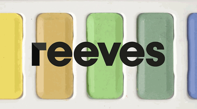
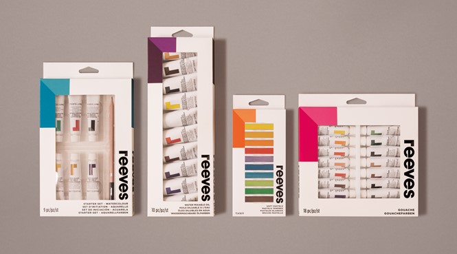
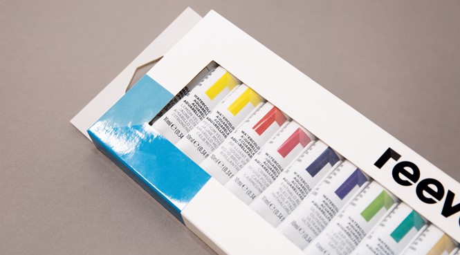
While the imagery which leads the new visual identity relies on strong, colourful portrayals of the Reeves products, such as paint splashes, tubes of watercolour and oil paint, Pearlfisher has chosen a blocky, black font. In contrast to its bright backgrounds, its new two-tone ‘r’ leads the logotype as distinct from font of the other letters. This highlights the brand’s prominence in the art world by ensuring it stands out among competitors, as well as creating a much-needed consistency across Reeves’ extensive range – everything from its children’s ‘painting by numbers’ sets to tools for more serious artists.
Speaking about the rebrand to Designweek, associate creative director at Pearlfisher, Jon Vallance, says, “Where the old packaging was prescriptive, showing finished artworks and step-by-step guides, the new packaging is about sparking creativity and celebrating spontaneous creation.” Pearlfisher hopes this new brand direction will emphasise the flexibility of art and encourage more people to step away from their screens to engage with an activity enjoyed by amateurs for centuries.
Carr continues, “From 1766 when William Reeves invented the watercolour paint palette that allowed people to paint outside of the studio, Reeves has been at the forefront of enabling creativity. As we enter this exciting new period, Reeves will continue to empower consumers, harness creativity and inspire personal self-expression."
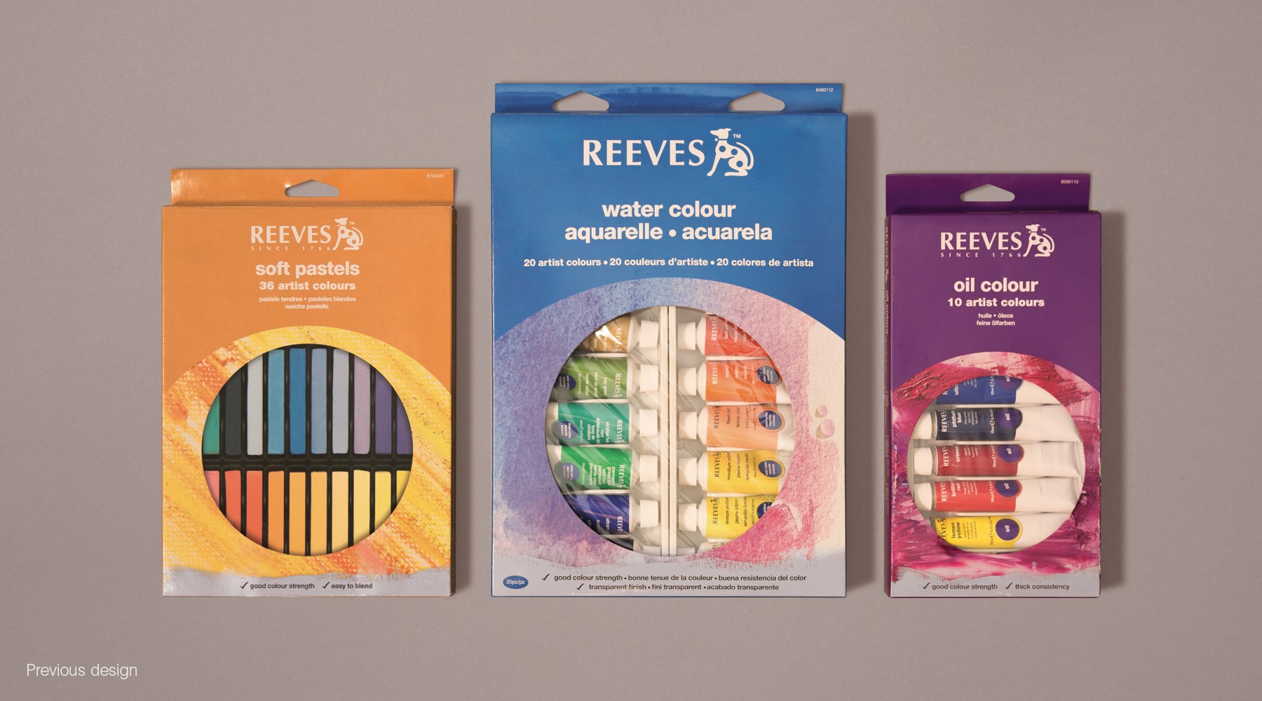
Previous Reeves identity


