Follow the yellow Laurel Road

Among the plethora of opportunities that exist for brand and design agencies, perhaps the prospect of rebranding the loans integral to ensure students can complete their university degrees is one of the least relished. Nevertheless, despite the obvious challenges, international branding agency Brand Union which is headquartered in London, has embraced the task. In a bid to soften the often corporate, unfriendly aesthetic and verbal tone surrounding many financial institutions, Brand Union developed a forward-thinking identity for one of Connecticut’s most aspirational loan lenders.
National online lender Laurel Road, previously known as Darien Rowayton Bank Lending Division, is a division of the Connecticut-chartered Darien Rowayton Bank, which launched over a decade ago in 2006. Wishing to define its bank lending division as the first source of income advice and financial security for the state’s many university students, DRB turned to the New York office of international design agency Brand Union to create an identity and help carve out its unique path.
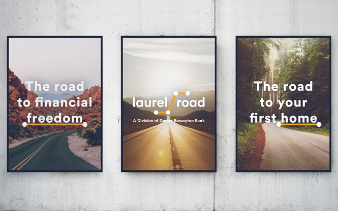
First the name, carefully crafted by Brand Union to reflect the role an online lender plays in the aspirations of its customers. Brand Union associate director for strategy, Jessica Lehmann, says it was important for the new identity to reflect the outlook of the lender’s customers. “The name itself – ‘Laurel Road’ – speaks to the path that people tread on their way to success, and was a real source of inspiration for how we brought the brand to life,” explains Lehmann.
Yet, with a plethora of competing lenders, a change in verbal identity alone was not enough to convey the undergraduates journey. It did, however, provide a solid basis from which the Laurel Road brand story was developed. “We built a rich story around that idea, so it was important that the design emphasised the journey too, using imagery and visual cues to connote roads and paths, while incorporating the idea of freedom that one feels when financially unburdened,” says Lehmann.
“The brand we created places the consumer at the centre and reflects the sense of optimism that the company’s target audience has for the future.”
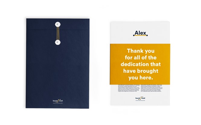
Laurel Road’s new strapline, also developed by Brand Union, is ‘Rewarding determination’ and acts with double meaning, being reminiscent of both the student’s educational motives and the lender’s financial role. It also serves to encourage its customers to pursue their college journey to its conclusion,
Senior client director at Brand Union, Sheila Sheedy, explains further, “It is a positive, future-facing story of how Laurel Road will reward its customers by helping them to leave their debt behind, making the difficult road to success just a bit easier.”
“It recognises that Laurel Road’s customers are often short on time – they’re working hard on getting to where they want to go and don’t want to waste the precious free time they have trying to navigate financial products that don’t provide them with the experience they deserve,” Sheedy continues.
Alyssa Schaefer, chief marketing officer at Laurel Road, says, “As a company, we feel strongly about recognizing the hard work of our customers. We feel that the new name does this well, as Laurel Road is about the path our customers have chosen and how we can support them in where they want to go.”


