Brand differentiation in the fitness sector

The growing offer of gyms, referred as the ‘gym boom,' was the result of new marketing strategies and motivated rebrands from already positioned gyms, in an attempt not to lose their customers - and gain new ones.
The revolution in fitness came with a polarization of the market in terms of cost, there are two extremes of the spectrum: low-budget and health club type, and staying in the middle is too risky for gyms. These two sides are no direct competition, as they target different audiences, budget amateurs and boutique gyms fitness lovers who require more specialised training.
The main brands had strong responses to the change in the market. Rebrands included venues, logos and technological engagement through their own platforms and apps.
Fitness First
One of the big names in the sector went through a rebrand that started with a new CEO, Andy Coslett and a partnership with London-based brand studio the Clearing to work on the refreshment of the brand that led to a new red logo symbolising energy. With more than 1 million members over 16 countries, Fitness First understood the need to present high-performance sporting in all elements of the premises. The company improved their staff’s skills and looks. It has also been using technology as a key element to engage customers. Fitness First made a large investment on interactive screens for virtual lessons and a free app, CustomFit, that helps people keep track of their progress, taking customisation to a different level.

Pure Gym
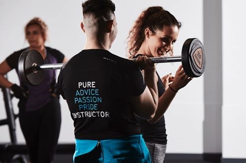
Pure Gym has placed most of its efforts on the economic aspect. First, it examined its competitors, Pure Gym attempted a merger with the Gym Group and then, actually took over LA Fitness, one of its main rivals. After that, the company decided to be characterised as a low-budget yet high-quality option. Pure Gym also eliminated swimming pools, saunas and cafes to lower costs and filled in the spaces with more equipment. In addition, flexibility became part of the strategy with a no-contract model and 24 hours service. With all these changes, the change of its blue and green logo to the black and blue one went unnoticed.
Fitness Garage
The 2014 Gym of the Year winner in the National Fitness Awards decided to focus on building identity and community around fitness. Its visuals in black and yellow and logo of a tyre represent its industrial setting, which served as inspiration for its concept ‘Fitness Garage is a place where you don’t train on machines but become a machine.’ Fitness Garage also emphasizes that training needs to be functional. Aware of the needs of its customers, its training programmes go from strength and conditioning to weight loss. Hard work can also be rewarded with the Beauty and Hair services offered.

Equinox
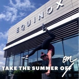
Equinox is a brand of luxury fitness clubs with studios in the U.S., Toronto and London. After a rebrand in 2014, fitness and luxury are part of a life style that Equinox is determined to inspire people to live. Consequently, the company will expand to hotels, starting in New York. The logo and website were renewed with a sober black and white look applied to suggestive mottos with a hype of exclusivity like ‘A fitness club for the elite’, ‘Not for everyone’ or ‘Upgrade yourself’. It also has digital magazine, Furthermore, that addresses food, travel and sleep as part of the fitness lifestyle and its own app.
The changes in the competitive fitness market have clearly benefited big companies who decided to invest to reinvent and reposition their businesses. The resulting new brands succeed in illustrating more energy and dynamism than has before been seen in this sector.


