Answers on a postcard
‘Lithuania is grand city skylines.’ So reads the first line of global publication, Lonely Planet’s, introduction to the Baltic state. Situated in northern Europe, Lithuania has Latvia to its north, and Poland and Belarus to its south. It boasts a coastline which runs along the Baltic sea, as well as miles of picturesque countryside which has become increasingly popular as a tourist destination in recent years.
Yet, to both internal and foreign visitors, the Lithuania tourism brand has been somewhat neglected. In a bid to increase its visitor numbers and visually highlight the merits of Lithuania as a holiday destination, its State Department of Tourism has updated its brand identity and overturned its existing brand direction.
While the tourism brand is not intended to match the Lithuanian place brand more generally – “We want to stay away from all possible speculations on the issue of the image strategy of the whole country”, says Jurgita Kazlauskienė, head of Lithuania’s State Department of Tourism, – it nonetheless works harmoniously with the country’s cultural offering. A poignant change is delivered through the department’s updated tagline, which for almost a decade has read, ‘Lithuania is a brave country.’ A move to brand the Baltic state as a visually stimulating experience, however, sees this updated to read ‘Lithuania. Real is beautiful.’
And the concept of honesty is what drives Lithuania’s new tourism brand, as developed by advertising agency, New!. Based in Vilnius, the Lithuanian capital, New! acknowledged early on that boasting of a country’s merits would not make stand out amidst strong competition. Tomas Ramanauskas, creative director of the New! says, “To get a picky traveller interested in visiting a small northern European country that doesn’t boast spectacular wonders of nature or architectural miracles and is sentenced with a hard-to-pronounce English name is an incredibly tough task.”
“The intense white noise of tourism communication does not spare those who talk like everyone else. We need to stand out and be different.”
Kazlauskienė agrees. He says, “The design of a new tourism brand required a new set of tasks – to introduce the heritage of Lithuanian nature and culture, to represent our country and differentiate it from other tourist destinations, invite visitors to Lithuania and promise an unforgettable experience.”
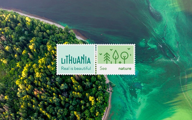
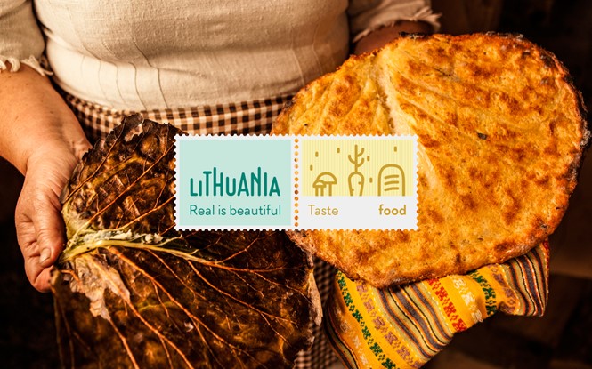
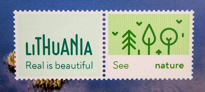
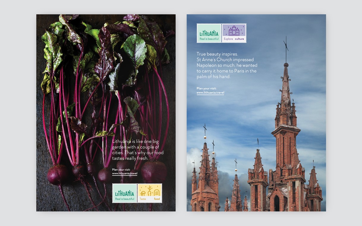
To emphasise the connections between tourists to Lithuania and their country of origin, Yes! has based the country’s tourism brand logotype on a postage stamp design. Each iteration, of which there are five, carries a bespoke message relating to a certain aspect of Lithuanian culture: “Meet people,” “Taste food,” “Stay active,” “See nature” or “Explore culture.”
In reference to the expanses of nature Lithuania has to offer tourists, the typeface across its logo is designed to resemble tree branches. Emphasised through the mint green colour palette, its wider marketing materials are also representative of the diverse landscape Lithuania offers.
“Lithuania is the place where real things are valued, even if they are a bit off or imperfect,” says Ramanauskas. “We are proud of our imperfections. In other words, we see the beauty in them. This is our new tourism statement. Unvarnished, free of cosmetic fixes, sincere, real.”
Through emphasis on its impressive natural assets, the image-led tourism brand should mobilise visitors into the mysterious yet picturesque Baltic region. It is clear from the marketing materials that a diverse world of culture and countryside awaits.
Updated: 14/02/2017
It has been brought to light by commentators in the Drum and the Telegraph, among others, that the photos used in the Lithuania tourism campaign are false and in fact depict other European countries. We will update this story when we hear more.


