Watch out for W
2015/16 may well be remembered as a formative period in broadcasting history, in which television channels of every genre decided to undergo significant changes to their visual identity.
From Channel 4 and BBC3, to Channel 5 and many others besides, changes to visual identity have increased in importance to become key to a channel’s brand purpose. This is a focus usually accompanied by a variety of new logos, and attempts to shift audience brand perception.
Watch, part of the channel network owned by UKTV, is no exception.
Last week its brand identity, which had thus far depended largely on BBC archive shows, was entirely changed in a bid to focus more closely on a female demographic. However, its content should still appeal to audiences of all ages and genders.
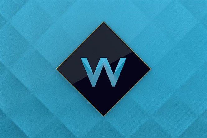
Moving away from Watch’s previous visual expression, which included gaudy colour schemes and images resembling eyes, the design of its replacement channel, W, has been led by design studio Art&Graft.
The agency has implemented a more sophisticated and subtle colour scheme and affirmed its focus on a new target audience through a teal, white, black and gold colour palette.
All are colours associated with wealth and elegance. The choices also reinforce the brand expression, with its luxuriousness defined through encasing the W logo inside a diamond shape.
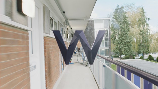
Founder and creative director at Art&Graft, Mike Moloney, says, “The central themes of the brand proposition, ‘Smart Escapism’ and ‘Endless Journeys,’ were key to all our creative thinking. We wanted the W idents to be intelligent and multifaceted, like the audiences they would be speaking to, and take the viewer on a continuous journey through moments of everyday bravery.”
“With our diamond motif as a transition point, this led us to think about using the idea of forward movement; moving outside of our comfort zone and pushing on regardless of obstacles, which is reflected in the scenes we pass through.”
Art&Graft were also keen to bypass traditional design tropes alluding to femininity, such as the colour pink or the use of overtly gendered imagery. By instilling this calming yet powerful brand identity, W has positioned itself as a leader in the premium visual entertainment market.


