University challenges
Universities have to ensure that any brand updates or rebrands are communicated with their many stakeholder groups to avoid the risk of a poor reception. How can universities best approach a change in brand? Amy Sandys investigates
On Pennsylvania State University’s main campus, the Nittany Lion crouches, keeping a close eye on the students under its charge.
It has sat there for decades, the eyes of the stone sculpture a constant, watchful presence over the campus of Penn State. When redesigning the Nittany Lion, Penn State’s historic emblem and the university’s mascot, its iconic eyes were a major consideration. The animal serves as a visual identifier for the university; its pupil-less eyes are one of its most striking features.
Jerry Kuyper, brand identity consultant at Jerry Kuyper Partners, the agency which led the Penn State brand update, is well aware of the importance the Nittany Lion holds in Penn State’s heritage. So important, in fact, that it has become the university’s main signifier. Kuyper says, “From the outset it was clear that maintaining the Nittany Lion was a key part of our criteria for success; we fully agreed on the importance of the Nittany Lion story and image as a critical part of the university’s visual identity.” Yet, the charge of updating Penn State’s previously staid, serious and disjointed logo application to a style more appropriate for a contemporary, progressive university also allowed Jerry Kuyper Partners a certain amount of freedom.
While the agency was given a certain degree of flexibility in its new implementation and, Kuyper says, “[The] freedom to explore a wide range of options in how to proceed”, retaining the Nittany Lion as a key feature of the Penn State brand was a given. The university’s unofficial symbol since 1904, it was first fabricated to counter Princeton’s Bengali tiger mascot during a baseball game. With sightings of historic mountain lion roaming Pennsylvania until the late 1800s verifying the idea, it stuck – the ‘Nittany’ prefix ensured it remains unique to Penn State.
“For the symbol, we wanted to maintain the equity of the Nittany Lion while improving its functional and communicative qualities”, says Kuyper. “For the brand architecture, we strove to create a sense of harmony and hierarchy among the university entities – and present them as clear identifiers of those entities.” The disjointed nature of Penn State’s departments could thus unite across its brand architecture, via the universal and hugely popular symbol of the Nittany Lion. “The university had developed a sound analysis and brand strategy before our project began”, says Kuyper. “The major involvement of the stakeholders was in the creative stage of the visual identity and brand architecture.” With the successful application of a university’s visual identity implicit in the brand’s reception, input from executive to student level was essential in the brand rollout.
Establishing a clear and coherent identity across every facet of a university’s brand architecture is an integral component in all rebrand strategies. Helen Pennack, director of university marketing at the University of Warwick; oversaw the complete overhaul of the university’s brand identity in 2015. Pennack says, “What [our rebrand] has done visually, is enable Warwick to make a step-change in having a coherent identity across all of our many and varied communications.”
She adds, “Typically in universities you get schools or departments which create their own logo, which just serves to fragment the overarching university visual identity. What the [University of Warwick] rebrand has done for us is brought everybody together, because in coming up with the new visual identity, we were quite clear that we had to create a ‘mother brand’ into which departments would sit, but would also still feel they had their own visual identity.”
It was thus important for the University of Warwick to update its brand identity into a more universal concept, while retaining a flexibility to allow individual departments apply the design in a more personal manner.


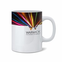
“That’s where the cut-out W comes in,” says Pennack, “To create a sort of ‘view’ onto the world of Warwick – different departments can use different images, cut-outs, colours, to really communicate what it is about them that makes them different and special.” Ensuring a universal brand overhaul is appropriated across all facets of an establishment is integral to the success of a branding strategy; for an institution as complex as a university, flexibility and clarity in the visual brand reflects the dynamism of its many stakeholders.
Rebecca Price, joint partner at Frank, Bright and Abel, the London-based brand communications consultancy commissioned to lead the University of Warwick rebrand. Price says, “[It] was about properly understanding the real, authentic positive strengths of University of Warwick, and representing them in a really powerful narrative, messaging and a visual identity that ensured it could look the part, as well as sound it.”
While the importance of heritage and establishment is recognised by both the University of Warwick and Penn State, both institutions have made conscious efforts to update their visual brands in a manner more relevant to 21st century identity. “At a logo level, we felt that the approach needed to be unconventional and so did Warwick, and that’s a principle that they went along with,” Price says. “So the logo is not a traditional crest; they’ve got a crest from way back for ceremonial items, but at a logo level it wasn’t right. And nor did it feel right to have any other, more contemporary, symbol.”
University brands thus tend to rely heavily on imagery, real or virtual, to convey its credentials – using historical associations as a basis for its brand theme is a way of lending credence to the existing university brand. For Kuyper, the Nittany Lion is not only a way of communicating Penn State’s brand strategy to the university’s plethora of stakeholders – it presented, he says, “The opportunity to bring logic, hierarchy and structure to a large university, with the goal of making it better known, and better understood.”
In this respect, the successful Penn State rebrand stands in stark contrast with the University of California emblem update. Announced in 2012, the new logo was going to replace the intricate and historic emblem, which had been in place since 1868 – intended to convey unity across the university’s institutions, it instead prompted outcry from students and alumni who had not been consulted prior to a quiet brand rollout. While Penn State focused on a much-loved image as its brand lead, the University of California sought a modern update, without taking on board the prestige of the institution and the investment of its alumni; the responses could not have been more different.
Yet, employing a good-quality photographer is not quite enough to cement the reputation for excellence all higher education institutions strive for. Like the University of Warwick, Kent University, England, was intent on rebranding itself to focus on what internal stakeholders felt made the university stand out. Sholto Lindsay-Smith, chief executive and founder at strategic brand consultancy, Industry, says the successful rebrand of a university brand conveys itself by means other than imagery.
As former managing director at brand transformation consultancy Uffindell, Lindsay-Smith was integral in repositioning the University of Kent, England, as a learning institution focused on academic excellence. Lindsay-Smith says, “The imagery for Kent was changed, from people sitting on grassy slopes drinking beer and playing softball to actually focusing on the passion of the lecturers standing at the front of the classroom. The [photography] shots are either of academic being inspiring in the lecture theatre, or students fairly engaged in conversations and seminars.”
The overarching message a university conveys to its prospective students is undoubtedly achieved, at least partially, through image; reception among external stakeholders is likely to vary according to the quality of its branding. Brand implementation can mean the difference between investment and partnerships, particularly invaluable for universities such as Warwick, whose focus extends beyond a purely academic remit.
To achieve recognition as a top university in a chosen field, however, higher education branding must go beyond brand image and implementation. Brand proposition is often the crux which sees vision become reality – as Lindsay-Smith says, “It’s deciding what your focus is. It’s strategic – you decide what you’re good at, you recruit the staff, and make some decisions about the things you don’t do, which of course is always the big brand strategy question – what will we give up doing, to focus on the things we should do well?”
The same rang true for Warwick, which needed a narrative to encapsulate its academic excellence into the brand; in an era in which corporate identity and brand reputation are as big a draw as institutional trust, an indistinguishable coat of arms no longer captures the imaginations of future students. For the university, it became the line, ‘What if.’ Price says, “What we were trying to do is set up an institution that does things differently, that is ambitious, that is driven, and bounded only by excellence.”
Ultimately, a successful university rebrand relies increasingly on specialisation in order to be a success. Gone are the days when a university could harness several brand touchpoints to attract potential students and investors; in an environment increasingly determined by economics, value for money is at the forefront in the minds of potential students. Lindsay-Smith says, “It’s strategic, finding out what you’re going to focus on. You can’t necessarily be good at everything. You’ve got to decide what, rather than going for a universal offer where you try and appeal to everyone, to a homogenous student population – in that sense, you need to specialise, and stand out for something. And you need to decide what it is.”