#TransformTuesday: 9 February
Every week, Transform examines recent rebrands and updated visual identities. This week's picks are below. For more from #TransformTuesday, follow @Transformsays
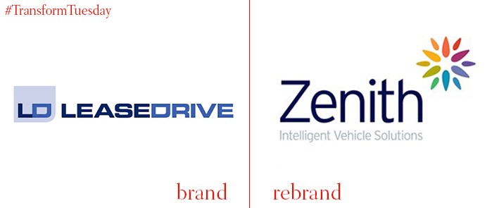
Since 2014 and an acquisition by HG Capital, contract hire and leasing company Zenith LeaseDrive had been operating under two names - Zenith and LeaseDrive. However, a decision has been made to drop the LeaseDrive name; the company will now operate solely under Zenith. This is reflected in its new visual identity, which includes a multi-coloured flower to the right of the company name. While the navy blue of its original branding is retained, the new design is less cluttered – a thinner, rounder font lends a friendlier feel.
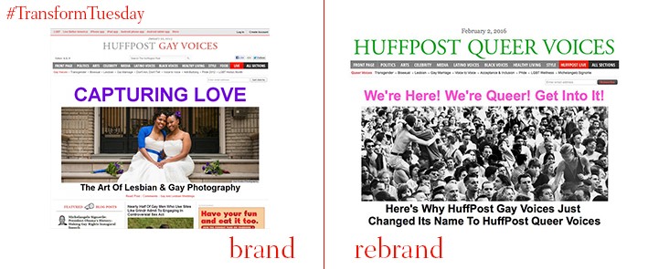
For many years, the term ‘queer’ was used in a derogatory manner to refer to those who identified as homosexual. However, in an unusual rebrand move, the section of news outlet Huffington Post which caters towards the LGBT community has changed its header, from ‘Gay Voices’ to ‘Queer Voices’. Despite changing the colour scheme from grey and red to a bolder green, the typeface remains the same. Yet it is the sentiment behind the change which is most striking. While use of the word ‘queer’ may have a divisive effect on the section’s intended audience, it is hoped that this is a step toward better integration and identification for the entire LGBT community.
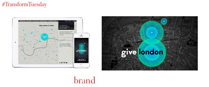
Cartography is the central basis for the givelondon visual identity, a charity which aim to provide support for people across all areas of London. Harnessing a calming yet striking aquamarine typeface over a greyscale map, branding and design agency The Allotment has ensured focus of the charity is made instantly clear through its strong brand image. Reinforcement of the ‘G’ in ‘givelondon’, reflected through the ‘glowing’ map points at the centre, allows this brand to stand out among usual London advertising. The new images form the visual basis for the charity’s campaign, which is based around its various projects. With each poster featuring an individual character, the new brand is personal and provokes emotion.
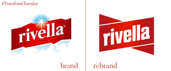
Despite its unconventional ingredients, milk whey-based drink Rivella has always had a popular following in its native Switzerland. Its rebrand, implemented by California-based design agency fuseproject, aims to extend this appeal. With a previous design reminiscent of a mineral water brand, its new logo has retained the eye-catching white text on red background, but streamlined the design to no longer include its jagged edges. Instead, its slight angle suggests Swiss mountains and therefore its heritage, while giving the brand a fresh and clean look.
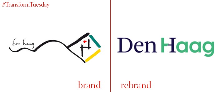
The collective effort of nine graduates from the Royal Academy of Art in The Hague, the Netherlands, has led to a place rebrand which centres on the heritage of this North Sea coastal city. Using marine colours and a combination of two typefaces, the new place brand aims to convey a duality between the modernity of the new city, and its unique heritage. While the old logo, designed by a Dutch artist, captures the city’s importance in the arts, its perhaps complex nature rendered it unsuitable for marketing purposes. The new design should rectify this, while reinforcing the area’s unique Dutch identity.

