#TransformTuesday: 8 November
Every week, Transform examines recent rebrands and updated visual identities. This week's picks are below. For more from #TransformTuesday, follow @Transformsays
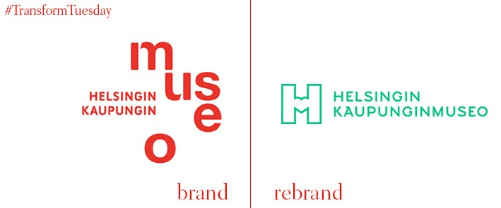
‘Everyone has the opportunity’ to fall in love with Helsinki.’ So cites Helsinki City Museum’s vision, a mantra which is apparent in its latest rebrand led by Helsinki-based graphic design studio, Werklig. Its new colour palettes and typefaces have been created with reference to the museum’s artefacts. The heart symbol apparent in Helsinki City Museum’s new logo suggests a more memorable side to its branding, reflected also in its bold, large application across the merchandise sold by the museum. With the help of digital agency, Byroo, which implemented the brand across all the museum’s outputs, Helsinki City Museum ensures its contemporary identity complements the new location and historic connotations.
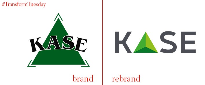
The Kazakhstan Stock Exchange, the leading stock exchange in mid-Asia region, has updated its visual identity in a way befitting of its importance. Having been in use since 1993, the green logo which formed the main image now constitutes the ‘A’ of the KASE acronym. It is also a much lighter shade than the previous pine green. Chairman of the KASE management board, Alina Aldambergen, says, “Now we are entering a new stage of development in the implementation of the strategy 2016-2018 years. So we decided to base the development of the brand on the experience of the past – it is a force shaping the future. Our new logo will reflect our dynamism, openness to customers, dedication, reliability and transparency.”
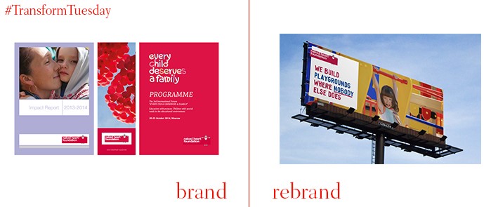
With the charity sector accommodating many philanthropic organisations aimed at disadvantaged children, attracting donations can prove difficult. The Naked Heart Foundation, which works to improve the quality of life for Russian children with learning difficulties and special needs, has rebranded to stand out and help secure further funding. Led by London-based business consultancy, BrandCap, the charity’s visual identity is now bolder and brighter. A contemporary and distinct tone is applied, yet its identity remains distinct and simple enough for it to be easily replicated across the Naked Heart Foundation brand architecture. Ed Bolton, creative director at BrandCap, says, “Through the simplicity of the new brand identity we are confident that it will enable The Naked Heart Foundation to gain more traction and recognition among donors and potential supporters.”
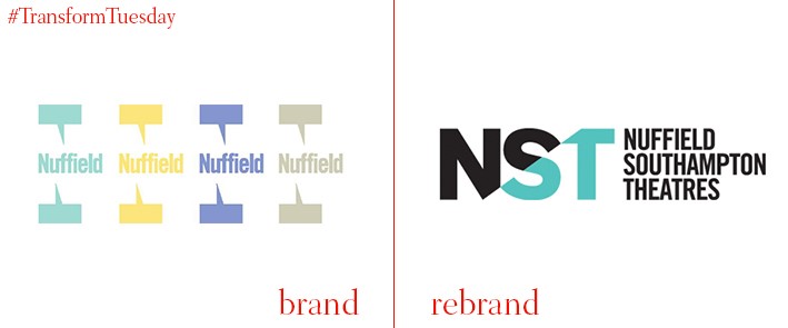
Located on the campus of the University of Southampton, the Nuffield showcases talent from across the country and the university’s own performing arts groups. Known simply as the Nuffield since its inception, it has been rebranded as Nuffield Southampton Theatres. This follows the development of a second Nuffield theatre in the city centre, which will be known as NST City upon completion and is part of £22m arts complex in Southampton's centre. The university theatre will be known as NST Campus. Speaking to theatre publication, The Stage, a spokesperson from NST says, “We’re going to be running both venues and working hard to make sure that our programme offers something for everyone. We want our audiences to feel at home in both our buildings.”
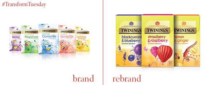
Following a £10 investment, historic British tea brand Twinings is updating its visual identity for its fruit and herbal tea offerings. Developed by international branding agency, Brand Opus, the new designs use outdoor storytelling to encourage consumers to link tea drinking with fond memories. Its bright yellow and green colours allow it to stand out on supermarket shelves. Paul Taylor, executive creative director, Brand Opus, says “This range design for Twinings healthy teas epitomises the feeling of positivity and optimism that consumers feel while drinking their favourite infusions. The unique illustrations convey the individual and different experiences of the blends from one pack to the next, whilst also helping to create a bright and distinct destination on shelf.”
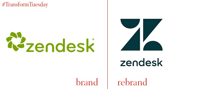
US-based customer service software company, Zendesk, has updated its brand to move beyond the customer service remit and make its brand identity more relevant to its current mission. Customer intelligence and deeper analytics are behind the development of two child brands, Zendesk Connect and Zendesk Explore, which aim to personalise the connection between customers and organisations. The visual identity of Zendesk has also changed. Carried out in-house, by chief creative officer Toke Nygaard, the rebrand aims to keep Zendesk at pace with its digital counterparts in Silicon Valley while retaining its Danish heritage. Nygaard achieved this through developing ‘Relationshapes’, seven geometric shapes which, while singularly representing the seven Zensdesk services, come together to create the new Zendesk logo.


