#TransformTuesday: 29 March
Every week, Transform examines recent rebrands and updated visual identities. This week's picks are below. For more from #TransformTuesday, follow @Transformsays
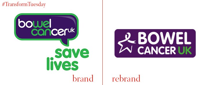
The main focus of Bowel Cancer UK’s rebrand is the ‘Star of Hope’ - residing to the left of the newly designed text, it is a key symbol of the charity identity. Digital marketing agency Adido led the redesign, retaining the distinctive purple and green colour scheme of Bowel Cancer UK yet aligning them in a less jarring way than the previous design. The ‘we can’ slogan from the Bowel Cancer lettering, originally picked out in green, has been forgone in favour of entirely white font, and its capitalisation lends the new logo an overall more demanding yet welcoming presence.
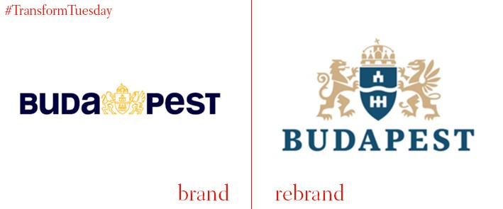
With a population of 1.7 million, Budapest is the largest city in Hungary, and is also its capital. Earlier in March, the mayor of Budapest, István Tarlós, introduced a new identity for the city, moving away from the previous incarnation which hinted at the historic divide between Buda and Pest. Designed by Budapesti Városarculati Nonprofit Kft (Budapest City Identity Nonprofit Ltd.), the new logo marries classic elements of the city, highlighted with the use of a royal blue and silver colour scheme, with Budapest’s desire to continue its journey as part of modern Europe. Sans serif font contrasts with the historic coat of arms; its new slogan (‘The city, which unites’) also reinforces this move to a more unified future.
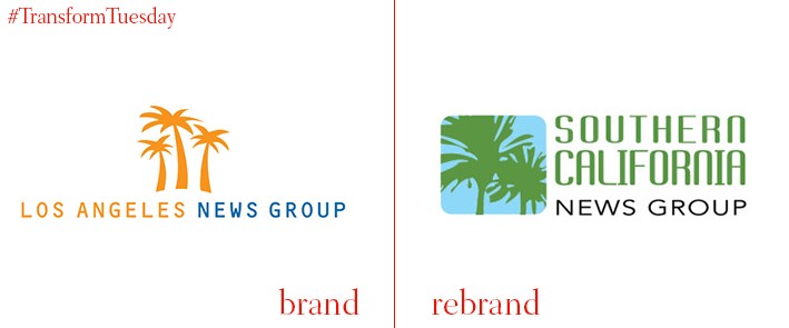
In a move set to cement its presence across the Southern coast of the US, award-winning Los Angeles News Group has been renamed Southern California News Group (SCNG). Encompassing Los Angeles, Orange County, Riverside and San Bernadino, the rebrand clarifies the area in which the news outlet operates, while reaffirming the brand commitment to providing quality local news across 261 communities of Southern California. The logo design has also retained its image of palm trees. Although the colour scheme has been toned to a subtler green, it still conveys a sense of sunshine and a more informal style of reporting. Larger, bolder text also immediately identifies the news organisation’s location, affirming its dominance in the region.
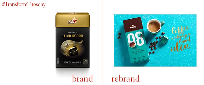
Israeli design agency, Shake Design – Mayaan Reshef Ltd., has teamed up with Strauss Coffee to create a new concept, sophisticated concept for its coffee capsules. The coffee strength classification system is a central aspect of the image design, with large white numbers adorning the front of each packet - all feature strong, bold and individual colours. By keeping in tune with an idea of indulgence and ‘treating yourself’, Shake Design has created a brand image for caffeinated products which suggests both affordability and luxury. Its embossed gold lettering and crisp imagery helps to reinforce this notion, a move away from the previously fairly generic design which would have been unremarkable on the shelf.
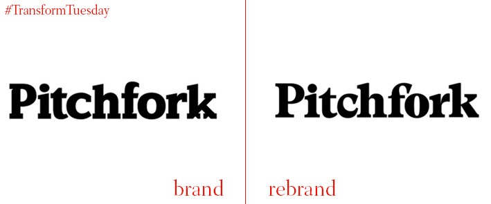
Chicago-based online music magazine Pitchfork has been a bastion of critique and reviews of the music industry since it was founded in 1995. Although the changes to its logo, done by Swiss type foundry Grilli Type, look slight and are not dissimilar from the previous 2011 design, the new brand identity has a smarter typeface and has also forgone the forked ‘k’. The magazine retains a 1970s music magazine vibe, while lending itself much better to digital application and functionality across the publication. Pitchfork’s typeface remains black, but with its new iteration less bold than the previous design, it does not overpower other website content – it is more suitable for a presence across smaller screens.
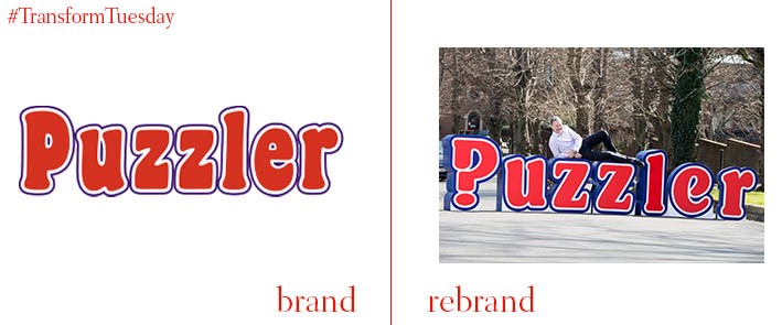
After 43 years on the shelves of newsagents, UK puzzle magazine Puzzler has undergone an update to its brand identity, in order to remain modern in the contemporary era. Its iconic red typeface remains key to the brand’s personality and integral to the colour scheme, although the new design has given the logo more flexibility to change colour, according to the magazine background. However, in a nod to the magazine content, the first letter P has been redesigned to resemble a question mark. Described by Puzzler marketing director Lynda Newland as, “An evolution rather than a revolution”, it should retain favour with its loyal following while attracting a modern following. This is particularly imperative given the more recent digital association Puzzler has, through its provision of puzzle content to other, online, publications.
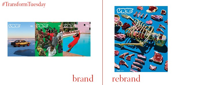
Investigative and often controversial provider of journalism, VICE, has undergone a redesign of its print magazine. Its new cover design, instrumented by Maurizio Cattelan and Pierpaolo Ferrari of Toilet Paper magazine, reflects its edgy and inquisitive side. While VICE is known for its blunt, witty and informative news pages, the magazine hope this brand image change will emphasise the cultural content, structure, and visually interesting pieces it hopes will come to define the publication. Led by imagery, the new design uses bright and bold colours to tell the story to its readers, with its journalism focusing on sensitive contemporary issues – for example, the plight of LGBT refugees fleeing Syria is a feature in the latest edition.
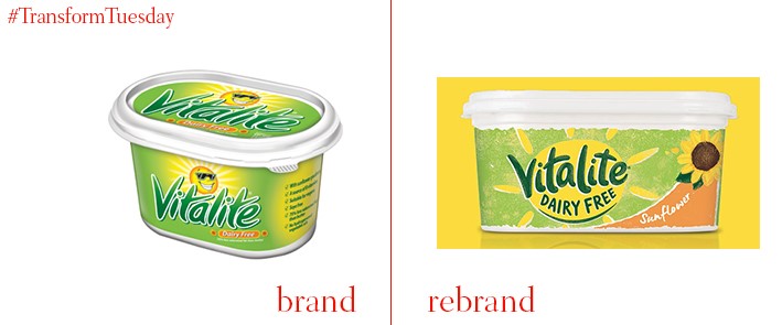
The market for ‘free from’ goods is expanding at a rapid pace, something dairy-free spread brand Vitalite has been quick to engage with. In a partnership with brand consultancy BrandOpus, Vitalite’s history as a provider of sunflower oil-based spread has been utilised in this redesign, and its timeless sunflower symbol is retained. However, the previous design was fairly cartoonish and arguably old-fashioned – the new brand evolution is designed to appeal to the 10% of the UK population who now avoid dairy, whether for lifestyle or health reasons. Coinciding with a recent overhaul of its ingredients, Vitalite hopes to position itself as a good dairy alternative by emphasising its taste, in a market once unfavourable to margarine-style spreads.
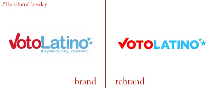
US-based civic media organisation Voto Latino aims to encourage Latino voters to be more active in the democratic process – particularly pertinent given the impending 2016 US presidential elections. While the Voto Latino brand has retained its distinctive red and blue, an ever-popular colour-scheme for US political organisations, the work done by New York-based digital product shop Charming Robot has given the logo a more mature feel. No longer is it characterised by the child-like font of Helvectica Rounded, where the organisation brand design was reminiscent of soft drink branding. Instead, the brand evolution is sophisticated and clear; despite its lack of acknowledgement of abundant Latino culture and heritage, it seems to take its mission more seriously.


