#TransformTuesday: 28 June
Every week, Transform examines recent rebrands and updated visual identities. This week's picks are below. For more from #TransformTuesday, follow @Transformsays
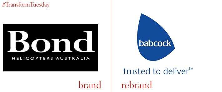
Managing equipment for safety critical environments is a main consideration of Babcock International Group, which has recently declared that its Australian Helicopters and Bond Helicopters Australia businesses will be branded under the Babcock name. Search and rescue (SAR), and emergency medical (EMS) are just two responsibilities of the newly-branded Babcock Mission Critical Services Australasia. Its sister company, Babcock Offshore Services Australasia, supports offshore energy companies on and around the Australian coast.
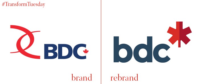
Business Development Bank of Canada, commonly known as BDC, is a government-owned bank, based in Canada, providing finance for business. Communications agency Cossette, which has headquarters in Quebec City and offices across Canada, has rebranded BDC’s corporate arm in a move to highlight the financing and advisory services BDC offers. Although now favouring a lowercase typeface, Cossette ensures BDC retains a strong red and blue colour scheme. This is as well as the inclusion of a more abstract maple leaf than previously, in a subtler allusion to its Canadian roots.
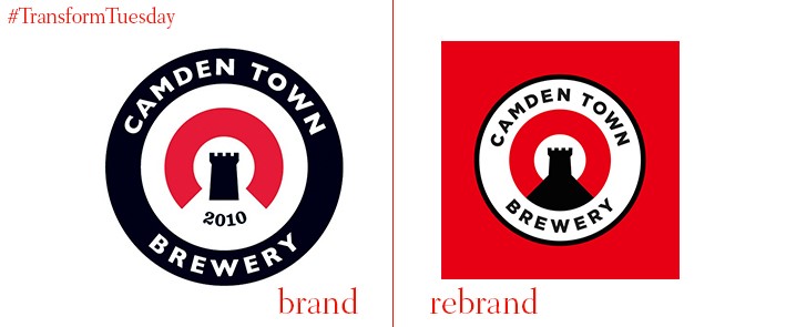
Camden Town Brewery, which has been based in Kentish Town, London, since 2010, has undergone a beer packaging rebrand, following its acquisition by global beer brewer AB InBev. While retaining its iconic roundel, as well as the black, white and red colour scheme for its logo which differentiated it from others on the craft beer market, branding agency Studio Juice says it has based the new bottle designs on, “Bold colour, strong typography, crafted illustration and a touch of irreverence.” With its beers sold in over 1000 pubs and bars, carving out a unique identity is a must for this London-based brand.
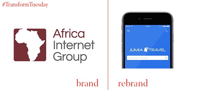
Africa Internet Group, which owns leading online platforms Kaymu, Hellofood and Lamudi, has rebranded to merge all of its operations under the brand name, Jumia. It is hoped this move will enhance brand visibility in the region. Its new tagline ‘Expand your horizons’, intends to reflect the desire of Jumia to extend internet services as widely across the African continent as possible.
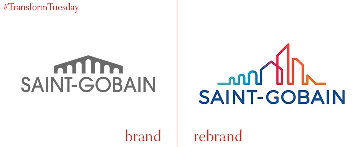
Saint-Gobain is a French multinational corporation, with headquarters on the outskirts of Paris. It is best known as a maker of specialised building materials, and its new brand logo – developed by Paris-based communications and branding agency, Tierre di Sienne - reflects the company’s work in construction and civil engineering. Its previous bridge motif has been made more colourful and eye-catching, intending to emphasise the habitat Saint-Gobain creates. In terms of this new design, the company says, "[A] skyline unfolds in an explosion of colour, reflecting a Saint-Gobain that, after more than three centuries of existence, is more dynamic than ever.”
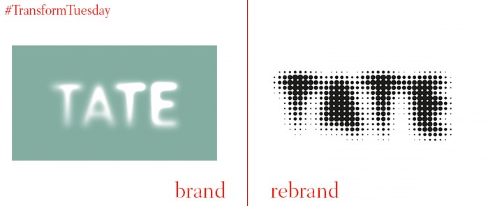
The iconic dot-art concept has long defined the Tate’s visual identity, for both its merchandise and museums. The design, made up of thousands of individual dots, has been refreshed by branding agency, North, together with the in-house creative team Tate Design Studio, in a move to unite and enhance all the organisations under the cultural Tate brand. This includes its London, Liverpool and St Ives galleries, as well as the brand’s consumer identity which North has animated in an interesting new concept. Its versatility and wide application reflects the countless exhibitions and events which cover all manner of subjects, held at Tate premises across the country.


