#TransformTuesday: 22 November
Every week, Transform examines recent rebrands and updated visual identities. This week's picks are below. For more from #TransformTuesday, follow @Transformsays
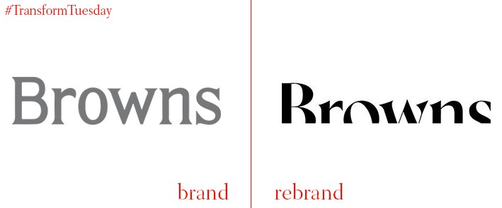
Browns
First opened in 1970 by wife and husband, Joan and Sidnet Burnstein, London-based Browns is highly acclaimed as one of the capital’s best independent boutiques. New CEO Holli Rogers has overseen a relaunch of the shop’s branding, website, stationary, materials and marketing strategy, Browns’ first for 40 years. South Molton Street, London, the location of Browns’ first outlet, also promoted the rebrand through hosting a giant scratch card in its window. The first 100 customers had the chance to win an item from Browns, worth £100, while a third of participants were in with a shot of winning a high-end prize.
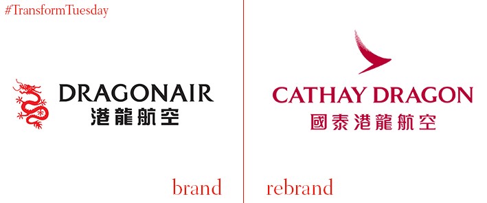
Cathay Dragon
Dragonair, the sister company to Hong Kong-based airline carrier, Cathay Pacific, has rebranded to appeal to the regional Chinese market. Now known as Cathay Dragon, the airline hopes to attract customers in South East Asia who want to explore far afield while seeking reassurances associated with flying with a reputable brand. A dragon symbol has replaced the previous ‘brushwing’ logo of Cathay Pacific on plane livery, as well as the staff uniforms and boarding passes. It will also integrate its website with the Cathay Pacific brand from the beginning of 2017.
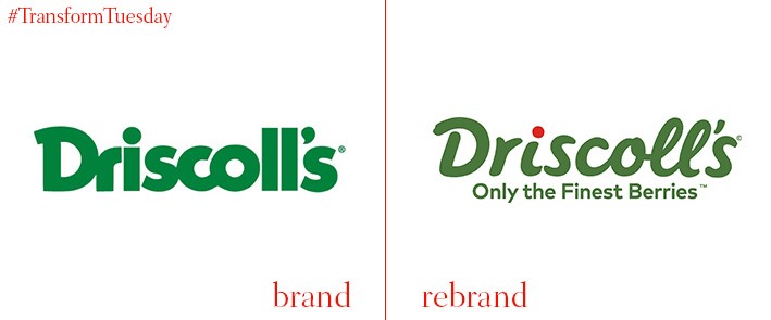
Driscoll's
Family-owned berry growing company, Driscoll’s, has headquarters located in California and owns berry-growing fields in California, Mexico, Florida and Australia. International brand and design agency, Pearlfisher, has updated its brand for the first time in its 100-year history. Driscoll’s wanted to establish a more emotional connection with its audience, something Pearlfisher has achieved via replacing Driscoll’s old, straight text with more signature-style italics. Brand recognition is upheld through keeping the yellow and green of the original logo, while a bright red ‘dot’ above the ‘I’ emphasises the berry business. Head of strategy at Pearlfisher, Karen Schnelwar, says, “The new brand positioning embodies the unique role Driscoll’s berries play – that when its berries are added to the mix, ordinary moments are made more special. By connecting the functional with the emotional, Driscoll's and its berries will live even more powerfully in hearts and minds of everyone they touch.”
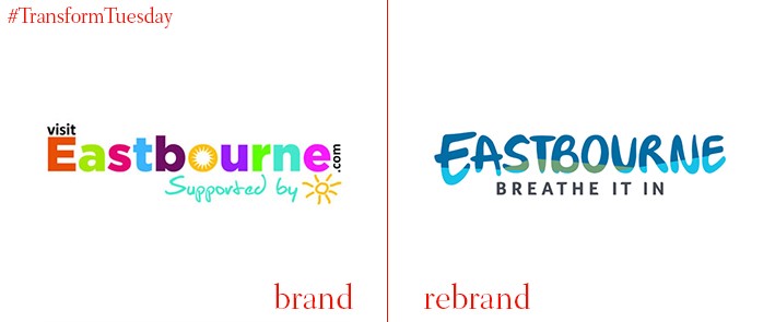
Eastbourne
Eastbourne, located in England’s south east in the county of East Sussex, has a long-held reputation as a seaside town with a high population of retirees. This perception, which residents dismiss as untrue, is further challenged through Eastbourne’s updated place brand, in a project carried out by Bath-based design studio, Mr B & Friends. Through collaboration with over 35 local groups and individuals, the town’s updated identity includes a new brand strategy, a place brand identity, tone of voice, and brand guidelines. These are all rolled out across Eastbourne’s place marketing materials. The town’s new visual place identity aims to communicate the great stories people can tell once they’ve visited Eastbourne, as well as highlight the diverse experiences the town has to offer.
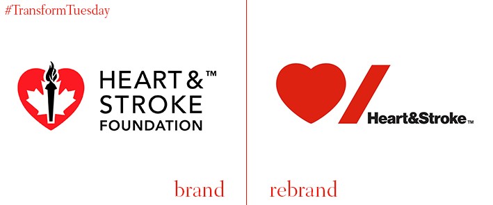
Heart & Stroke Foundation of Canada
The Heart & Stroke Foundation of Canada, a charity set up over 60 years ago, has undergone its first rebrand in this time. Led by Paula Scher, a partner at the New York base of international design firm Pentagram, led the brand update. The change aims to develop a ‘more cohesive visual system’ for the charity, which merged from separate heart and stroke charities into one, in 2011. The new logo reflects the two main organs associated with heart disease and strokes, the heart and the brain. Scher also hopes the bold red imagery, which bears a contemporary feel, will appeal to younger generations involved in fundraising. As Canada is a bilingual country, the new identity should also bridge any potential language gap. Pentagram says, “The symbols transcend language, and while the stroke symbol does not translate as directly to the French word for stroke as per English, it represents a feeling anyone who has been impacted by a heart attack or stroke has felt—an abrupt punctuation, exactly how stroke interrupts life suddenly.”
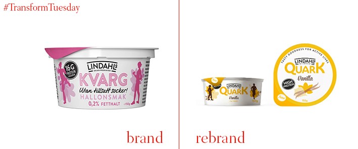
Lindahls
Scandinavian design influences the latest brand update for Sweden-based quark company, Lindahls, as it enters the UK dairy market via stock in supermarket, Waitrose. While quark is less well known in the UK, it is a popular dairy product in northern Europe. UK- and US-based design agency, Hornall Anderson, has thus rebranded Lindahls in a bid to appeal to this diversity while retaining Lindahls' Scandinavian roots. Lindahls is available in a range of flavours to appeal to both sweet and savoury palettes. Matt Gandy, creative director at Hornall Anderson, says, “We wanted to ensure the brand remained true to its roots, but also make it fresh, new and different. Design cues communicate the product’s main benefits effectively, highlighting the fact it is natural, high in protein, fat free and healthy. The bright colours and beautiful Swedish design will give the brand standout on shelf.”