#TransformTuesday: 20 December
Every week, Transform examines recent rebrands and updated visual identities. This week's selections are below. For more from #TransformTuesday, follow @Transformsays.
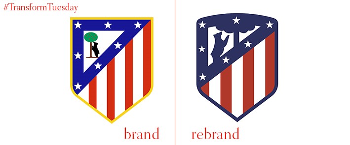
Atlético Madrid is the fourth most successful Spanish club in terms of number of trophies won; the update to its crest aims to maintain the team’s pride and emphasise its heritage going into the next season. In a change implemented by Barcelona-based independent brand studio Vasava, the logo is now more functional for use across the brand’s online assets and marketing collateral. Atlético’s colour palette has been minimised, with a dismissal of its original yellow and green allowing the red and blue combination to make a deeper impact on both the club and its fans.
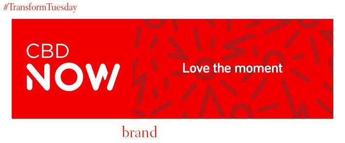
January 2017 sees the launch of new Dubai-based digital challenger bank, CBD NOW, as a sub-brand of the Commercial Bank of Dubai. “Love the moment” is the tagline line around which the new brand guidelines have been developed by global brand consultancy, Industry. The CBD NOW colour palette is led by a vibrant red in a move to attract a young, digitally-savvy audience, accentuated by Industry’s focus on imagery highlighting the merits of Dubai’s forward-thinking business environment. Sholto Lindsay-Smith, CEO of Industry, says, “This is a sophisticated, next generation bank, fresh and unencumbered by legacy systems, that is set to shake up the entire personal banking sector. It is a bank brand that customers will genuinely love. It is a genuine first for the region.”
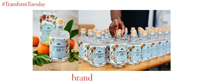
ClemenGold, a brand of soft citrus fruit developed in South Africa, has recently launched a new addition to its product range. The ClemenGold gin is, its website says, ‘crafted according to an age-old recipe’ with branding for the new product carried out by South African branding agency, Fanakalo. ClemenGold gin uses nine botanicals in its infusion, including ClemenGold oranges, cinnamon, honey, ground almond and juniper berries.
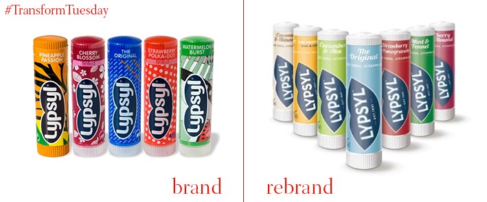
London-based design and branding agency Seymourpowell has developed an updated identity for classic chapped lip remedy, Lipsyl. While it once dominated the UK lip balm market, Lipsyl is working increasingly harder to cut through the competition it faces in a crowded market segment. In the rebranding process, Seymourpowell emphasises the new flavours made available by Lipsyl such as Cucumber & Aloe and Mint & Fennel. Claire Fisher, client director at Seymourpowell, says, "The category has matured and evolved rapidly in recent years with a soaring number of competitors offering new products, flavours and packaging structures, leaving Lypsyl behind. Our challenge was to make the brand feel relevant again whilst staying true to its unique heritage.”
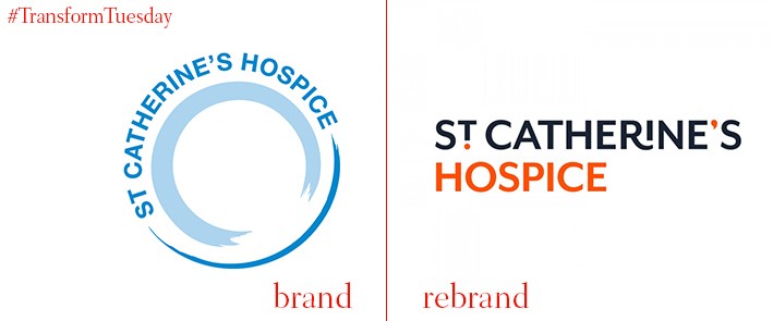
St Catherine’s Hospice, a West Sussex and East Surrey-based charity providing palliative care, has updated its visual identity to heighten recognition among the local community. The rebrand, carried out by London-based design practice, SomeOne, is the charity’s first in a decade and aims to draw attention to the work done by St Catherine’s during people’s final days. A tagline, ‘We’ll be there when life comes full circle’ is the notion around which the identity is designed; a black signature line runs through the brand’s visual iterations. Founder of SomeOne, Simon Manchipp, says, “Babies, and the brands associated with their care, get the lion’s share of attention, but the end of many people’s lives should, wherever possible, be as carefully managed as the beginning. We set out to give St Catherine’s the amplified volume of voice it deserves.”
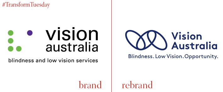
How to effectively brand a charity catered towards the blind and partially-sighted is an issue tackled by leading Australian blindness charity, Vision Australia, in collaboration with Australasian design agency, Designworks. The eight-month-long project took into account the charity’s strategy and brand positioning, as well as its surrounding architecture and visual identity. Its leading imagery consists of three dark navy links on a bright yellow background, emphasising the charity’s commitment to linking clients, staff, volunteers, donors and the wider community in a caring and considerate way. Vision Australia also displays a new tagline, ‘Blindness. Low Vision. Opportunity.’


