#TransformTuesday: 2 August
Every week, Transform examines recent rebrands and updated visual identities. This week's picks are below. For more from #TransformTuesday, follow @Transformsays
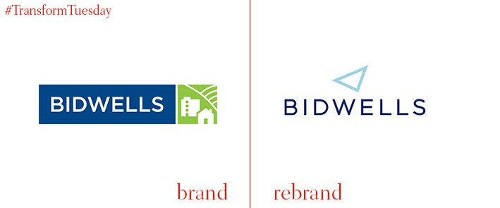
Bidwells is a 177-year old property consultancy which has a specific interest in properties around the Oxford and Cambridge areas. This focus is reflected in the new identity. Created by strategic brand consultancy, Industry, Bidwells’ visual identity now encompasses the traditional university colours of Cambridge light blue and Oxford dark blue. The logo is a triangle, reflecting the triage of cities in which Bidwells holds it specialist property interest. Marc McConnell, director of business development and marketing at Bidwells, says, “We have identified our key strengths and developed a clear vision for the company focusing on the geographical golden triangle and sectors where we have unrivalled knowledge and expertise.”
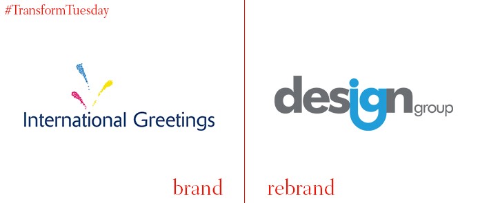
International Greetings, a company which focused predominantly on providing wrapping paper solutions, has been rebranded. As of summer 2016 it will be known as IG Design Group, following a rebrand by IG Design Group subsidary, Scoop Design, in conjunction with mattr.media, lyonsbennett, and Ampersand Company. The company focus is also shifting to specialise in designing products for special occasions. IG Design Group also hopes to expand its international markets, following the acquisition of US-based home décor and supply company, Lang Companies, Inc. The company has adopted a sophisticated grey and blue colour scheme, reflective of its expansion into the more serious product design market.
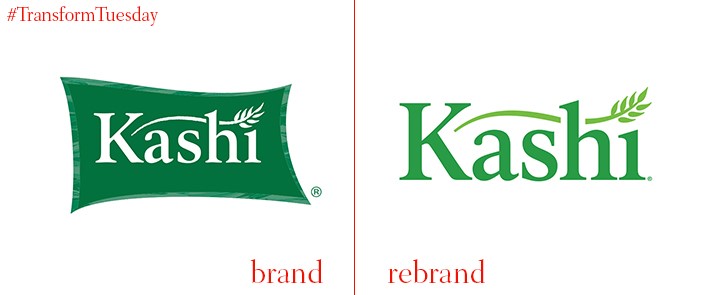
Global branding agency, jones knowles Ritchie (jkr), has redesigned the visual identity for natural and plant-based food producer, Kashi. Although Kashi was purchased by Kelloggs in 2000, it runs as an independent business; its refreshed packaging designed emphasises the importance of respecting food and its origins. As well as the new design, jkr has also included an editorial-style insert onto the Kashi cereal packaging. This aims to divert away from the over-reliance on farm and natural imagery relied upon by many alternative healthy brands. Instead, its new designs emphasise the contemporary nature of its packaging design while telling the stories of individuals making a big impact on the Kashi story.
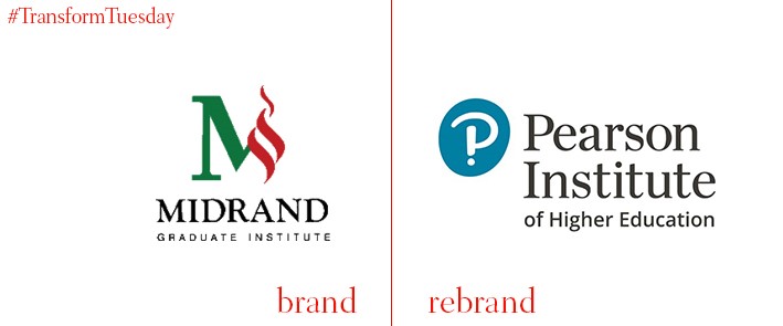
The university formally known as The Midrand Graduate Institute (MGI) has changed its name to The Pearson Institute of Higher Education (PIHE). In 2013, Pearson South Africa, a subsidiary of Pearson plc, acquired MGI and has been working with them on the rebrand, which sees the institute developed into a leading centre of higher learning. PIHE will specifically focus on employability skills which, given South Africa’s propensity for high unemployment rates, is paramount in ensuring the young people attending PIHE are given the best start in the workforce.
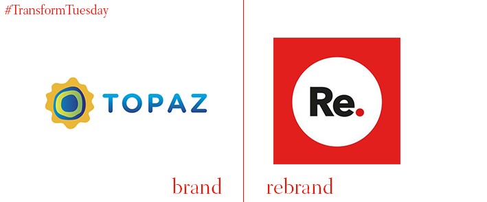
Topaz is a leading fuel and convenience store brand, based in Ireland, with 444 stations and a 35% market share. Topaz has announced its intention to invest €5mn in two rebranding projects, with the aim to standardise the business. The rebrand will entail the transition of 27 company-owned Topaz sites to become known as Re.Store. Topaz is also rebranding the Esso network, after the company acquired Esso Ireland.
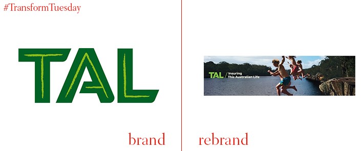
In 2011, TAL divested from the Australian Securities Exchange to be wholly owned by its subsidiary, Dai-ichi Life Group. Following this move, what was once known as TOWER became TAL – this acronym has also been rebranded, and now stands for This Australian Life. The TAL rebrand is a bid to raise both growth and trust in the business. It has been implemented alongside a widespread marketing campaign, by creative agency BMF Australia, which aims to focus on the positive, joyful aspects of life – rather than the negatives, towards which TAL services cater.


