#TransformTuesday: 19 July

Every week, Transform examines recent rebrands and updated visual identities. This week's picks are below. For more from #TransformTuesday, follow @Transformsays
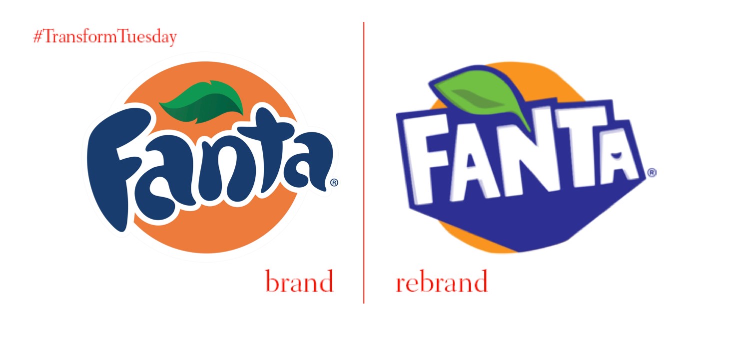
Fanta, the second drink to be introduced as part of the iconic Coca-Cola brand, is almost as famous as its Cola predecessor. The drink is now available in around 100 different varieties worldwide – it is consumed approximately 130mn times daily around the world. The historic label has been updated for a modern audience, by London-based beverage design agency, Drinkworks. Currently available in Poland, Italy, Romania, Serbia, and Malta, the packaging update is intended to increase the impact Fanta has on shelves – as the world’s first asymmetric bottle, it is certainly original.
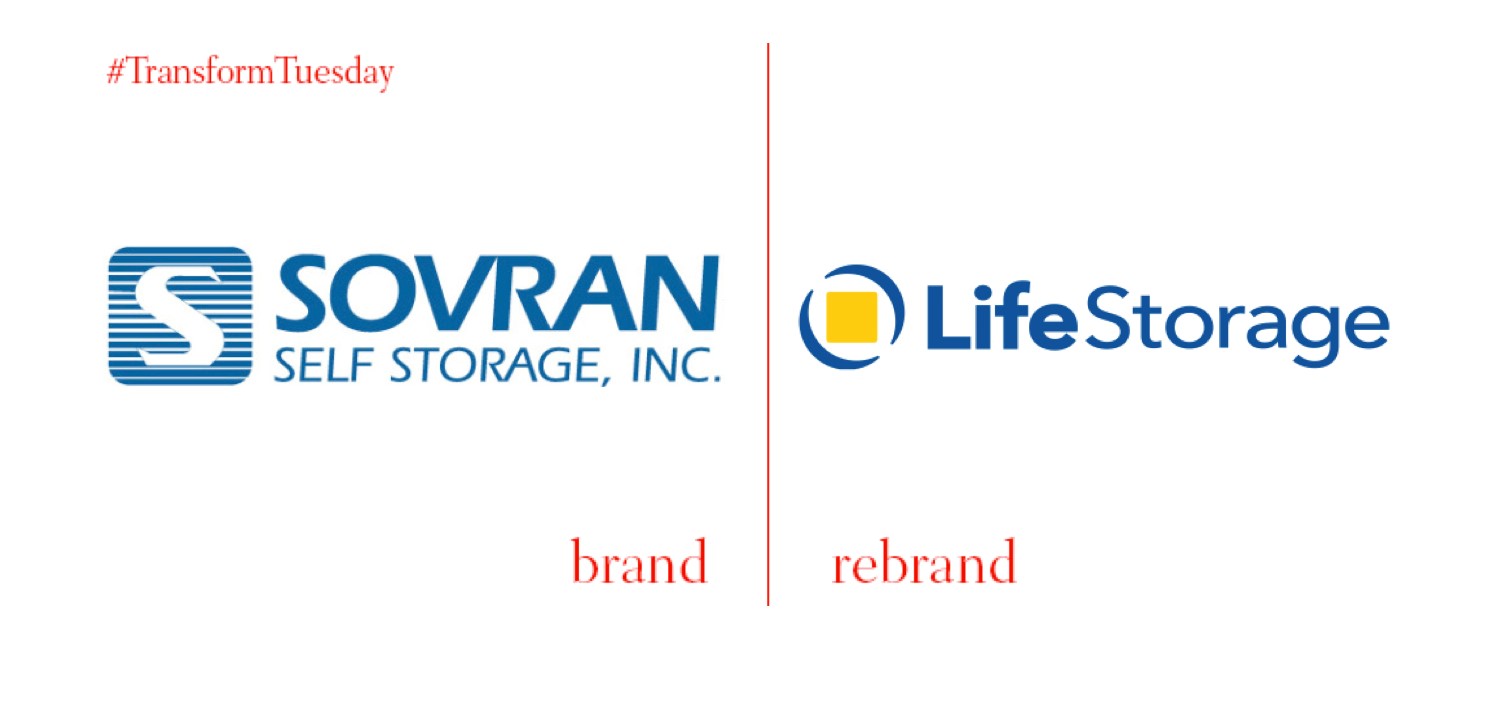
Sovran Self Storage, Inc., is a self-storage real estate investment trust with its headquarters in Buffalo, New York. It has announced a rebrand of its 563 storage facilities currently operating under the name Uncle Bob’s Self Storage, to Life Storage. It will also change its corporate name from Sovran Self Storage to Life Storage, in line with the facility name change.
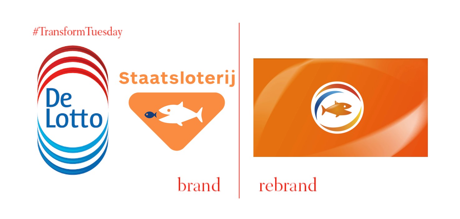
The two biggest lottery companies in the Netherlands, Nederlandse Staatsloterjj and De Lotto, have merged to become Nederlandse Loterjj. The move comes as a result of competition from foreign firms. The new logo design, which has been carried out by Leiden-based identity agency, Millford, reflects the previous identity of both child companies. An orange fish is taken from the previous Nederlandse Staatsloterjj visual identity, complemented by the bold colours and bright arches of De Lotto.
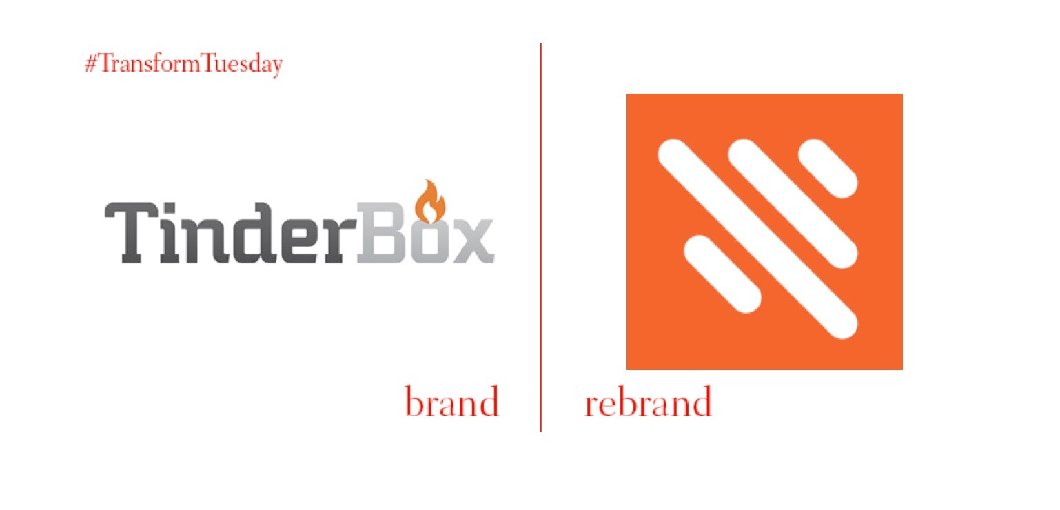
US-based TinderBox, now known as Octiv, is a provider of sales productivity solutions for company marketing departments. Based in Indianapolis, Indiana, the firm announced its name change, to Octiv, in July 2016. It will also hire over 220 new workers in the coming years. The rebrand is led by Indianapolis-based design consultancy Studio Science. Dustin Sapp, co-founder and CEO, Octiv, says, “[Studio Science] worked closely with our team and our clients to craft a brand that has strengthened our internal culture, and positioned us to lead the way in creating the future of sales.”
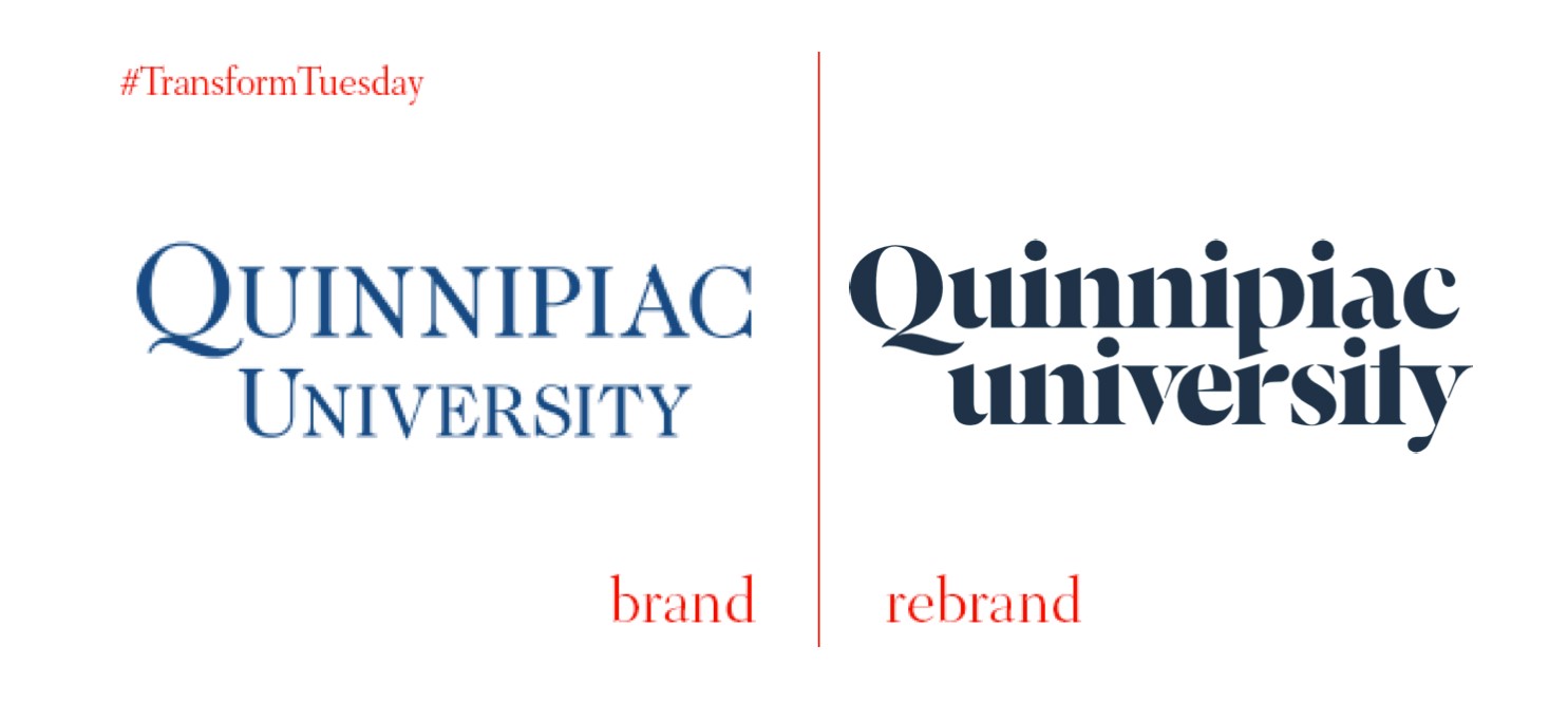
Connecticut, a state situated on the south coast of the US, is home to the private Quinnipiac University, an institution well-known for its public opinion polling centre. It has has recently updated its visual identity. Dropping the lowercase ‘u’ for university, it is now only ‘Quinnipiac’ which remains capitalised – a decision provoking slight controversy among students. Despite this, the visual update is sophisticated; the ‘double cut q’ is reflective of respected academia, and has become the university’s official symbol.
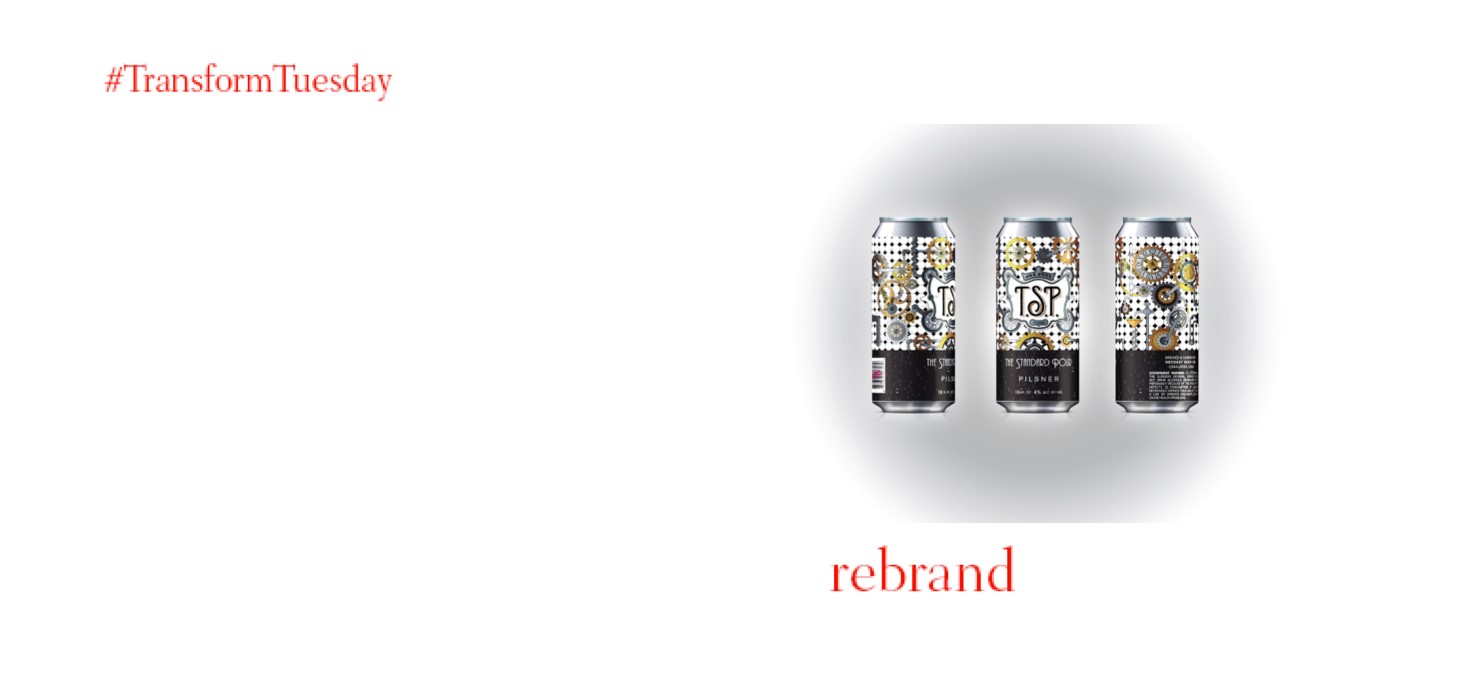
US-based White Unicorn Agency, which has studios in Dallas, Texas, has carried out a branding project for New York-based bar, The Standard Pour. The Standard Pour is known locally for its bourbon, cocktails and whiskeys; White Unicorn Agency has created a design specific to the bar’s new, and exclusive, range of beers. Sold only in The Standard Pour, the intricate design for its Pilsner is based on the 1920s prohibition era, made famous in novels such as The Great Gatsby. Hopefully this nostalgic atmosphere and interesting product design will soon be more widely available.