#TransformTuesday: 19 January
Every week, Transform examines recent rebrands and updated visual identities. This week's picks are below. For more from #TransformTuesday, follow @Transformsays

A product which amplifies the sound generated through even low-quality earphones, the new brand design for BoomCloud 360 reflects the product’s audio capacity. Exchanging faded grey and light blue for a bold, black font and clear logo placement, its asymmetry is assertive and cements the product as a forerunner of hi-fi technology. The rebrand was carried out by San Diego-based branding agency MiresBall.
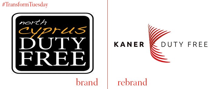
North Cyprus Duty Free has recently rebranded to Kamer Duty Free, in a move set to reflect its transition towards a more international business model. This is the next step on from its already large expansion of the North Cyprus Ercan airport duty free departures shop, which will be over 2400sqm by the time it is complete in March 2016. The new brand is sleek, using bold typeface to reinforce the location of its operations and creating a clear departure with the old, frankly unprofessional, previous logo.
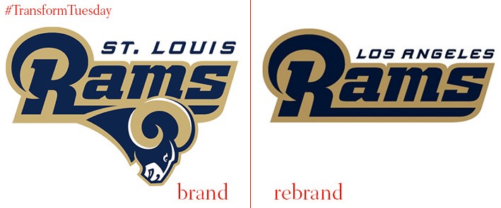
Although not much has changed visually in the St Louis to Los Angeles club rebrand, this offering is streamlined and chic to reflect a return to its original hometown. While omitting the ram from the new design in a bid to attract a new demographic of fans, keeping the old logo essentially intact ensures The Rams’ location change does not alienate it from NFL affiliation. It should also pave the way for the club to forge more corporate relationships.
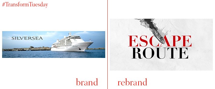
This Monacan-Italian luxury cruise provider reaffirms its target audience in a sleek and sophisticated rebrand undertaken by brand strategists The Partners. Although it has kept the original logo, implementing a black, red and white colour scheme lends a high-quality style that may not previously have been as obvious. Dramatic, cinematic images portray the travel made possible by cruises, rather than relying on the hackneyed images of on-board activities so often used by cruise liners.
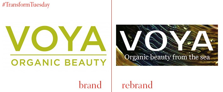
Irish cosmetic retailer VOYA has enlisted the expertise of global design consultancy Dragon Rouge to rebrand its collection of luxury skincare products. Based on seaweed, the original and main ingredient present in VOYA’s products, the new design returns to its aquatic origins with a crisp design and clear, striking images. The product’s organic and sustainable roots are also emphasised with a colour scheme largely based on dark green and marine blue.
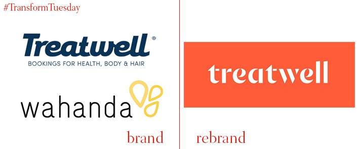
Wahanda, an online service offering reductions for hair & beauty products and services, has announced that it will be rebranding its UK operations to Treatwell. After recently acquiring Treatwell in Europe, the company will rebrand across its entire business; adopting the Treatwell name but with an entirely new visual identity. Its new, bright and colourful design, created by brand agency DesignStudio, is bold and clear cut. Centred around the notion of personal expression, Wahanda’s rebranding emphasises the individuality of its clients.


