#TransformTuesday: 19 April
Every week, Transform examines recent rebrands and updated visual identities. This week's picks are below. For more from #TransformTuesday, follow @Transformsays
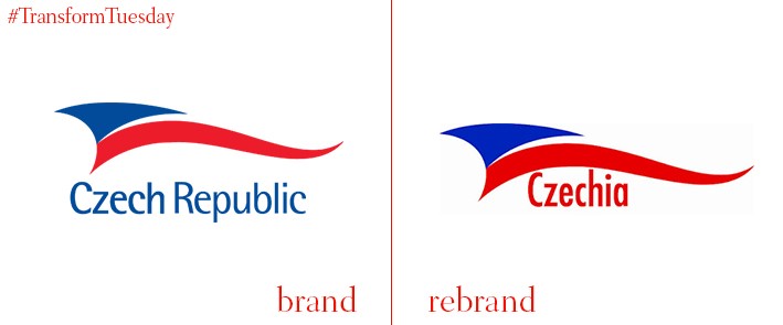
While not been gifted a new visual identity, per se, the country formerly known as the Czech Republic has been rebranded by name – henceforth, it will be known as Czechia. Part of a bid to make branding items such as sportswear and regional produce easier, the Czechia name has also been implemented to ensure populations residing outside Bohemia, the country’s main section, are integrated into the Czech national identity. This is not the first time the country has renamed itself, however. Following the collapse of communism, in 1993 the country formerly known as Czechoslovakia became separate states Czech Republic and Slovakia. Yet it had only been known as Czechoslovakia since 1918, after dissolution from the Austro-Hungarian Empire. It is therefore hoped that, despite still pending cabinet approval, this most recent name change is a permanent fixture of a state with such an interesting history, and variety of names.
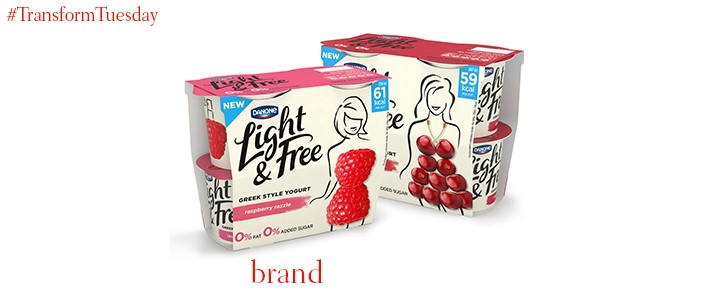
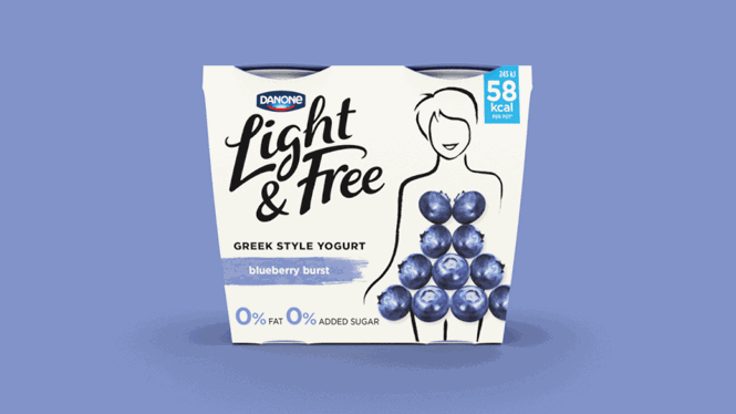
Female fashion and a renewed love of the healthy eating market can be cited as the visual inspirations behind Danone yogurt’s latest design, in a development led by London branch of international branding agency, Dragon Rouge. With 30% fewer calories than average fruit yogurt, the brand name ‘Light and Free’ emphasises the yogurt’s healthier credential. This is also reflected through the integration of fresh fruit into the skirts of the female figures on its packaging, in a move which also helps define Danone’s target market. Using appetising images of colourful berries and passion fruit, the packaging is stylish, tempting and bright – it easily slots into the canon of healthy, ‘lifestyle’ brand.
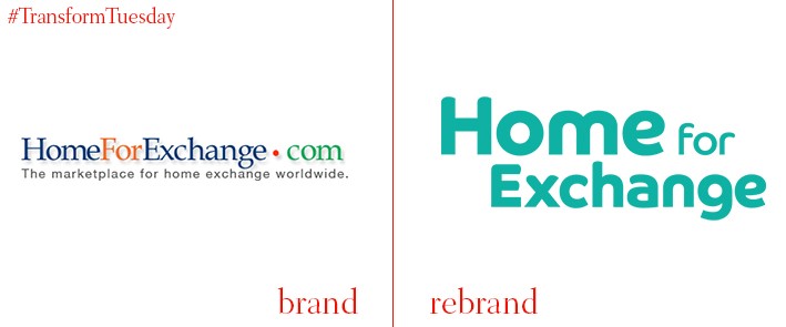
Following an unprecedented rise in popularity of alternative accommodation sites such as AirBnB, a growing and lucrative market has emerged. People now offer their homes, in return for accommodation or rental elsewhere. With properties available in 190 countries, Home for Exchange is a forerunner of this format; its visual identity redesign, created in-house, reflects the youth and vibrancy of the brand’s offering. Forgoing the multi-coloured, corporate feel of its previous brand identity, the new typography is styled in attractive teal. Its rounded design is welcoming, a feeling accentuated through the word ‘home’ set in slightly larger font than the other words. The rebrand follows the change in visual identity of parent site LoveHomeSwap, which acquired Home for Exchange in December 2015.
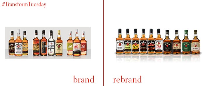
Produced in Clermont, Kentucky by Beam Suntory, Jim Beam whisky has been sold since 1796, with production halted only during the Prohibition era. Its new look, developed by London-based design agency Pearlfisher, is designed to unify the brand’s existing global portfolio. The new design philosophy and concept, cited by Pearlfisher managing direction Darren Foley as ‘living legacy’, integrates the notions of family and history into the Jim Beam packaging. Fresh tropes have been introduced to the Jim Beam design palette, such as rosettes, a redesigned logo and bottle profile, which are at once unifying and also allow the products to be differentiated from one another.
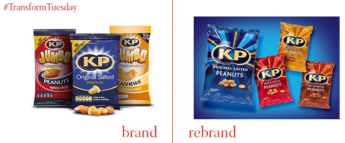
Any British person entering a pub since the mid-50s will be familiar with KP Nuts, a staple bar snack and much-loved convenience food brand. With its heritage in mind, London-based design agency Coley Porter Bell, tasked with the redesign, has not strayed far from the original imagery. While retaining the bold blues, reds, oranges and browns which differentiate the different nut flavours, Coley Porter Bell has also included yellow rays around the KP logo. Designed to distinguish KP from its rival brands and highlight its positions as leader of the snacking retail category, the inclusion of a new chilli flavour also lends the brand some diversity in a highly competitive market.
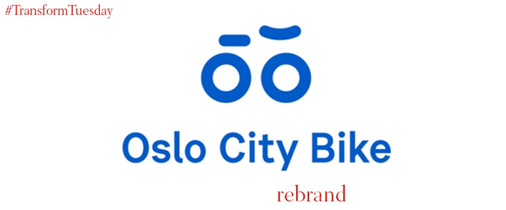
Design agency Heydays, a Norwegian firm local to Oslo, has created a visual identity for Oslo Bysykkel (or Oslo City Bikes), a city wide bike-sharing system across Norway’s capital. Expanding to encompass around 3000 bikes in 300 stations, bikes will also be available in between Ring 2 and Ring 3 of the city, as well the centre. Although a striking blue before the redesign, the brand itself had no real distinctiveness. Its new iteration is based on the idea of a smiling face, using an abstract outline of a bicycle to create a dual identity. Optimised for digital use, as well as acting as a logo to appear on the racks and bicycle frames, the design is universally applicable and should appeal to tourists and local alike.


