#TransformTuesday: 18 October

Every week, Transform examines recent rebrands and updated visual identities. This week's picks are below. For more from #TransformTuesday, follow @Transformsays
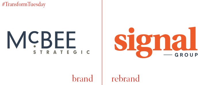
After a planning stage of almost two years following the departure of its founder Steve McBee in 2014, the company previously known as McBee Strategic has changed its name to Signal Group. It has also undergone a total overhaul of its brand assets, which Signal Group says is intrinsic to its ‘multi-year strategic plan.’ In a statement, Peter Shields, executive committee member at the firm and Wiley Rein managing partner, says, “Our goal at Signal is to reach beyond the traditional business of advocacy, communications, and public affairs. Today’s audiences aren’t difficult to reach, but sustaining their attention and commanding action is what we have built Signal to deliver.”
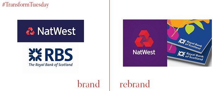
A 1968 brand guideline document forms the basis for Natwest’s new identity, in a visual rebrand led by the London office of globsl design agency Futurebrand, which aims to differentiate the bank from its competitors on the high street. While the original iteration was grey and black, NatWest has retained its purple-red colour palette in order to not stray too far from its established identity. The rebrand also comes as owner of NatWest, the Royal Bank of Scotland, aims to establish its brand family as a ‘house of brands’ and strengthen the investment arm of the NatWest bank.

In a climate with digital disruptors around every corner, Pandora is the latest music-based app to take on the likes of Spotify, Apple music and Deezer. The changes to Pandora’s new logo and brand identity, designed by an in-house team headed up by new creative executive director, Julie Scelzo, is are the first for Pandora since its launch, 11 years ago. It is also expected that Pandora will announce a streaming service to rival Spotify’s service, the colour palette and visual identity of which was also updated earlier this year.
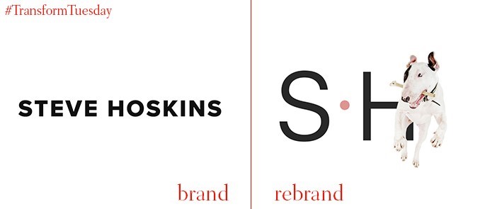
Award-winning Steve Hoskins, a photographer who specialises in landscape and animal photography, has updated his brand identity with help from design and communications agency, Designhouse. The original identity has been stripped back to be replaced by a simplistic monotype, black and white in palette, and with the addition of a holding dot. Designhouse has also taken the ‘camera obscura’ as inspiration for a visual device of two triangles, which act as a framing device for Steve’s photography. Hoskins says, “The challenge was not to overwork the logo and to produce a simple solution and system that complements the photography. Designhouse has interpreted and developed our ideas to create a really fresh look for the business.”
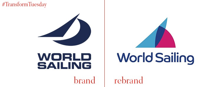
Branding agency, Rbl, has created a new identity for global sailing governing body, World Sailing. Developed in the shape of an abstract sail, the new visuals aim to convey the history and heritage of sailing. It also ushers the governance body into the modern age, particularly through the World Sailing name – formerly, it was known as the slightly clunky International Sailing Federation. The use of both navy and light blue is a nod to the organisation’s maritime heritage, while the blue, white and purple complement the palette and the abstract shapes render it suitable for digital use.
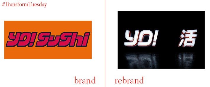
The Japan-inspired restaurant chain, Yo! Sushi, has retained its ubiquitous orange but updated the Yo! Sushi name in the first logo evolution since its launch in 1997. The bold move drops the ‘sushi’ part of its logo altogether, relying on its brand equity for recognition as the chain attempts to expand into more international territory. Carried out by London-based graphic design studio, Paul Belford Ltd., the rebrand lends Yo! a more urban influence. The studio has also dropped the anime credentials from the previous brand update, carried out just six months ago. The Yo! imagery is based on Tokyo-inspired designs, with bold imagery and defined characters emphasising the ‘eat well’ theme of the brand.