#TransformTuesday: 17 May
Every week, Transform examines recent rebrands and updated visual identities. This week's picks are below. For more from #TransformTuesday, follow @Transformsays
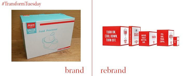
40 years ago, retailer Argos introduced a new way of shopping to the high street, through the use of catalogues. Now trading as a largely online homeware retailer, it needed an update to remain relevant in an increasingly competitive marketplace. Strategic brand consultancy The Partners has thus taken the Argos brand back to basics – but with a colourful edge. The Partners’ strategy sees the launch of a new Super Value range and the development of over 140 lines, all with a humorous edge to its product descriptions. Communicated across its print, digital, advertising and store environment, The Partners has worked to cement ensured Argos as a brand for the 21 century.
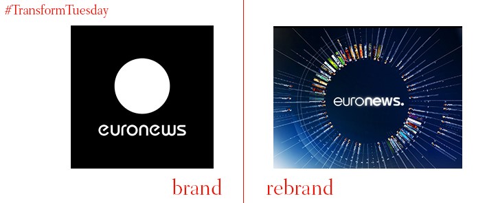
To cement its identity as an organisation relevant to the digital age, European news agency Euronews has updated its visual brand, with the help of international digital branding specialist, Lambie-Nairn. Using real-time still images atop a striking black and white colour palette for its overall channel ident, the urgency and relevance of Euronews broadcasts is communicated. The blues and teals used by Lambie-Nairn to form an individual identity in Euronews’ Sports and News idents emulates a classic news channel look, while emphasising the contemporary relevance of a European news channel.
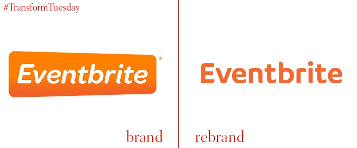
Established in 2006, Eventbrite is the world’s largest self-service ticket platform, having processed around 200 million tickets since it came into existence. Its visual identity has been redesigned in-house, including a reversal of its original white on orange colour palette – now, it displays orange lettering on a white background. The Omnes font has also been replaced with a hybrid, formed of Lineto Circular and FF Cocon, with type curves lending the Eventbrite personality a new edge.
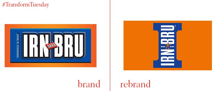
A carbonated, orange-coloured soft drink, IRN-BRU has become synonymous with the home of its production – Scotland. In its first brand refresh since 2008, and in collaboration with brand design consultancy jkr (Jones Knowles Ritchie), the drink has embraced its heritage to ensure it remains relevant to the contemporary soft drinks market. A girder, a type of beam used in construction, is the design basis for the new cans, forming a letter I on the front – this is also the new IRN-BRU icon. Jkr has also combined two of the product's main USPs, sugar-free and originality, to develop an overall ‘masterbrand’ – iconography is essential in ensuring the drink remains popular with its customer base.
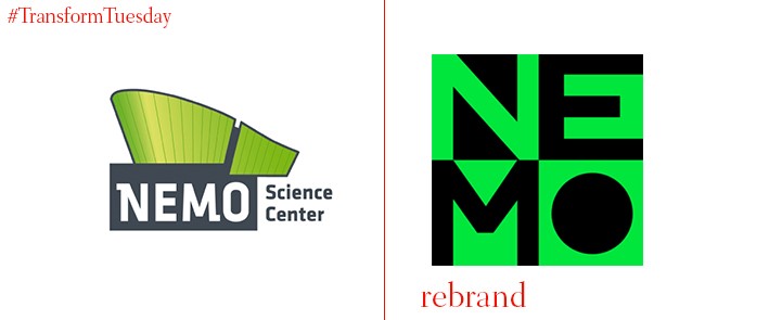
Italian architect Renzo Piano designed the building that has homed the NEMO Science Museum since 1997. Where the previous logo acknowledged the culture associated with the building’s history, its new visual identity adopts a striking colour scheme while still making it clear that the place functions as a science museum – it used to, among other things, be called ‘Dutch Institute of Labour and Technology’. The new logo, created by international design agency Studio Dumbar, lends itself well to the various places on which the museum branding will be applied. The bold green and black, as well as its aesthetic square design, renders it both applicable and recognisable across the brand architecture.
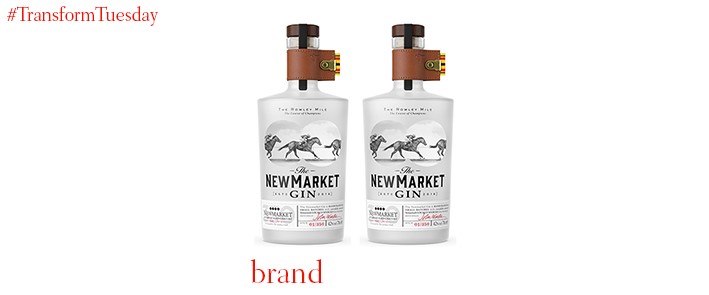
Juniper, coriander, Seville oranges, wild horseradish and wild chive are just some of the flavours abound in this specially crafted gin, created by Master Distiller John Walters. Celebrating the 350-year history of racing in Newmarket, Suffolk, designs for The Newmarket Gin bottles were produced by London-based branding agency Nude Brand Creation. A frosted glass binocular shape at the front of the bottle allows the drinker to spy the horses designed to the rear of the bottle – the leather collar bears the specific Newmarket Tan shade.
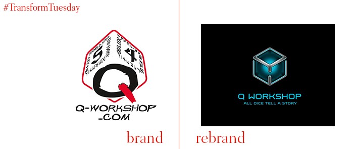
Design innovation agency Minima Agency was tasked with rebranding Poland-based dice manufacturing company, Q Workshop, the biggest manufacturer of ornate dice in the world. By combining the letters Q and W to create a cube shape, a new logo has been produced for the company, along with its new brand message- ‘All dice tell a story’. Imagination is also a key theme of the Q Workshop design, with designs on its choice of accessories reflecting the variety of genres and universes implicit in a fantasy world.


