#TransformTuesday: 15 March
Every week, Transform examines recent rebrands and updated visual identities. This week's picks are below. For more from #TransformTuesday, follow @Transformsays
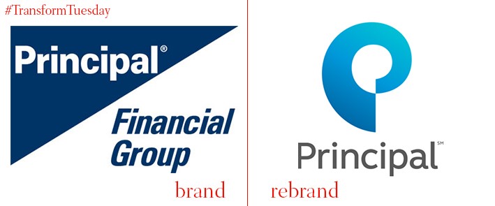
The sharp-edged, corporate logo which defined the Principal brand has been simplified, along with its name which has dropped the Financial Group tagline altogether. Through introducing a softer, lighter blue/turquoise palette into its brand identity, Principal hope to alleviate the concerns of potential customers that its services were too complex, a prevalent fear with the previous branding. Yet with brand strategy and design agency, Lippincott, leading the redesign, the agency focused on the idea of ‘human embrace’ in order to foster an atmosphere of unity and collaboration in the new visual identity. The spiral-like design of the brand image is visually more pleasing than the original, fairly severe, offering, and lends the Principal name a more rational, approachable image.
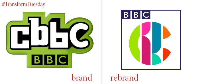
CBBC, the children’s flagship entertainment channel, has undergone its first rebrand in a decade. A new multicoloured brand design has been unveiled, designed by Red Bee Media – it is described by CBBC controller Cheryl Taylor as “a colourful and versatile identity that is box fresh and fit for purpose in a mercurial and constantly shifting media landscape.” It certainly is colourful, with a veritable rainbow of green, pink, red, orange, burgundy, and blues combing to create a ‘C’ shape. The background, which once fitted around the logo, has been replaced by a mid-blue square, complete with BBC branding on the top left corner. Although there has been some complaints that - like its BBC3 logo counterpart – the new visual identity is hard to read, a key aspect to the rebrand was allowing viewers to state their preference for a design. In an environment where digital is increasingly challenging the television in entertainment choice, a visual identity which allows CBBC to stands out amidst all the other distractions has been developed.
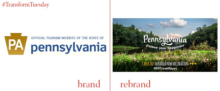
The old logo for Pennsylvania included a keystone, a reference to its nickname of ‘the keystone state’. Despite this historical allusion, for a state which wanted a rebrand to promote itself to tourists, it was decided a friendlier, more appealing look was needed, along with clearer symbolism. Hence, an overall softer and more welcoming image has been developed by Red House Communications. Its slogan, ‘Pursue Your Happiness’, was developed out of consumer focus groups, which stated a preference for the new state brand to be centred on fun and adventure. The custom-produced font aims to uplift the area with a contemporary feel, while the ‘happiness’ alluded to in Pennsylvania’s new branding is reflected through the upwards incline of the logo – almost as if it’s smiling to any new visitor.
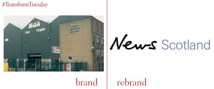
News UK, the parent brand which owns widely-read titles The Sun, The Times, and The Sunday Times, has announced that its Scottish arm will now be known as News Scotland. This latest rebrand comes after it was revealed that one in five News UK readers live in Scotland – a general manager, Richard Bogie, was appointed to work across Scottish editions of the aforementioned papers in 2015. Despite becoming a separate arm, News Scotland retains the same design as its News UK counterpart, emphasising its inclusion in the parent brand. The stark bold black font is instantly eye-catching, providing a contrast to the softer blue of ‘Scotland’ – while possibly by chance, the branding coincides nicely with the blue and white of the Scottish flag.
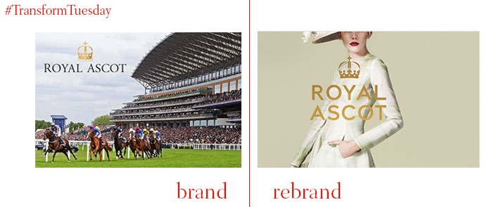
Ascot racecourse has rebranded, in a bid to communicate to its clientele that the event space and venue is open throughout the year for occasions other than the Royal Ascot horserace. As a result, the overall Ascot brand has been given a new identity by London-based design consultancy The Clearing. Its redesign seeks to introduce storytelling into the Ascot brand in order to extend its appeal, while according to the agency, ‘juxtaposing a classic colour palette with a graphic pattern inspired by racing silks’. Its characteristic crown, albeit simplified, remains atop of the Ascot typeface; the lettering itself has also been toned down somewhat. Its capital sans serif font is clearer and less fussy than the previous incarnation, lending itself well to anything it might be applied to, while retaining the elegance and sophistication that makes Ascot unique.
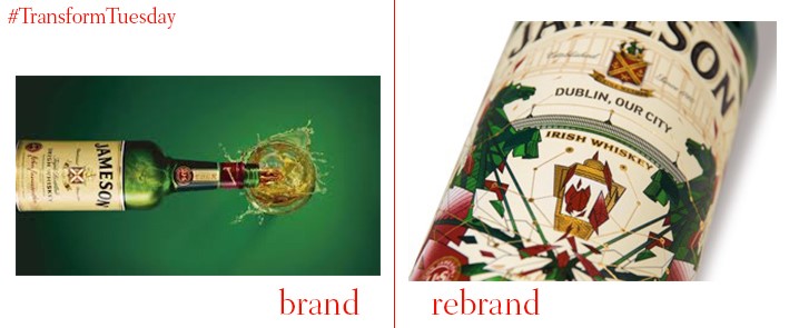
In anticipation of 17 March, celebrated in various locations around the world as St Patricks Day, creative branding and design agency Pearlfisher has unveiled its annual rebrand of the classic Jameson’s Irish whiskey. This is the fifth year in a row it has done so. Teaming up with Dublin street artist James Earley, the design is inspired in equal measures by the bridges that cross the River Liffey in Dublin, and Earley’s own family’s stained glass business, which ran for 100 years in the centre of Dublin. This year’s exciting visual offering marks a change from the usually more sedate designs present on the whiskey frontage. It is hoped this collaboration will highlight the potential for innovative artwork on such products, through the linking of ‘space, people and ideas’ - its availability in 38 markets will help spread the St Patricks Day cheer.


