#TransformTuesday: 11 October
Every week, Transform examines recent rebrands and updated visual identities. This week's picks are below. For more from #TransformTuesday, follow @Transformsays
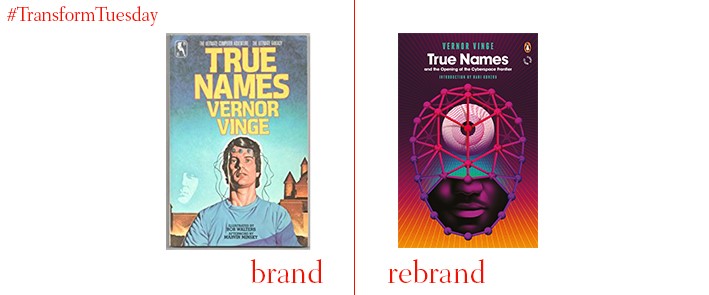
Scot Bendall, of independent design studio La Boca, has teamed up with classic book publisher Penguin to reimagine the covers of selected classic sci-fi, fantasy and horror novels. Illustrators at La Boca were free to read the books then create imagery for the covers derived from their imaginations. With no template to stick to, the designers developed a truly a unique identity for each story. Although the designs were created with the intention of attracting a more contemporary audience, the illustrators were also careful not to disregard the importance of past decades during which the stories were written. Speaking to Design Week, Bendall says, “In many ways this was a dream commission for us as Penguin sci-fi covers have always had a significant influence on La Boca, especially the work of David Pelham and Alan Aldridge.”
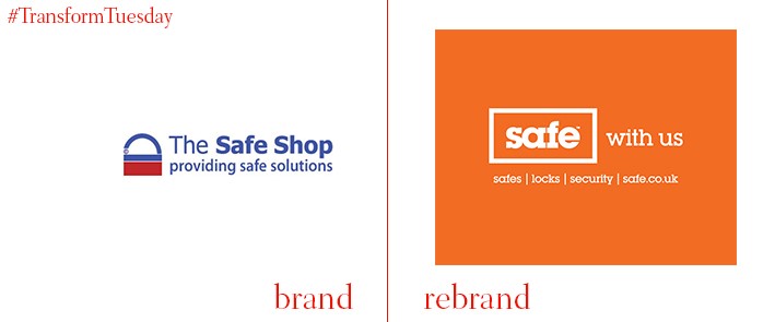
Safe, the online supplier of locks, filing cabinets and safes, has recently undergone a rebrand to updated the previously tired brand identity and highlight the expertise of its staff and suppliers. Increasing competition from online marketplaces such as Amazon creates stiff competition; Yorkshire-based branding, strategy and design agency, 10 Associates, combats this with a fresh and visually arresting new identity for Safe. Managing director at Safe, Anthony Neary, says, "10 did such a great job of guiding us through this process, the brand they created for us is spot on and is easy for us to live up to as it truly captures who we are. They wowed us creatively and are full of ideas for how we give customers a fabulously branded experience.”
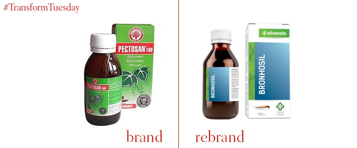
Latvian pharmacological company, Silvanols, is a well-known brand across Latvia, which markets itself on its green credentials. Building on the reputation Silvanols has for this more ecological approach, independent Riga-based branding design agency, Unicorn, has developed a new brand identity to bring the company aesthetic closer to nature. The products offered by Silvanols are diverse and range from tablets to sprays; Unicorn ensures the packaging is diverse enough to ensure the designs suit all product types. Illustration inspiration is derived from the Baltic people, who traditionally collected berries and herbs to treat ailments through the winter months.
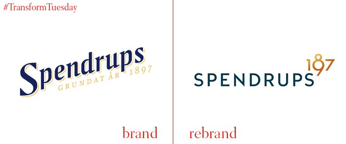
Spendrups, one of the largest breweries and beverage importers in Sweden, was founded in 1897 and distributes its products across the country, including to restaurants and Swedish supermarket chain, Systembolaget. At the end of September 2016, Spendrups launched a new corporate identity, developed by Swedish brand design agency, Neumeister. Its font is now sans serif, unlike the previous iteration which had a more classic feel. Although the blue and gold colour scheme remains, the overall changes marks the brewery’s shift in global outreach strategy.
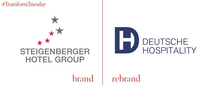
Frankfurt-based hospitality group, Steinberger Hotels AS, is consolidating its three hotel groups in order to expand into international markets more effectively. Steigenberger Hotels, the luxury arm, Jaz in the City, the young and urban arm, and IntercityHotels, with excellent transport hub links, currently comprise the overall Steinberger Hotels AS brand. They will henceforth be known under the umbrella brand, Deutsche Hospitality. While branches of all three hotel brands will retain their current names, following the merge the external brand identity will change to reflect the energetic characteristics of the company. CEO of Steigenberger Hotels AG, Puneet Chhatwal, says, "These two words combine our German roots and our international vision. The new umbrella brand is a vital lever that will unleash dynamism, help us to expand internationally, and drive innovation."

L.A.-based TrendCreators provides market research and surveys to companies across the US, regardless of size or industry. After 25 years, head of the company previously known as Trendsetters, Lynda Hubbard, decided the company’s visual identity required an updated to truly reflect the business’ recent growth and development. The change of name more effectively highlights the services offered, while a change from its initial trophy aesthetic indicates TrendCreators’ relevance in a contemporary market. DBD International, a global branding agency headed up by David Brier, developed the strategy behind the TrendCreators rebrand. Brier says, “After an initial discussion, we decided we had to have the brand reflect the voice of the customer, and to more accurately mirror the world of her customers. Not only in words but in visuals; not only to freshen up the brand but also to have a look that was reflective of - today’s design aesthetic and the concerns of today’s businesses.”


