#TransformTuesday: 10 May
Every week, Transform examines recent rebrands and updated visual identities. This week's picks are below. For more from #TransformTuesday, follow @Transformsays
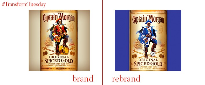
On Monday, 2 May 2016, UK-based Leicester City FC enjoyed a historic win of the Barclays Premier League. Diageo drinks, in collaboration with independent creative agency, RPM, has released a one-off edition of its popular Captain Morgan’s spiced rum in celebration of this feat which, at the season's beginning, had 5000/1 odds. Named Captain ‘Wes’ Morgan, after Leicester City’s popular captain Wes Morgan, the bottle will feature the player in place of Captain Morgan himself. Captain ‘Wes’ Morgan’s royal blue and white robes will match his Leicester kit, with a medallion inscribed with the 2016 date to mark the year of Wes Morgan’s winning captaincy.
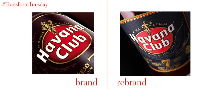
The iconic Cuban rum, Havana Club 7, has undergone an identity restructure and packaging redesign, at the hands of UK-based creative design agency, Pearlfisher. In a collaborative effort between the agency’s three London studios, Futures, Strategy, and Design, Pearlfisher has renewed integrity in the brand, beginning with Havana Club 7 – its most popular product. Inspired by authenticity and cultural immersion into the life of Cubans, Pearlfisher, along with Cuban artists, combined techniques of screen printing and 19th century cigar art. This is intended to communicate the depth of the rum’s legacy, as well as develop an independent and unique visual language for the brand. The rebrand is set to roll out across all Havana Club products over the following months.
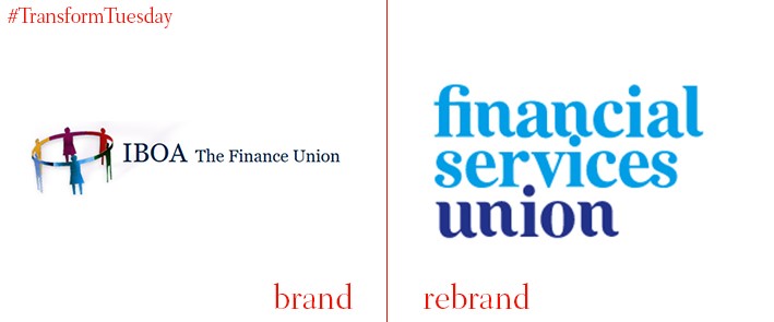
The Irish Bank Officials’ Association, a private sector trade union based in Ireland and representing around 15,000 members, is rebranding after almost a century. In a bid to attract more members from the wider financial sector, the IBOA will henceforth be known as the Financial Services Union. It has retained its soft blue colour palette, although its white serif typeface marks a change from the sever capitalisation of its previous logo.
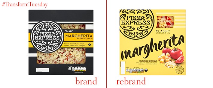
Pizza Express is an Italian-influenced restaurant chain popular across the UK, although it has also expanded to other regional markets, such as the Middle East. Packaging design agency, Bulletproof, has updated its ‘At home’ range, in a bid to consolidate its retail offerings with the Pizza Express restaurant designs. Refreshed colour palettes allow shoppers to differentiate between standard and premium ranges, while photos of ingredients, shot by food photographer Andy Seymour, adorn the package fronting – an unusual move in an industry which usually relies on clear packaging to showcase its product and ingredient selection.

Leading online ticket marketplace, StubHub, has rolled out a rebranded design and new strategic vision – despite only updating in August 2015. The corresponding campaign has been designed by San Francisco-based advertising agency, Goodby Silverstein & Partners, designed to generate the excitement an audience can expect from live events. Turquoise now acts as the brand’s main colour, and StubHub has replaced its previous bold, block lettering with the Interstate font type.
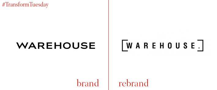
Fashion names Emma Cook and Alasdhair Willis have been drafted in, to help British fashion brand Warehouse retain its youthful, competitive edge on the high street. Although the logotype remains as black typeface on a white background, it is now a capitalised, sans serif font to reflect a serious competitive edge. Warehouse has also changed its target audience, shifting it upwards in age slightly to attract what it describes as the ’25-40-year-old city woman’. With its brand focus reflected in its move to luxury packaging, an adequate brand strategy will help differentiate from major rivals such as Topshop, or newer high stree additions, such as &OtherStories.


