#TransformTuesday: 1 November
Every week, Transform examines recent rebrands and updated visual identities. This week's picks are below. For more from #TransformTuesday, follow @Transformsays
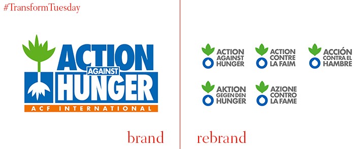
The green leaf which constituted part of Action Against Hunger’s previous logo iteration caused confusion to those unfamiliar with the charity and its work. As a result, and to unify the organisational brand framework, London-based brand consultancy Johnson Banks reinterpreted the visual identity while ensuring it remained true to its initial design cues. The ‘for/against’ concept is retained, due to its coherence across many languages. In this guise, the rebrand also encouraged the French-based charity to update its brand name to Action Against Hunger across the 50 countries in which it operates. Known as ACF (Action contra la Faim) universally, this causes some translation issues and confusion in non-French-speaking countries.
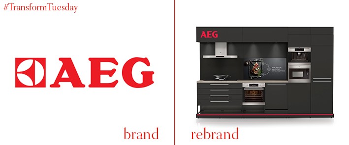
In September, the visual identity of home appliance brand, AEG, underwent a major redesign. It was carried out by London studio of global brand and marketing consultancy, Prophet. The brand update involved making the red colour palette of the AEG name darker, losing the parent name ‘Electrolux’ from its products and streamlining the digital and in-store experiences in a more coherent way. The changes made by Prophet reflect the AEG mantra of delivering new innovations in the home appliance sector before its competitors. Gregg Finlay, creative director at Prophet, London, says, “The new brand allows AEG to tell its story in much richer, meaningful ways. Crucially, the brand is really single-minded, so no matter where you are in the consumer journey it is expressed consistently, whether that be visually, verbally or experientially.”
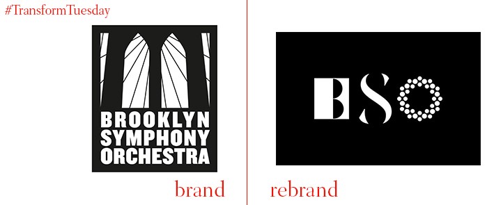
Brooklyn Symphony Orchestra, established in 1973, has commissioned the New York office of brand strategy agency, The Partners, to updated its visual identity. The rebrand comes as the orchestra moves to permanent residency in Brooklyn Museum, a big move for an organisation which started out as a small collaboration between Brooklyn residents. New components of the logo reflect three distinct facets of the Brooklyn Symphony Orchestra’s identity: it is the only Brooklyn-based high quality musical experience, beauty and power inherent in classical music and the community collaboration which has made it possible. Nick Clark, executive creative director of The Partners New York, says, “It has been a delight working with the Brooklyn Symphony Orchestra. The passion and commitment of the players and the organisation reflects the true meaning of the word amateur: “from the heart”.”
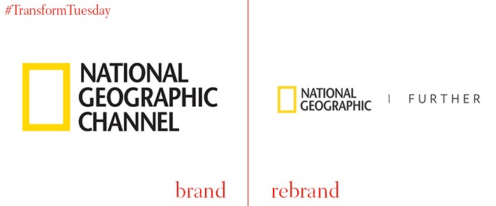
Global magazine and entertainment brand and information vessel, National Geographic, has updated its brand to include the word ‘Further’ across all its architecture. It has also redesigned its iconic National Geographic magazine covers and adopted a more consistent font style across its printed materials. These visual magazine changes were implemented by New York-based branding agency, Gretel, to coincide with the beginning of a specially commissioned series about Mars beginning November 2016. There will also be programmes about the red planet commissioned across the National Geographic digital networks. Dropping the word ‘channel’ from its name closely aligns the brand outputs and the ‘Further’ tagline will be extended to include additions such as a ‘Further’ section to the National Geographic magazine.
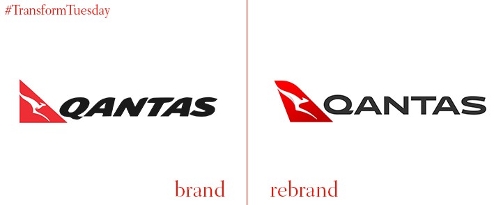
Australia-based airline company, Qantas, has retained the red and white of its traditional livery but updated its kangaroo logo. This latest rebrand coincides with the release of a further eight aircraft, all Boeing 787-9 Dreamliners. Although the first of this new fleet will be revealed in autumn 2017, Qantas began rolling out its new brand architecture digitally and across its signage and marketing materials. This also marks the fifth updated for the Qantas brand since its launch in 1944, with the aim of communicating a more premium feel. Marc Newson, consultant designer at Qantas, says, "The typography for the word Qantas, which measures almost two metres high on the 787, has been carefully streamlined. And Qantas will appear on the aircraft’s belly, so you can tell when it’s the national carrier flying overhead.”
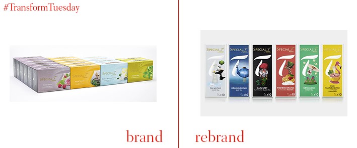
The fantastical world created Nestle’s premium tea capsules, Special.T, campaign has been recreated in a brand update by B&B Studio. The London-based brand design agency has focused on segmentation and navigation to differentiate Nestle’s tea flavours, whose packaging previously carried similar designs. An embossed logo and imagery specific to each flavour lends to brand a more premium feel, while the strong and bold brand icon lends Special.T a distinct identity among the instant tea and coffee market place. B&B Studio is also lined up to produce future ‘special edition’ packets. Shaun Bowen, creative partner at B&B studio, says, “The wonderful world of SPECIAL.T was ready to be captured and transformed by us into distinctive and beautiful packaging. We were able to communicate the intrinsic premium qualities of the tea brand and also bring some consistency across the various teas to express the full SPECIAL.T experience.”


