Timeline: Penguin Random House
Penguin Random House merged in 2013 to form one of the world’s largest publishing groups. Its combined logo transformed from that of a placeholder to a stylish wordmark in its own right. But both organisations have grown through acquisition and by adding imprints to their portfolios. Uniquely though, most of its sub-brands and imprints have brands that are unchanged over the decades.
Random House
1927-present Groundbreaking in many ways, Random House has grown to become one of the biggest publishing houses in the world. Its acquisitions and growth has seen it publish major international bestsellers, open offices around the world and expand its interests into film. Its 2013 merger with Penguin 2013 hasn’t changed the company’s home location in midtown Manhattan, the beating heart of the brand since its inception.
Puffin
1940-present The children’s imprint was conceived of as the counterpart to Puffin and Pelican. The puffin logo has watched over some of the most prominent modern children’s books including the Chronicles of Narnia, Charlotte’s Webb, the Hobbit and American classic Spot the Dog, by Eric Hill.
Pantheon Books
1960-present Alongside Knopf, Pantheon is one of the core brands in the Random House stable. It made its name not through a strong visual identity, but through a reputation for publishing political, historical and controversial titles.
Everyman’s Library
1991-present Random House’s counterpart to Penguin Classics, Everyman’s Library is also well-known for its standardised cover design and visual system. Random House relaunched the 100 year-old brand in 1991, breathing new life into old books.
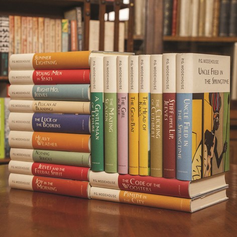
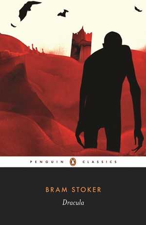
Penguin Classics (right)
2002-present Though they have been around since 1946, the Penguin Classics brand most commonly seen around universities worldwide is the black-with-white-band iteration. The brand, which features a large image and orange author name, has become synonymous with classic literature.
Rough Guides (below)
2003-present A recent addition to Penguin and founded in London, the travel brand has been showing people around the world with budget-friendly advice and a unified visual style for 34 years.

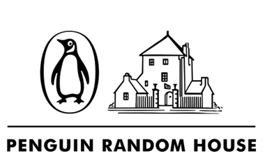
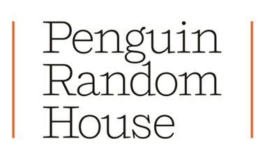
Penguin Random House
2014-present The newly-designed corporate brand for Penguin Random House was implemented by Pentagram as a way to avoid using one of the company’s 250 plus existing symbols. The new, unified wordmark was neutral ground for the two companies and marked the beginning of a new era. The simple serif font Shift is related to Courier and thus has an inherent correlation to the world of publishing.
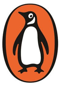
Penguin
1934-present The iconic orange penguin mark stands watch over a stable of imprints that includes homegrown brands like Puffin and Penguin Classics, and those it has acquired over the years like Dorling Kinderseley and Rough Guides. Since 2013, the little penguin mark has ceased to be the corporate logo, but still retains pride of place on books and other Penguin products.
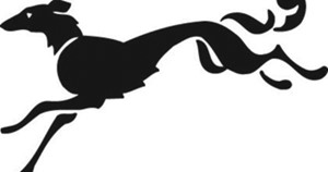
Alfred A. Knopf
1960-present A longstanding mid-size publisher, Knopf’s logo dates to 1925 and was designed by founder Blanche Knopf. It was incorporated into Random House in 1960. The ‘borzoi colphon’ brand icon is still a signifier of the imprint’s publications.

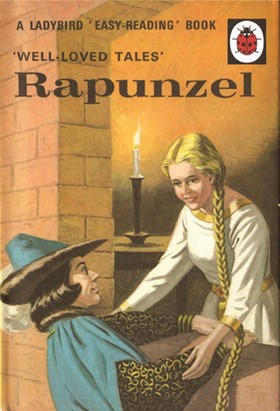
Ladybird Books (left)
1998-present Ladybird Books, founded in 1867, was incorporated into the Penguin family in 1998. The vintage cover style, dating to 1940, is still popular today and has been experiencing a revival with modern booklets published under the classic brand.
Dorling Kindersley (below)
1999-present DK Books was founded in 1974 before joining Penguin in 1999. It has a range of titles, but is best known for its informative illustrated tomes.

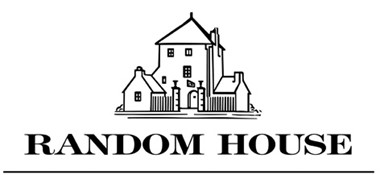
Penguin Random House
2013-2014 The first corporate brand after the Penguin Random House merger in 2013 was designed as a placeholder. It combined the iconic Penguin and and Random House icons together with a serif wordmark. It did the job while the company went through a transition period, but was understandably replaced after only 11 months of service.