The Endpoint field guide to the built environment
For shoppers, navigation through a department store can be a task worthy of the best mariners. Endpoint teamed up with John Lewis to simplify that task and align brand touchpoints in store. Amy Sandys reports
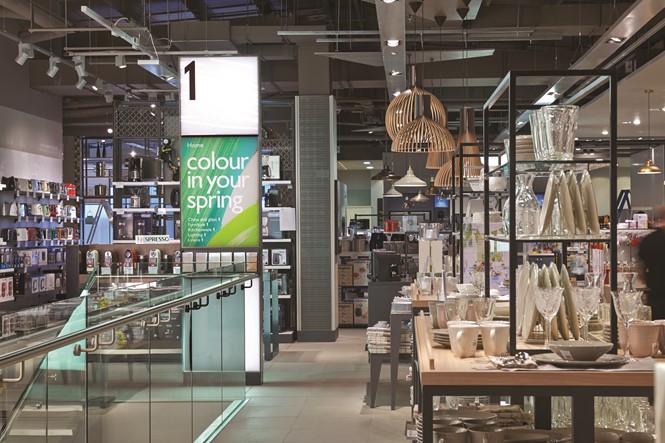
John Lewis is a much-loved brand in Britain and beyond, achieving recognition for its quality products and customer service provision. Its recent store opening at Birmingham New Street presented the challenge of keeping the brand fresh and uncomplicated while creating an easily navigable shopping experience.
Lisa Wells, design standards and signage manager for John Lewis, says, “The most important things in the shop are actually our catering outlets and the toilets – it’s a bonus too if they’re going to shop and buy merchandise, so we tend to focus on the service features.” Given the multi-level layout of John Lewis stores, a wayfinding strategy needed to be developed which corresponded to modern shopping needs.
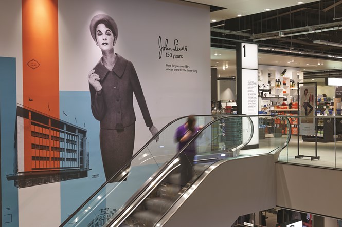
Built environment-focused brand consultancy Endpoint has worked with John Lewis for 15 years, providing service from the consultancy stage through to rollout. John Lewis’ stores visual identities now emphasise service areas and advisory points at which customers can interact with staff – particularly important for Birmingham New Street, the second largest John Lewis in the country. Store designs reflect the brand simplicity, with illuminated signage and clear expressions allowing the merchandise itself to act as the customer’s wayfinder.
A classy and modern brand has been created to showcase the development of new John Lewis stores. Endpoint’s wall artwork and in-store installation design ensures products are given optimum exposure and facilities are accentuated, all while the brand stays relevant to the modern retail experience.
“There is this whole move to simplify their [John Lewis’] communications, from their packaging to everything. Black and white plays really well to legibility but is also more in keeping with their update – in terms of their visual identity, the green has been toned down a little and the lighting’s more atmospheric. They create mood and contrast with different lighting – the sign design was a reflection of that.”
– Gideon Wilkinson, co-founder and managing director, Endpoin