Something to chew on
Stimorol, the market leading gum range, in Northern Europe, has redesigned its brand for the ‘global snacking powerhouse’, Mondelez International. Working with Bulletproof, a strategic brand and packaging design agency, it has created a fresh visual identity and portfolio architecture which will 'make Stimorol cool', driving the public to reappraise the brand.
The goal was to have this gum brand standing out among others in the aisle therefore, to achieve this, Stimorol needed a new “bold and cohesive” design, as mentioned by Viktor Konya, brand equity and innovation manager at Mondelēz.
Bulletproof says, “Stimorol as it stood felt like a dysfunctional family, all of the variants playing very separate roles with no visual cohesion across the portfolio. We needed a big idea and a masterbrand framework that could tie the range together, allowing each variant the right amount of freedom to express their individual personalities.”
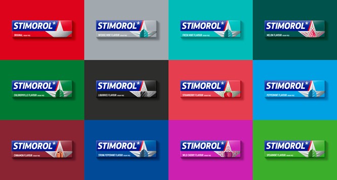
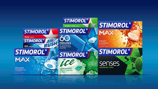
Bulletproof was appointed by Mondelēz, in September 2014. It created a new design for the gum packaging which imposes a sense of uniformity; the same design is now used on all variants of Stimorol chewing gum. This helps make the brand recognisable among all of its products, bringing about visual cohesion.
The brand logo has been specially designed to look clean and fresh with visual impact. The consistent use of the red, blue and white support this impact and makes the packaging identifiable. Incorporation of a star into the design of each gum variant packaging shows that they all fall under the one brand, the ‘star brand’, Stimorol.
Bulletproof says, “We then had to strengthen the core brand assets - Stimorol red and blue, as well as the star - and work out their role in the new design to deliver true impact and win at fixture. The chosen design route, ‘fresh superstar’ uses the star as the focus for the branding, which sits within a bold and flexible portfolio architecture that is tailored to communicate the individual product characteristics, while still tying into the overall masterbrand identity.“


