Peer perspectives: Budweiser

American classic, Budweiser, has launched a global rebrand and repackaging. How does its new look compare to earlier editions of the brand? How did its rise to global prominence change the way the brand is perceived and experienced? Ron Cregan discusses simplicity, heritage and style
Project: Budweiser rebrand by Jones Knowles Ritchie
Reviewer: Ron Cregan, head of business development, Sedley Place
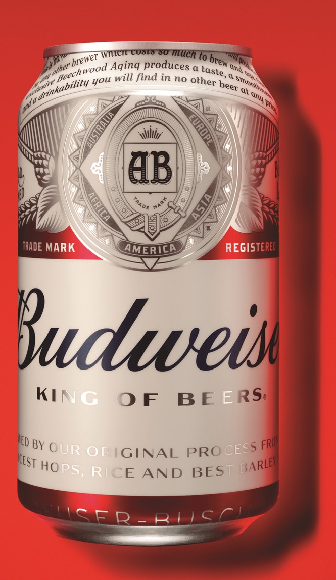
How beer branding works: When I started in design around 30 years ago, we used to talk about ‘cabbage’ in the world of booze branding. The term relates to all the stuff that brands try and cram on to their products to endorse them. Typically for beer, this would be any mention of awards it has won, a representation of origin in the form of sheaves of barley, hops or barrels, and some narrative history.
“More cabbage!” was the common cry whenever a design emerged with a scintilla of empty space on its label.
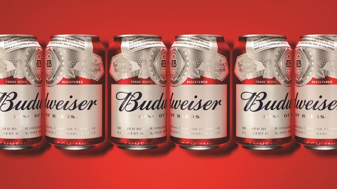
IKEA recently claimed we had reached peak stuff, and it’s fair to say that beer brands reached peak cabbage some time ago. In this respect, Jones Knowles Ritchie’s (jkr) rebrand of Budweiser is a landmark as it strips away the dense iconography around one of the biggest beer brands in the world.
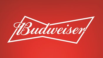
Cut the cabbage: Of course jkr has been here before with its work on Boddington’s in the ’80s. However there is a world of difference between suggesting something radical for a small regional brand, and a beer that has a global footprint. You can see this in the last Budweiser redesign, also by jkr, which played up all the brand’s brash American values – it was loud, proud and fun.

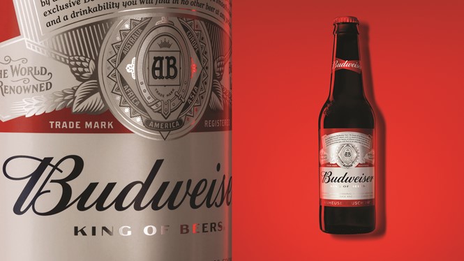
It is also rather dated now. Computer design allowed a lot of 3D visualisation of logotypes, and the 2011 Budweiser neck ‘bowtie’ is a classic example – all fussy layers and details. of this return to simplicity. It has employed font designer Ian Brignell to produce two new fonts and a hand drawn logo that is utterly beautiful. These have been used to reflect the craft element of Budweiser’s brewing. Not craft in the sense of bearded guys stirring the mash in a barn, but a focus on the care Anheuser Busch takes in brewing its beer, exemplified in its new tagline, ‘Brewed the Hard Way’.
Although Budweiser doesn’t compete with craft beers, the latter group’s claims of representing a more authentic form of brewing will have stung – ironic when considering that Budweiser, brewed since 1876, actually has the heritage to which these Johnny-come-latelies aspire.
Why it works: The end result is confident and authentic. AB Inbev has taken a brave step and decluttered substantially. The new logotype sits in a sea of white space, framed like the miniature work of art that it is. In terms of aesthetics, the design of 2011 can be likened to a Wurlitzer – all upfront and gloriously gaudy – whereas the new design evokes another American icon, the American flag, in its elegant simplicity.
Brand
Rebrand
Cards on the table: Sedley Place actually designed the first Budweiser Wurlitzer bar tap, so I can’t claim complete disinterest. The work we did was for a time when Budweiser was pushing out internationally as a brand and wanted to make a strong statement.
The Budweiser name is now so powerful that it doesn’t actually need the bells and whistles. It stands alone as the hero on the packaging, for the first time.
Also, jkr has brought consistency and a great deal of thought into each iteration – be it bottle or can. Cans are primary packaging that sit on a shelf and create a display, whereas bottles come in a box or cardboard outer. The actual bottle is usually covered by the hand of the drinker – that’s where the iconic bowtie comes into its own, peeping out over the hand.
Still the King of Beers?: The proof of the pudding will be in another five years. Will the design stand the test of time or will the next redesign be a radical reaction to this one? My money is on this being a success – and hopefully an inspiration for other beer brands to cut the cabbage too.