One strong future
Dutch-owned supermarket group, Ahold was established in 1887; Belgian-owned supermarket group, Delhaize, in 1867. Back in June 2015, the companies announced the intention to merge.
In July 2016, $29bn later, this expectation became a reality.
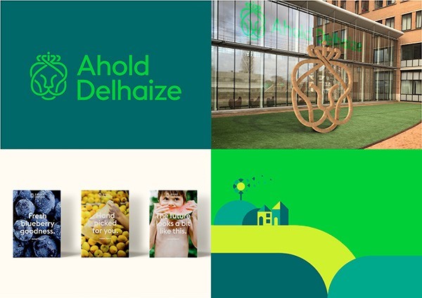
Annual sales of the group reach around $50bn per year, and each week it serves around 50mn customer across 11 countries through 22 local brands. The newly-named Ahold Delhaize therefore required a strong visual and corporate identity to remain a leader in retail experience.
International brand design agency, Futurebrand, was chosen as a sufficiently experienced agency to deliver the new branding.
The integration of company values is clear in the visual identity of the merged company, which was unveiled in Zaandam, The Netherlands, where the headquarters of Ahold Delhaize is situated.
The proximity of the Netherlands and Belgium means Ahold and Delhaize shared a similar heritage and outlook – something which became a focal point of the rebranding campaign.
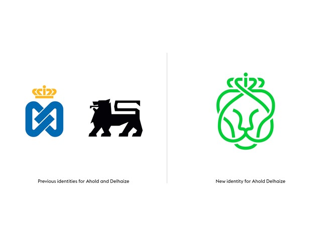
Yet, with Delhaize better known in the consumer sphere due to the lion logo adorning the branding of many items, effectively integrating Ahold as a major part of the company brand presented a challenge. Customer experience as well as heritage therefore became a main focus of the visual design, and a common concept under which the two distinct identities could be married.
A customer-oriented experience is also an underpinning theme in the Ahold Delhaize marketing strategy, as well as in its new branding. Ahold Delhaize is a forefunner in an internationally competitive retail sector - FutureBrand has ensured its typography and imagery design reflects this leadership, while remaining sufficiently welcoming to customers.
A regal theme was present in both the previous Ahold and Delhaize logos, through a crown symbol and lion symbol respectively. FutureBrand has retained these elements, combining them into one, more rounded logotype.
This is applied in a welcoming green colour, which cements Ahold Delhaize’s modern credentials and reflects its commitment to sustainability and healthy, fresh food options.
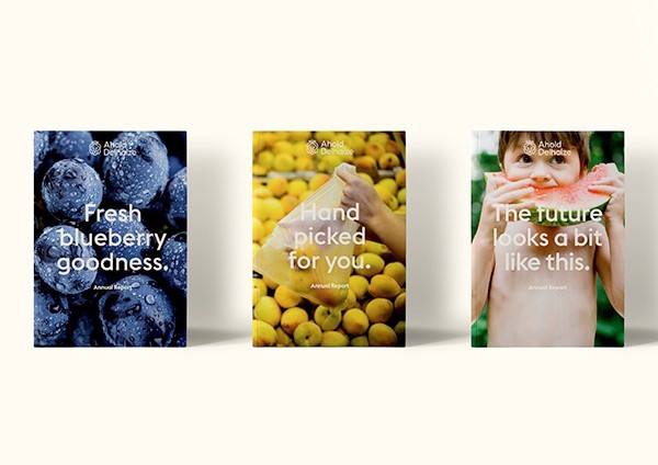
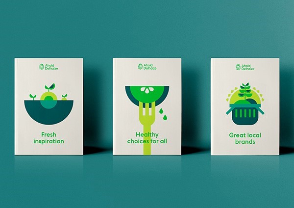
FutureBrand’s newly created bright green, teal and blue colour palette is a theme throughout the brand’s marketing materials and campaign. It focuses on the fresh aspects of Ahold Delhaize products, creating a uniform identity while retaining more specific aspects that make Ahold Delhaize stores sufficiently local.
This is particularly clear in its print assets, which use close up pictures of bright and fresh fruits to reflect the vibrancy of the Ahold Delhaize brand.
Vanessa Hofland, global communications at Ahold Delhaize said “We all really appreciate FutureBrand’s dedication and commitment to delivering exceptional creative to the highest levels, with strategic rigour. Working with the FutureBrand team has been a very enjoyable experience and we look forward to the rest of the journey ahead.”